Admin portal
Product design
A radical vision for customer relation management (CRM) portals for the life insurance industry, based on user research I conducted at Ethos. Despite not having been shipped, this design set a northstar with immense downstream influence.
Justin Sayarath, product manager
Ikagar Singh, account executive
Tyler Monteferrante, head of design
Gokul Dhingra, VP of product
2019
Overview
Ethos is one of the D2C insurance companies that took off circa 2017. Skipping the human agent, Ethos boasts an all-online insurance buying process in the web browser, as well as proprietary pricing technology that allows the user to instantly see prices from all eligible insurance products that Ethos runs.
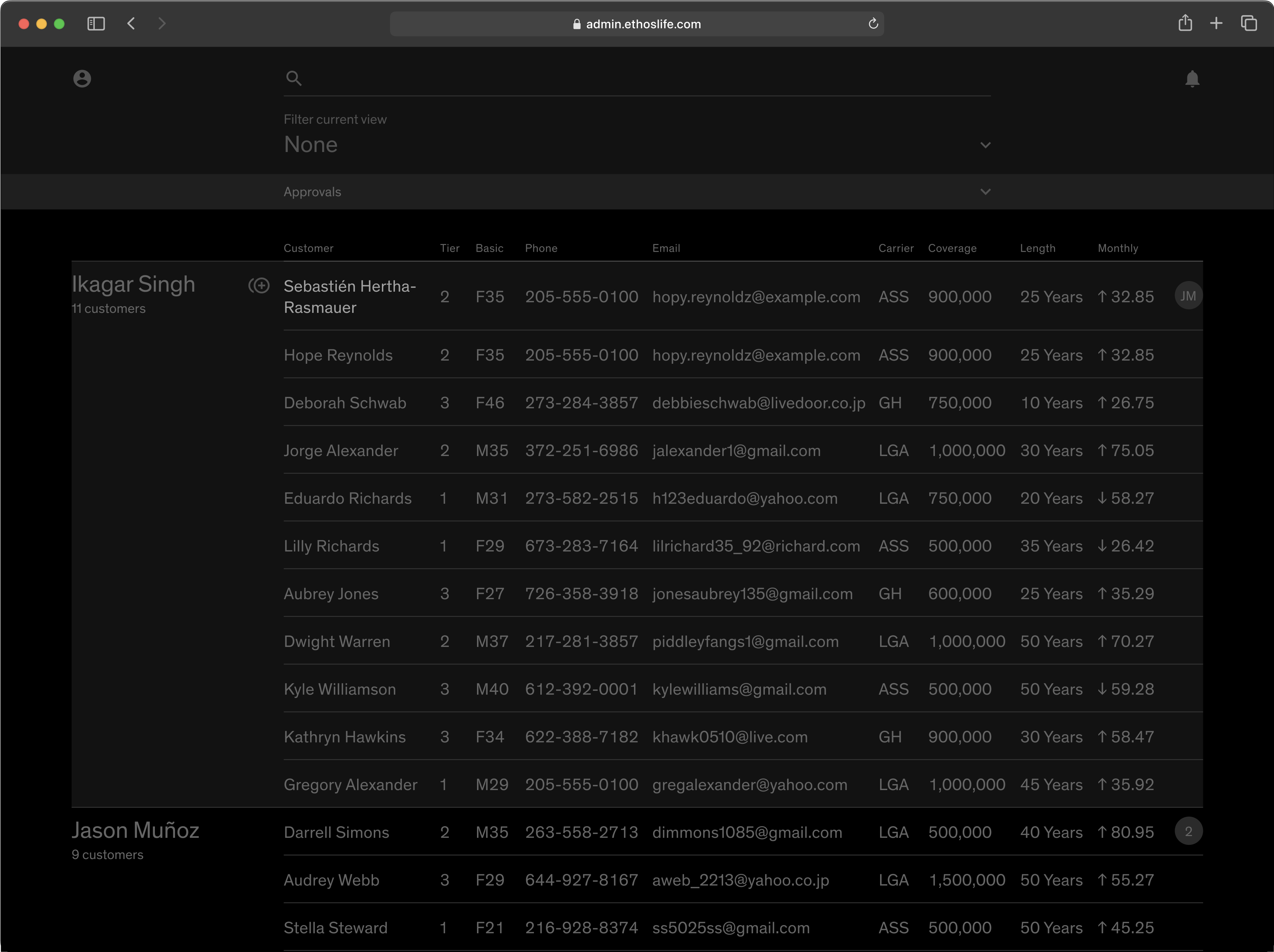
Naturally, customer representatives had an intense number of customers to call every day, and had been using a hacked together web portal to keep track. Since we hadn’t have any internal tooling for any form of customer tracking, I successfully convinced my managers that a better agent dashboard was worth the investment.
User research
At the time Ethos didn’t have any user research capacity, so I conducted my own research to answer the question of “what does a better admin portal mean?”. This also became a catalyst advocating for Ethos’s own user research department. Over two weeks, I conducted the following:
-
3 semi-structured interviews with two line agents and one shift manager. The sample size was kept small to save time;
-
contextual inquiries: I sat down with three line agents to have them walk me through their work tools setup and daily routine; and
-
shadowing: I sat next to three line agents as they performed live calls.
Shift manager
Manages and coordinates line agents
Goals
- Assign and reassign clients to balance different agents’ workloads across shifts
- Ensure clients feel respected in conversations
- Maximize rate of success across client calls
Pain points
- Client lists are complex and updates frequently—prone to error
- Difficult to keep track of client assignment
- Need to mentally calculate agent workload
Line agent
Uses information in portal to call clients
Goals
- Achieve sales goal of the client’s current stage
- Ensure client feel respected during call
Pain points
- Client communication is spread over too many software platforms (at least 6)
- Digging for information during calls is highly stressful
- Difficult to maintain interaction history if client was handed over from another agent
These personas then gave rise to a set of concrete design principles:
-
Speed: both personas have highly regimented workflows, so the UX can have higher learning cost as long as it improves speed on these predictable workflows. This is also a pro tool, not a consumer app where zero learning cost is mandatory.
-
Consolidation: try to incorporate as many data sources as possible to reduce agents’ context-switching between tools.
-
Keyboard-first: through shadowing, I found that agents’ mouse actions are highly repetitive, which means we can both reduce carpel tunnel and increase the UX speed by allowing tasks like navigation to be performed by keyboard only, with mouse being the fallback.
Learning from TV
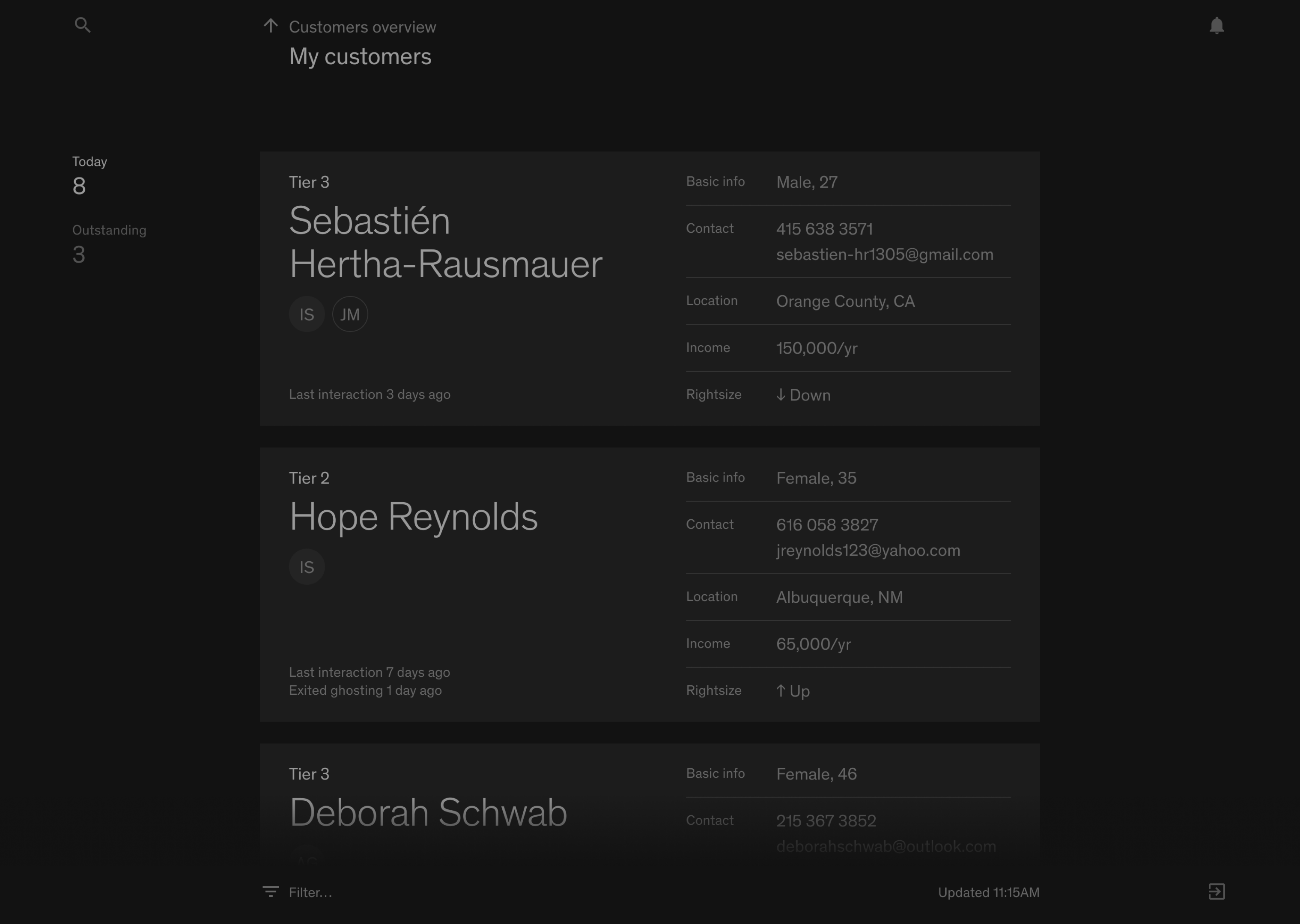
However, people were also confused when confronted with the card-based UI the first time. I also felt it took up too much space for a tool so utilitarian and technical.
I then realized that the deeper problem was that I still designed with the mouse in mind—after all, desktop manipulation with a cursor was too prevalent a paradigm. The first draft simply doesn’t work if you used arrow and enter keys to operate:
Pondering how to make keyboard-first navigation work, I suddenly realized that navigating with keys is just like using a TV remote: they’re both based on a set of arrow buttons and a set of enter/exit buttons. And design for TV remote I knew—I worked on a tvOS project a few years ago!
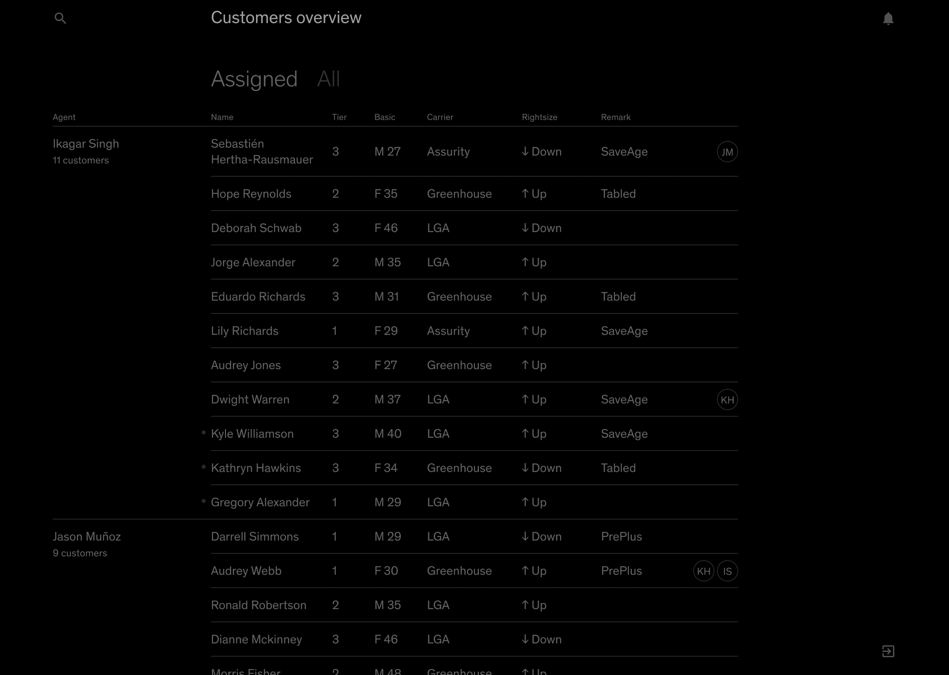
Like the keyboard, the Apple TV remote’s touchpad only recognizes 4 direction inputs, so tvOS apps need to be laid out in 90-degree axes. Otherwise, the interaction would feel odd because the touchpad wouldn’t honor diagonal swipes. This also imposed a strict but comforting constraint on design: all highlightable elements must be arranged on either a vertical or horizontal line.
UI on TV needs to have low information density because it’s viewed afar and usually in a relaxed setting, but we could still apply the same interaction paradigm to work software with higher density.
Crucially, the vertical axis is used for traversal, while the horizontal axis drills down or goes up levels of information. Consistently following this principle, I believe, creates a sense of predictability in a giant information system.
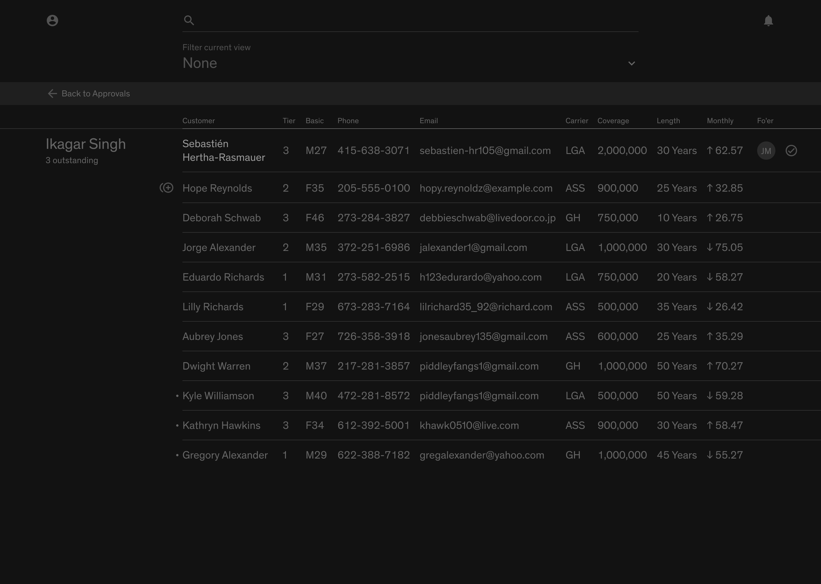
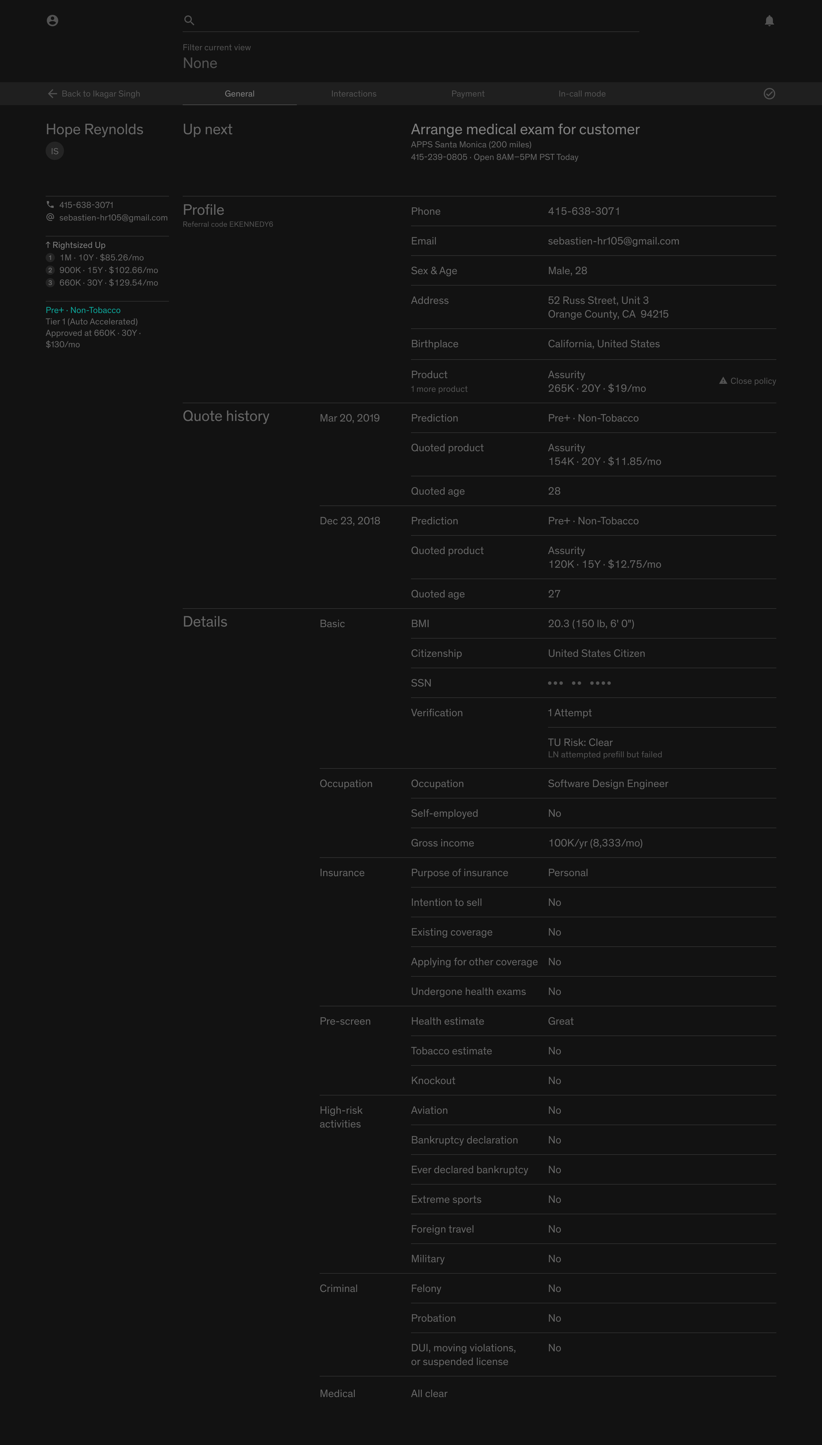
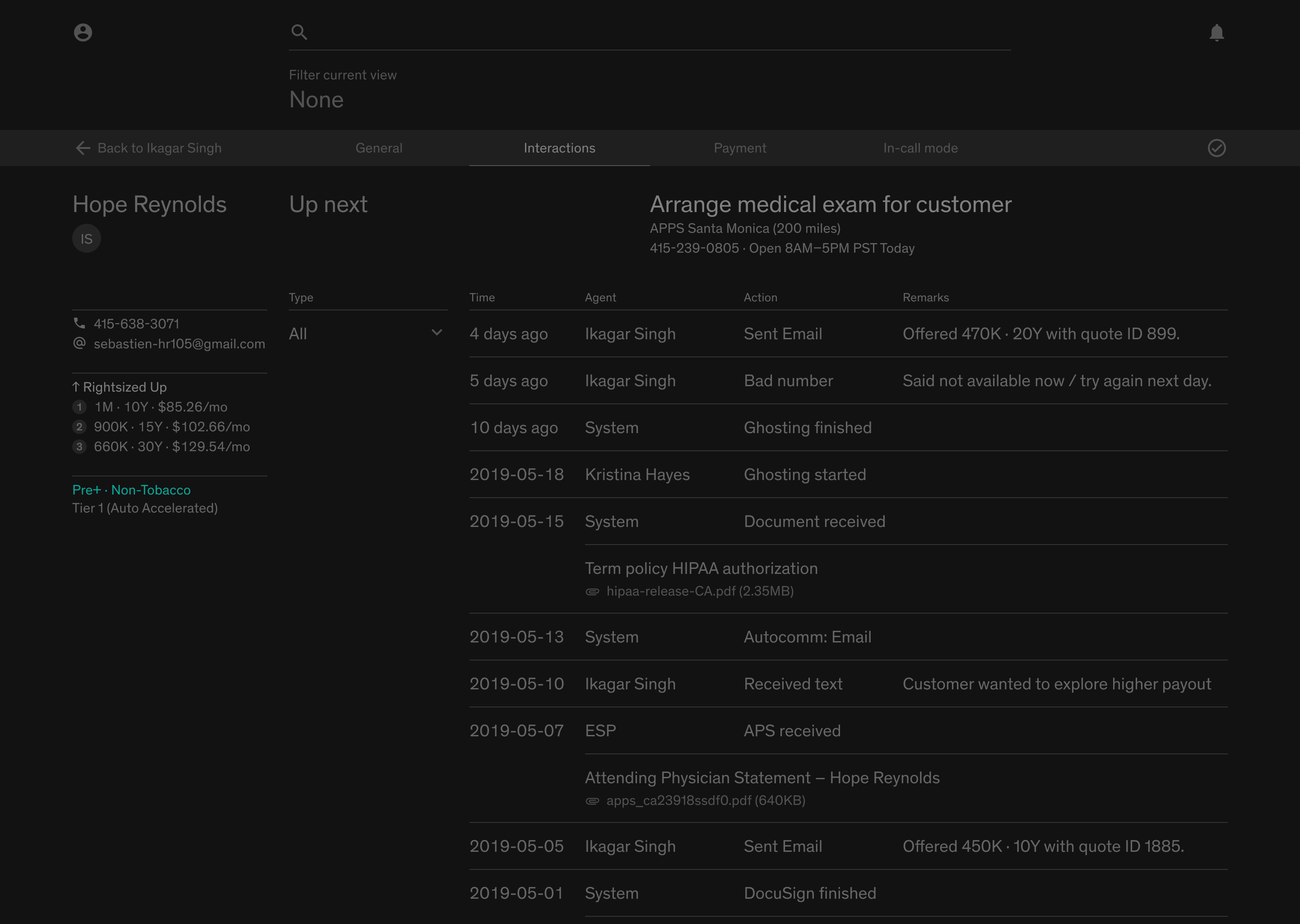
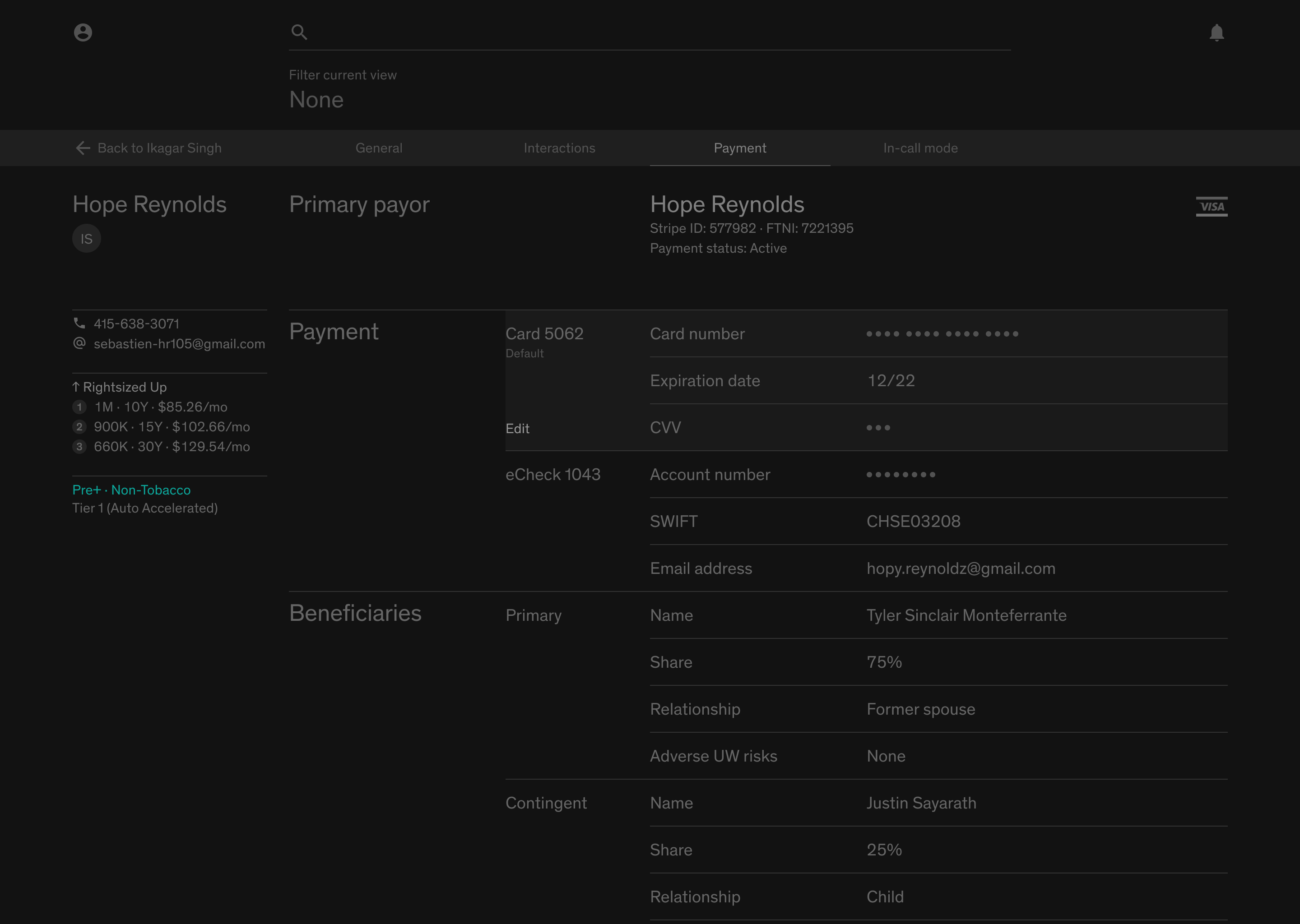
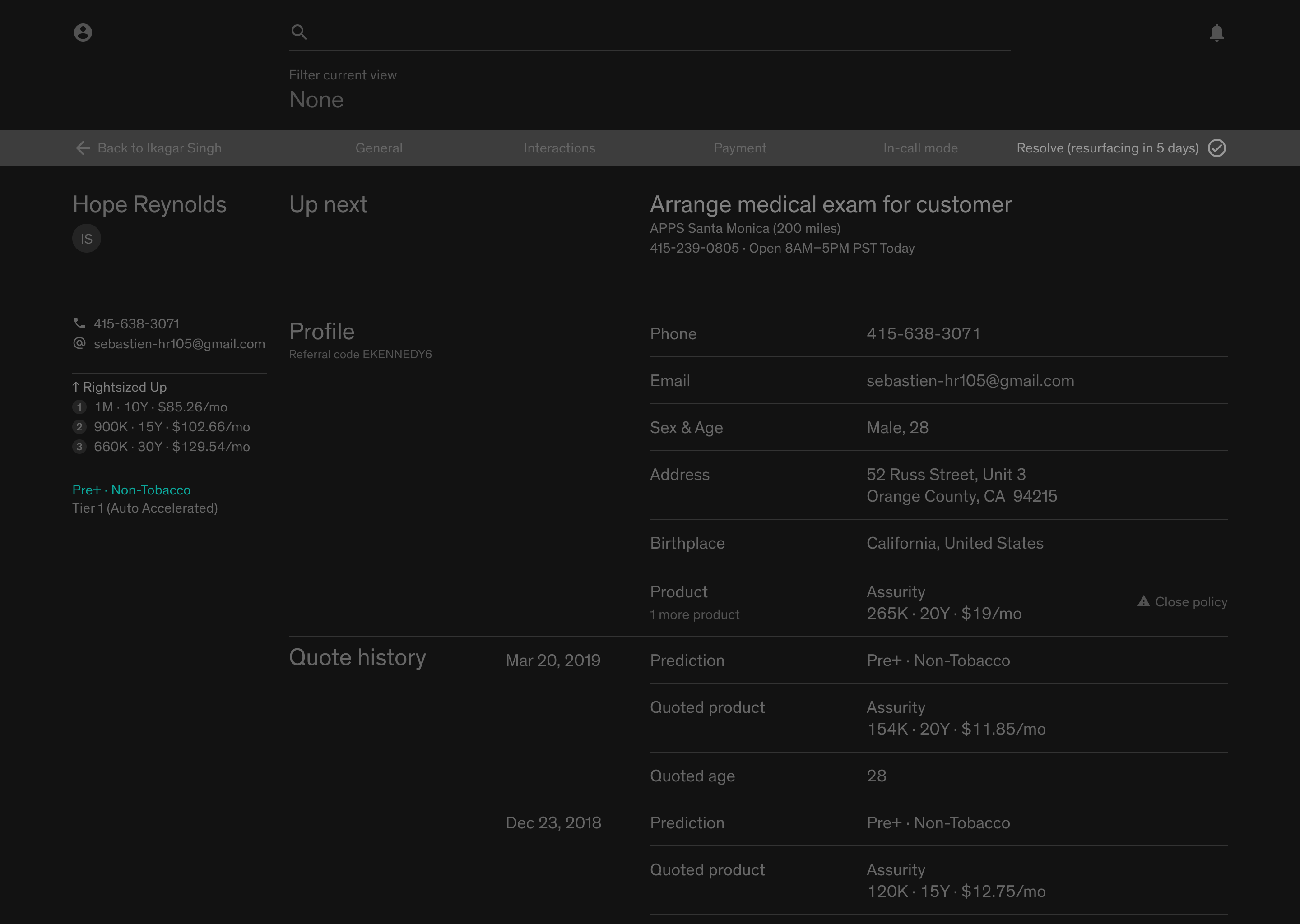
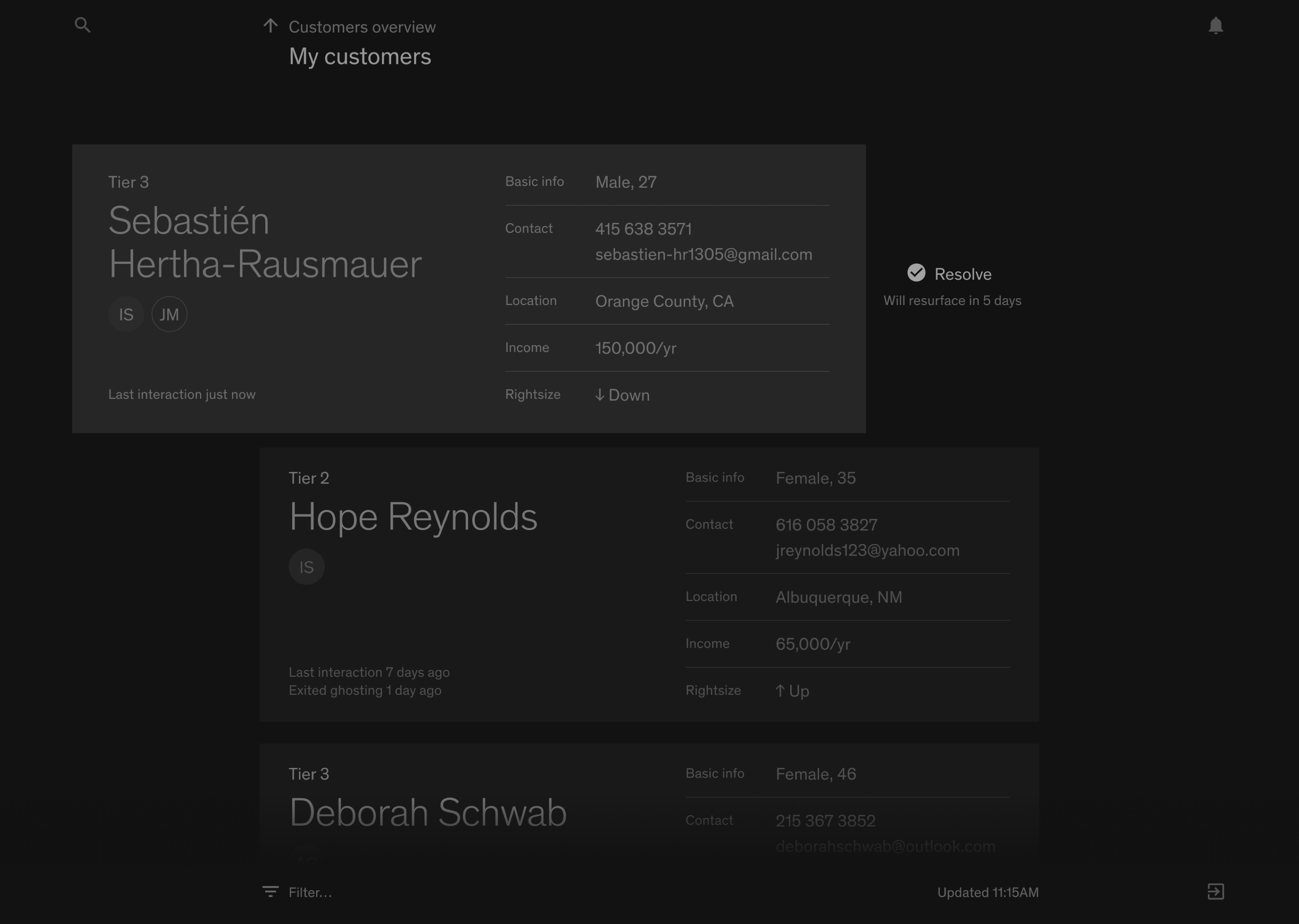
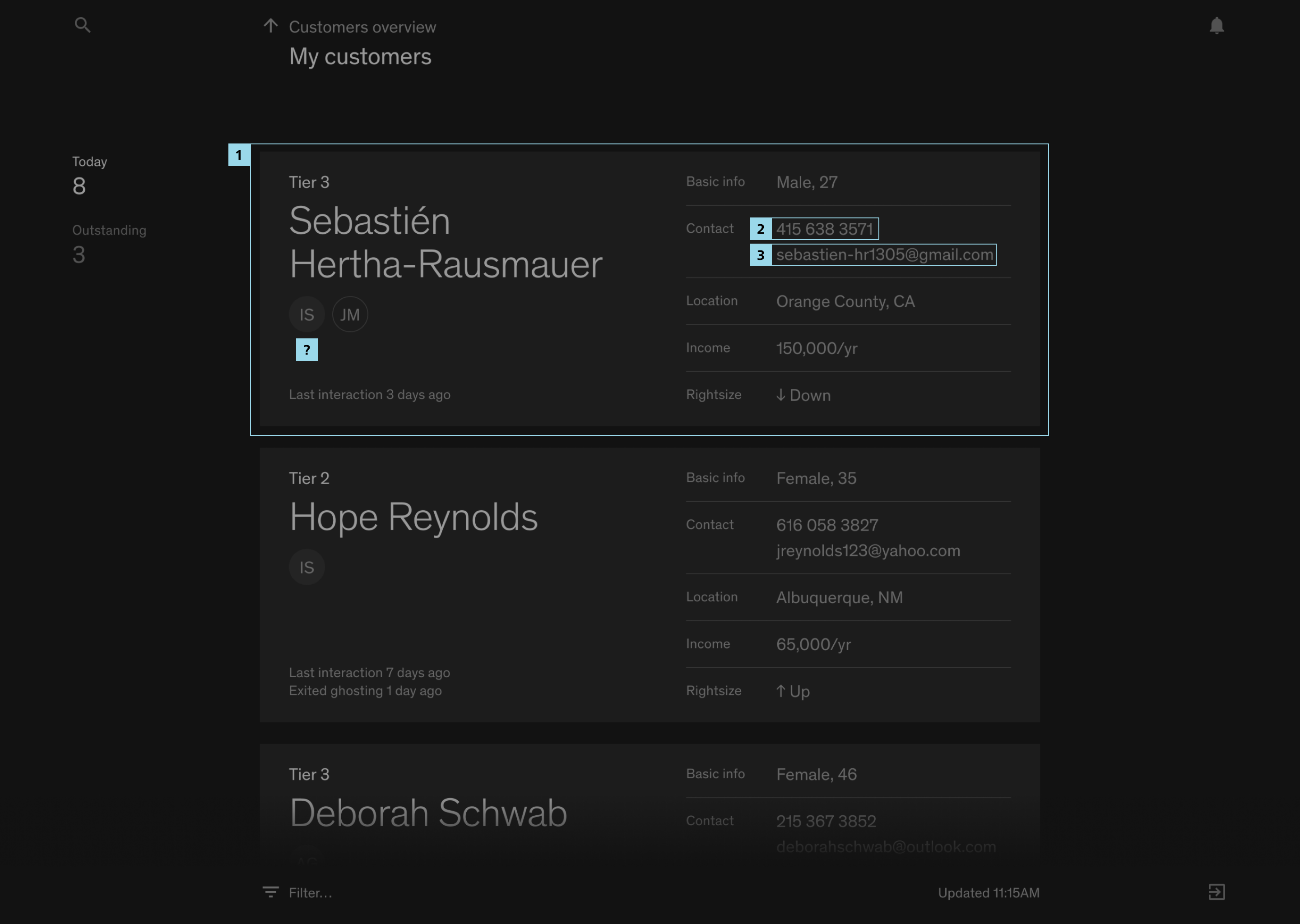
Client details
With the navigation pattern figured out, the client details view is easier. It was a process of collecting information and finding the most logical arrangement. The top bar that used to host the stage switcher conveniently turns into a tab bar.
The narrow column to the left is persistent across tabs, and gives a glance a client’s profile: history of rightsizing, risk grade, evidence collection speed, and underwriting decision. This little combination determines the price, and drives the agent’s whole phone call with the client.