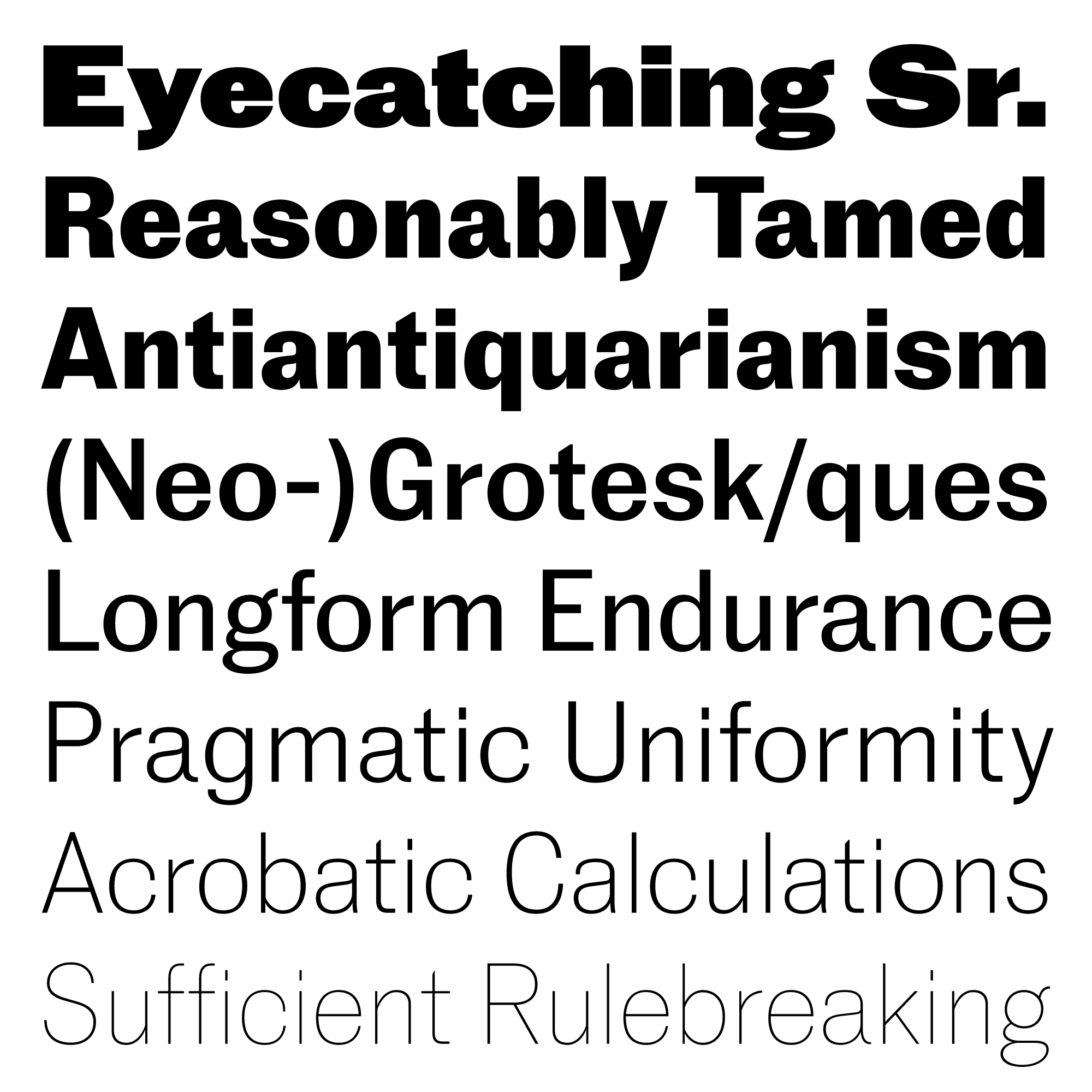
Review: Marcin Antique
In the neo-grotesque genre, there is almost no combination of design strategy, logic, and archetype left to research or develop. So it’s laudable enough that Marcin Antique, released in 2017, still managed to tiptoe into the world without intruding on anyone’s territory.

Acrobatic calculations are in play. Thanks to its smaller x-height, Marcin Antique’s counters are only slightly squarish, less rectangular than Univers but more rectangular than Helvetica or Victorian grotesques—sufficient for letters to adhere, but not so much that verticals take over. The squarish counters presented an opportunity for a monospaced variant, titled Marcin Typewriter. Stroke contrast has the same nuance: more than what’s expected of a neo-grotesque, but just a hair less than what would make it a contrasted sans serif like Vinter or URW Imperial. This improves on many neo-grotesques’ shared ailment of excessive uniformity, without turning the paragraph into a high-contrast legibility nightmare.
Most of the glyphs are tame and anonymous, but there are just enough delinquents to enliven a page: the prominent terminal of a, the Franklin-like two-storey g, and the timidly-tailed Q. All in all, these delicate balances and considerations save Marcin Antique from unoriginality, dogmatism, or unfettered antiquarianism.
Of course, Marcin Antique isn’t infallible. I understand Feliciano’s decision to draw italics a touch lighter to compensate for the sloped forms’ weight gain, but after seeing the specimen, I wonder if we’ve conditioned ourselves to see darker italics as normal. Spacing could probably be finessed a bit, too: there are a few spots in the extreme weights where letters leave visible gaps or almost collide. But to the everyday typographer accustomed to manually spacing headlines, this is a trivial issue. The lighter italics might stand out a bit, but it firmly signals difference, evens out the overall page color, and makes the typeface more recognizable among a million other neo-grots.
Marcin Antique is a revival neo-grotesque that attends to the needs of longform reading. Typographic experimentation or form-giving breakthrough happens less often in a typeface like this, but that doesn’t mean it’s worthless. Quite the opposite: neo-grotesques are hot (have they ever not been?), revivals are fashionable now, and not many trendy sans serifs can endure the brutal environment of 10pt running text. With just the right amount of idiosyncrasy, a comprehensive style coverage, an eye-catching Super weight, and a monospaced variant, Marcin Antique is a unique and versatile addition to a typographer’s repertoire.