Template Gallery
Product design
Templates are Notion’s biggest conversion surface and creators have formed a bustling ecosystem. I led the redesign of the entire Templates experience from scratch in 3 months, expanding its capabilities to empower creators and users alike.
Matt Piccolella, product manager
Cory Etzkorn, designer
Tanner Godarzi, web engineer
Eric Nagy, web engineer
Victor Huang, engineering lead
2023.5–8
Overview
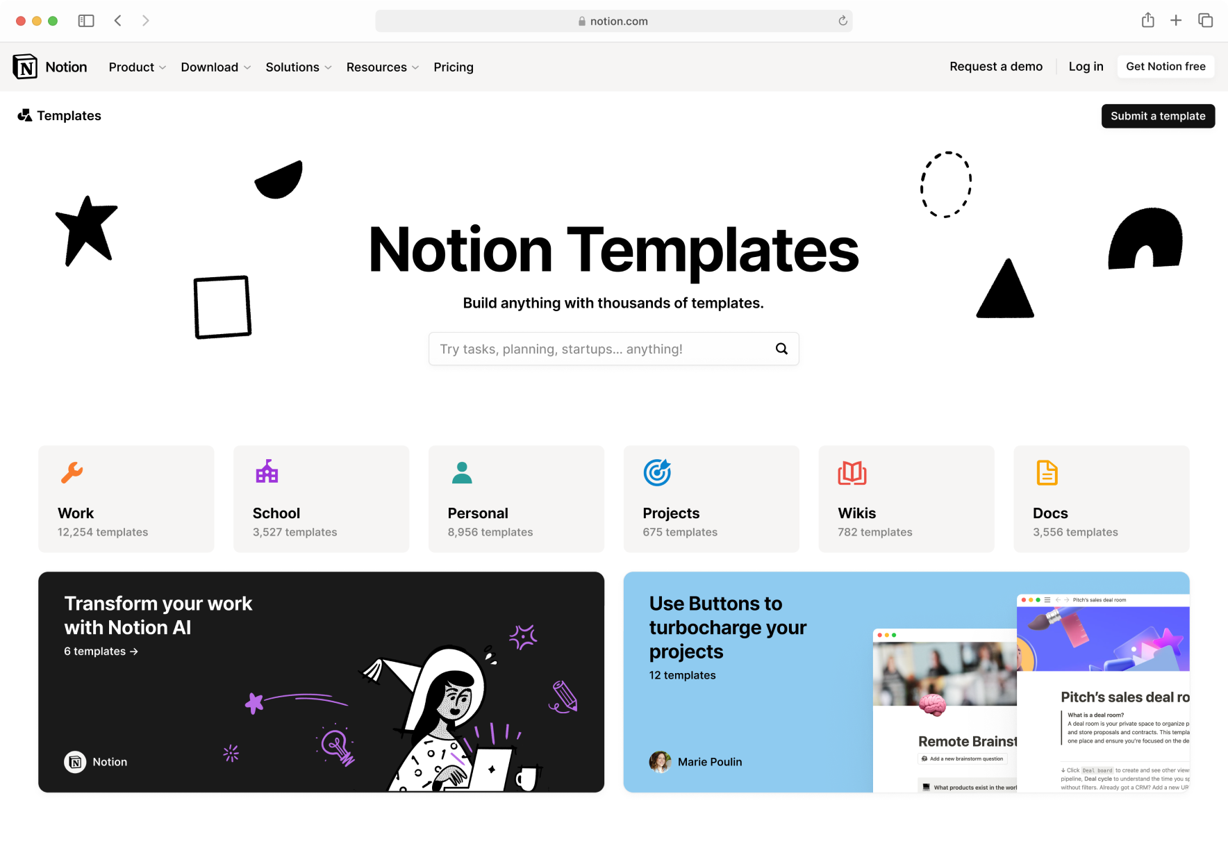
To double-down on organic distribution channels, Notion decided to invest more heavily into its creator community in 2023, starting with the Template Gallery. At that point, the old gallery only had a dozen templates and categories. A lot of creators already made substantial profits selling Notion content, but they were all on Gumroad, Patreon, or other social media sites.
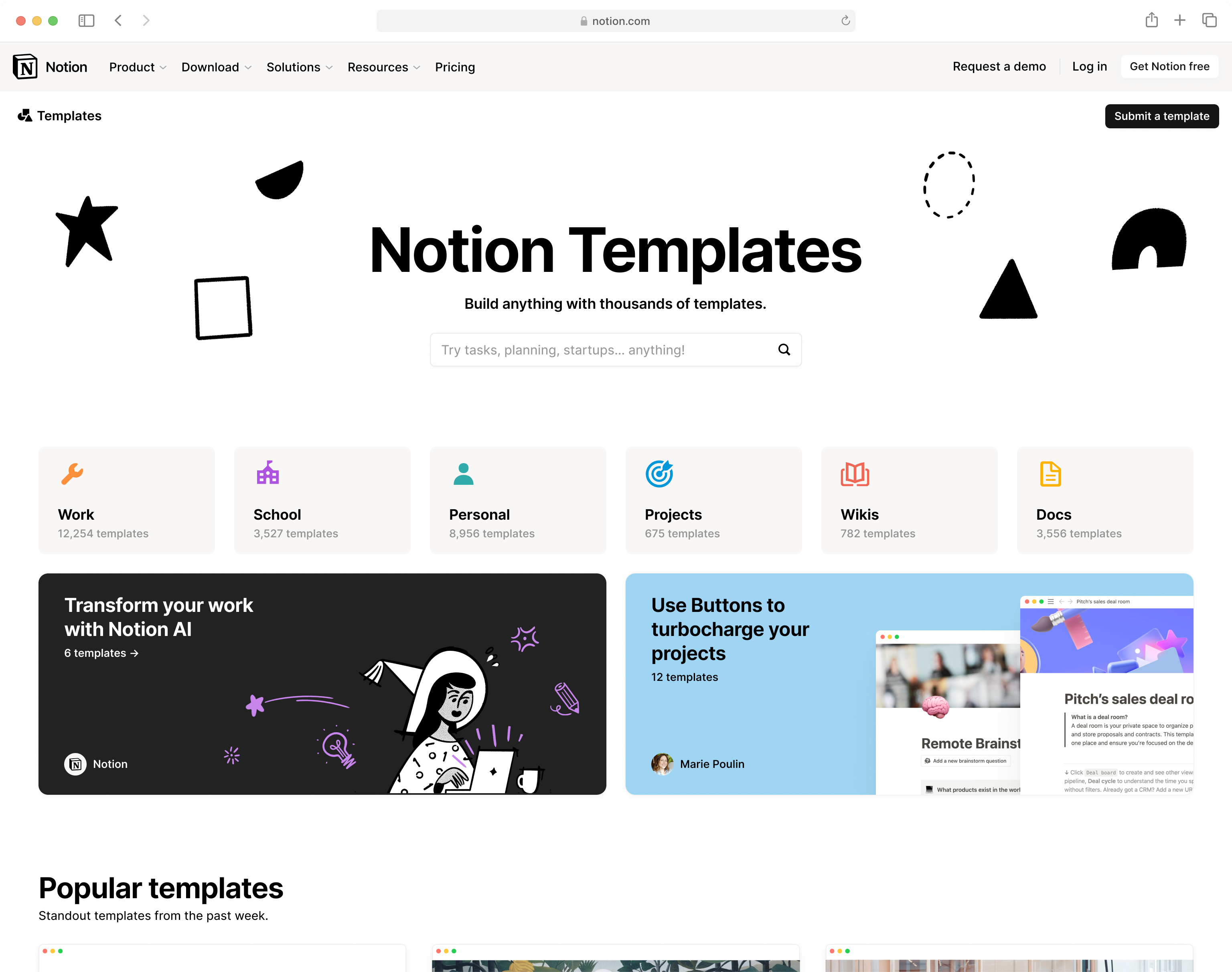
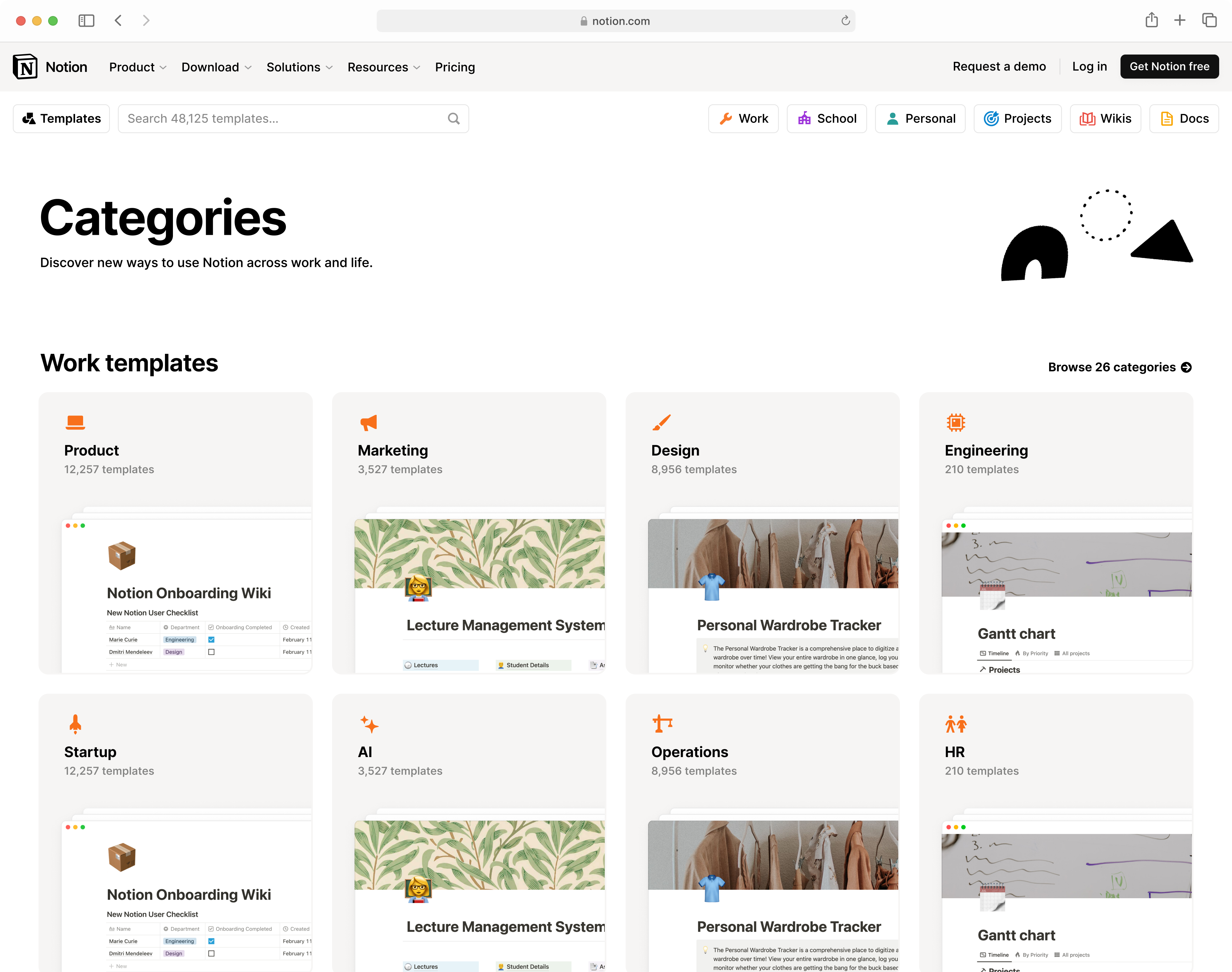
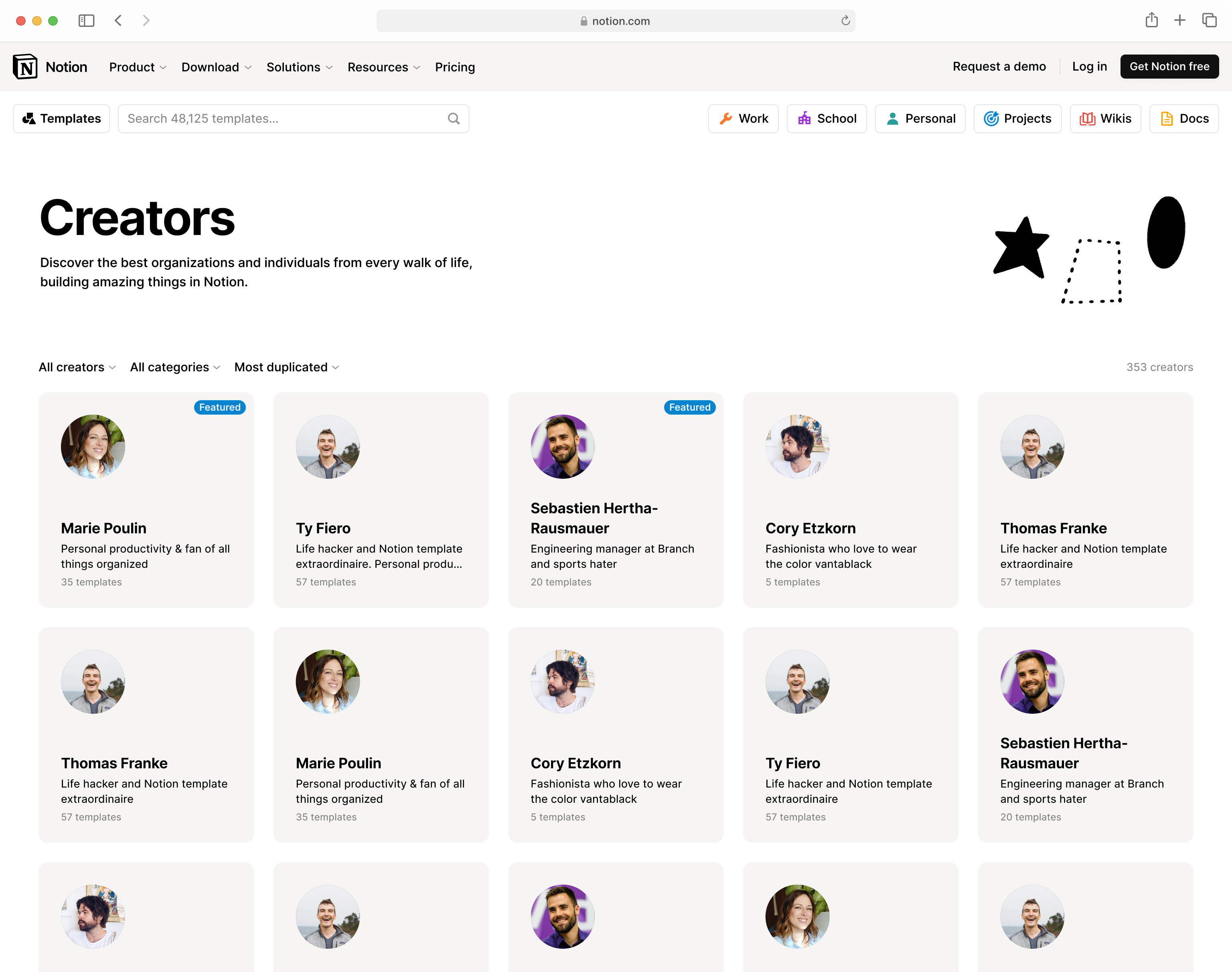
We re-launched the gallery with 100× more templates, categories, and creators. To handle this much content, we redesigned a high-throughput navigation pattern that facilitated user exploration and content curation. A newly dedicated creator profile view allows creators to better advertise their work and connect with followers.
Within just a week post-launch, the new gallery saw immense engagement and revenue potential. It accounted for 40% of total visits to the Notion website, and users coming from templates are 30–40% more likely to activate paid subscriptions. Today, it’s home to more than 15,000 templates from over 8,000 creators.
+114%
1.8m
+21%
+90%
+14%
23.9%
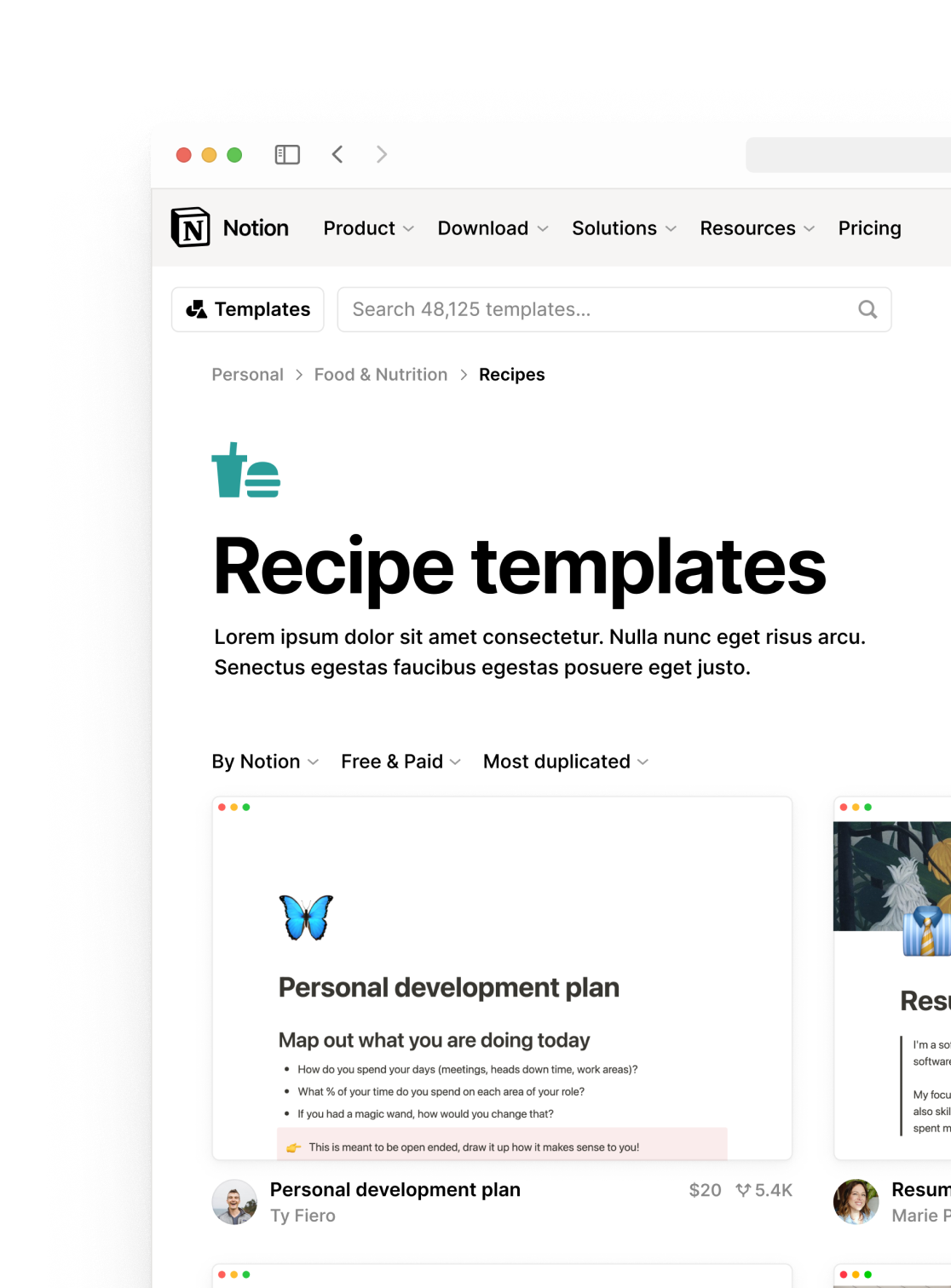
Navigation
The new gallery would serve over 5,000 templates in 250+ categories at launch, ten-fold the current. The main problem was to figure out the homepage and category pages—two tentpole pieces for navigation—so users aren’t overwhelmed by the scale.
Starting with category pages and designing outwards, we tried out patterns from either e-Commerce sites or streaming apps with templates data:


During this sketching phase, none of these combinations felt right as they were. They either felt too flat and strict in structure, or would require too much manual or algorithmic curation that the team couldn’t afford. But as I sketched, I slowly started to realize what our concrete issues were:
-
Uncertain image quality: the team was too small to “art-direct” all user submissions, so we couldn’t show the template previews too big;
-
Uncertain depth: some categories have one layer of sub-categories but others could have up to 4;
-
Uncertain routes: the same template can be accessed from multiple category routes, some of which we wouldn’t know beforehand.


However, I still felt that these issues were too local to form a problem statement. In short, they didn’t capture the problem’s essence—but what was its essence?
Looking back, I found that I always tended to make the hierarchy completely visible to the user, and kept getting sabotaged by its uncertainty or our lack of editorial resourcing. Being aware of this tendency made me question what I should solve for, and turns out it wasn’t “a navigation pattern that handles varying depth or routes”. It’s about that feeling of cluelessness when you first land on this convoluted database. The problem statement now became:
How do we make users feel safe and not loss, regardless of where they end up in their journey?
Making sure users always feel safe means adding more sign-post elements, and only then did I realize it had nothing to do with whether or not the entire category hierarchy is visible at the start. In other words, people might not care about seeing the whole picture as long as their hands are held well.
Having made this trade-off, we quickly arrived at this pattern:
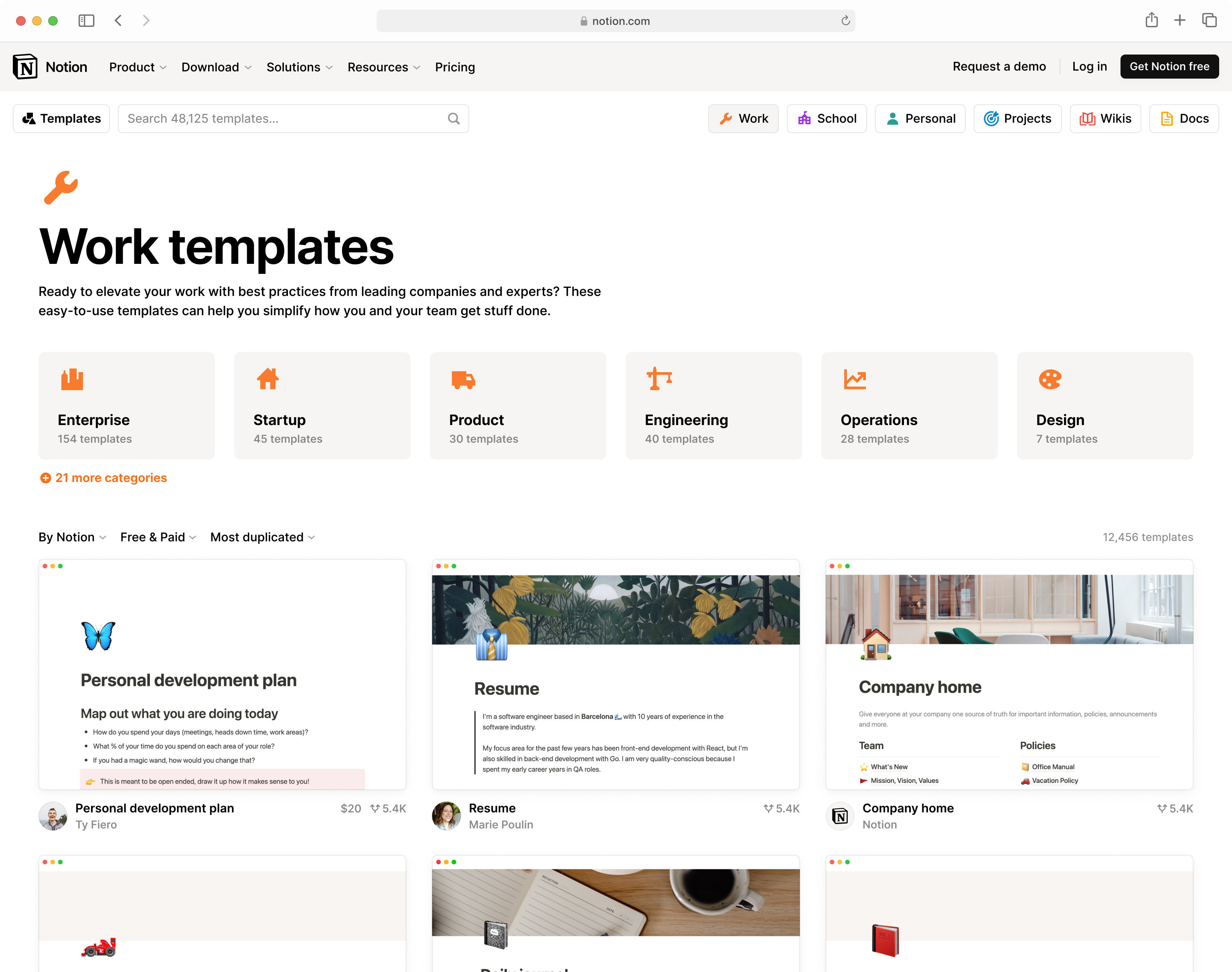
Cory (the other designer) and I had been separately sketching, and we ended up at similar places. At that point, we knew this was it. This pattern checked all the boxes, and then some:
-
It’s dead-simple, flexible, and infinitely repeatable at every level;
-
It doesn’t care how many children a category has, and automatically differentiates the top sub-categories from the rest;
-
It doesn’t rely on template previews being big and beautiful;
-
It gave birth to a flexible and modular “tile” formal language, which can be applied to many other situations.
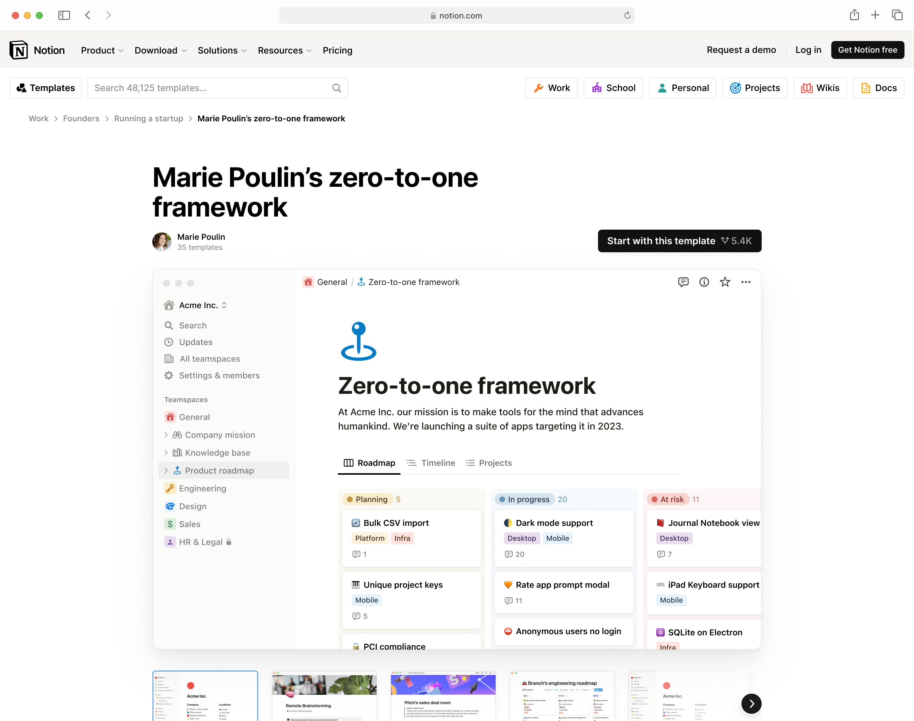
Preview & duplication
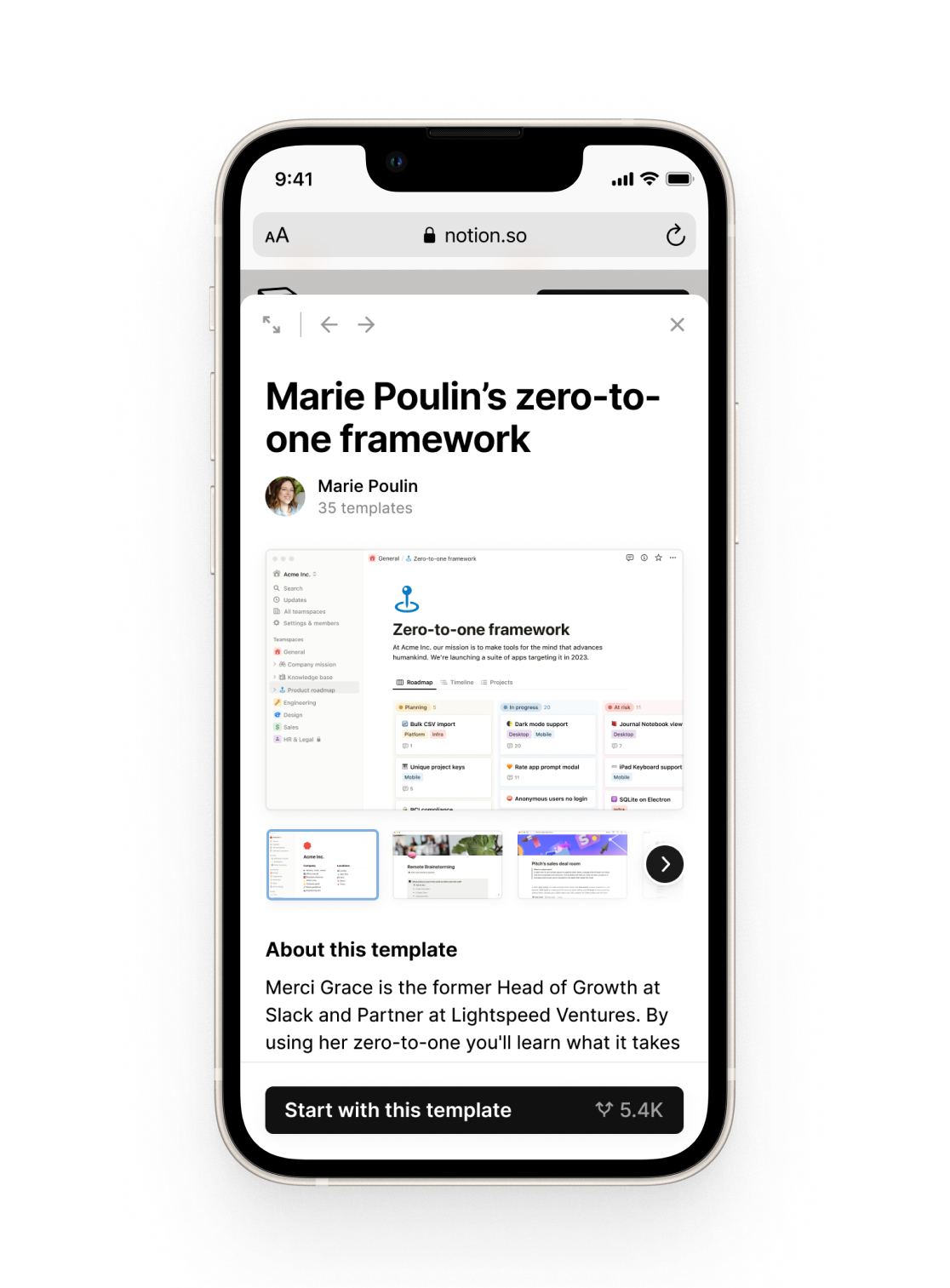
Figuring out the middle navigation layer made it easier to design the individual template preview, which sits at the bottom of user journeys. I did some simple iterations on the layout and settled on a fairly uncontroversial option:
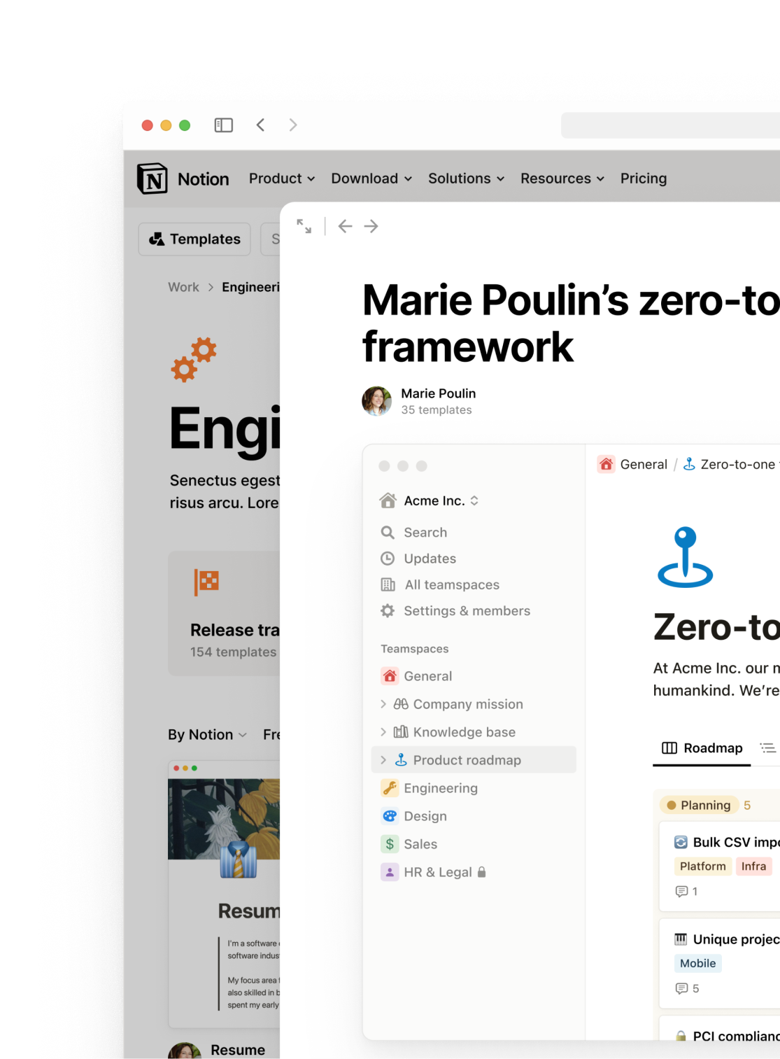
We also defined a popup modal version, allowing users to quickly jump in and out in their browsing journey. Cutting away the related recommendations, this “mini” version has only the basic above-the-fold content.
I also took the chance to consolidate the modal, control bar, and breadcrumb patterns in our fledgling website design system.
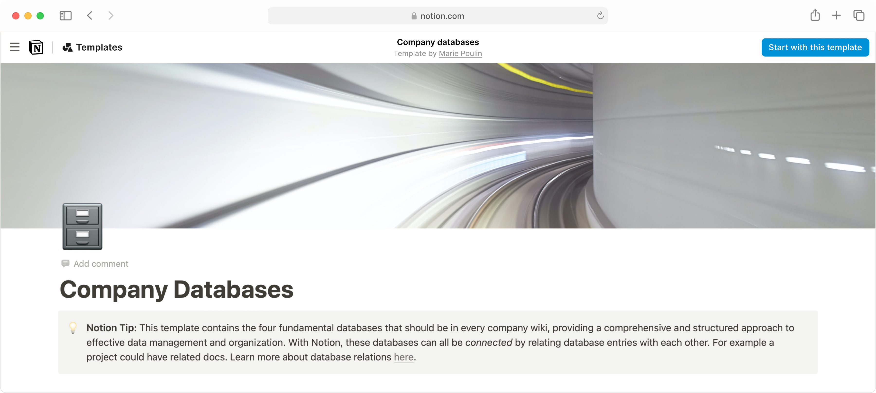
I also worked on the template preview outside of the gallery. Accessed from outside, it’s effectively a public Notion page (that embeds sub-pages) with a special top bar.
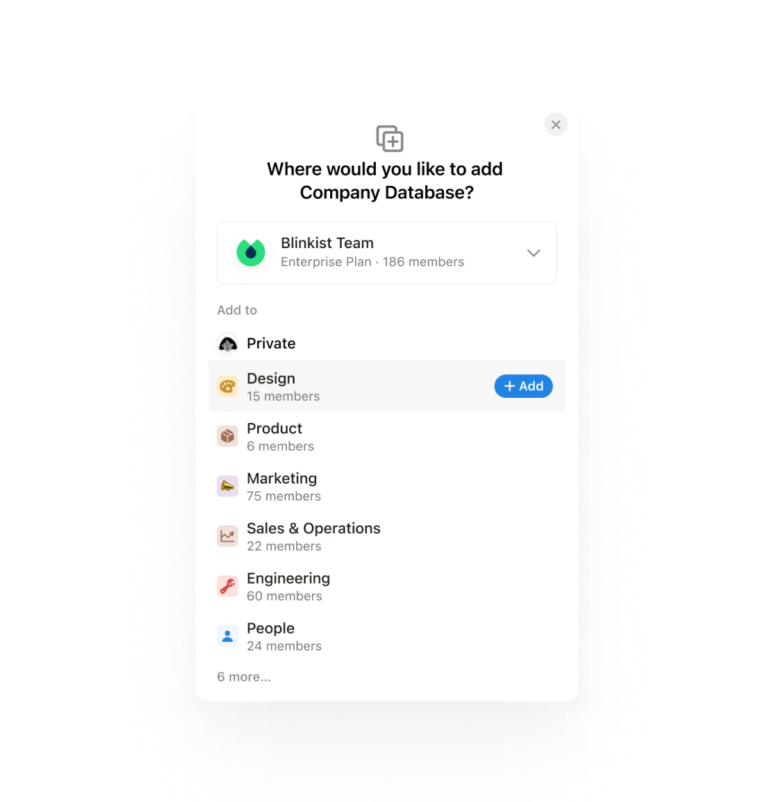
Another significant change was the duplication flow. Previously, templates were duplicated into the user’s private workspace by default, then moved to the desired location. In this re-launch, we decided to allow picking a location before the user duplicates the template. This tiny UX improvement had a surprising impact—46% more users duplicated templates within the first week it launched.
Other areas
Finalizing the category and individual template views shaped up enough direction for the rest of the gallery, most prominently the creator profile view.
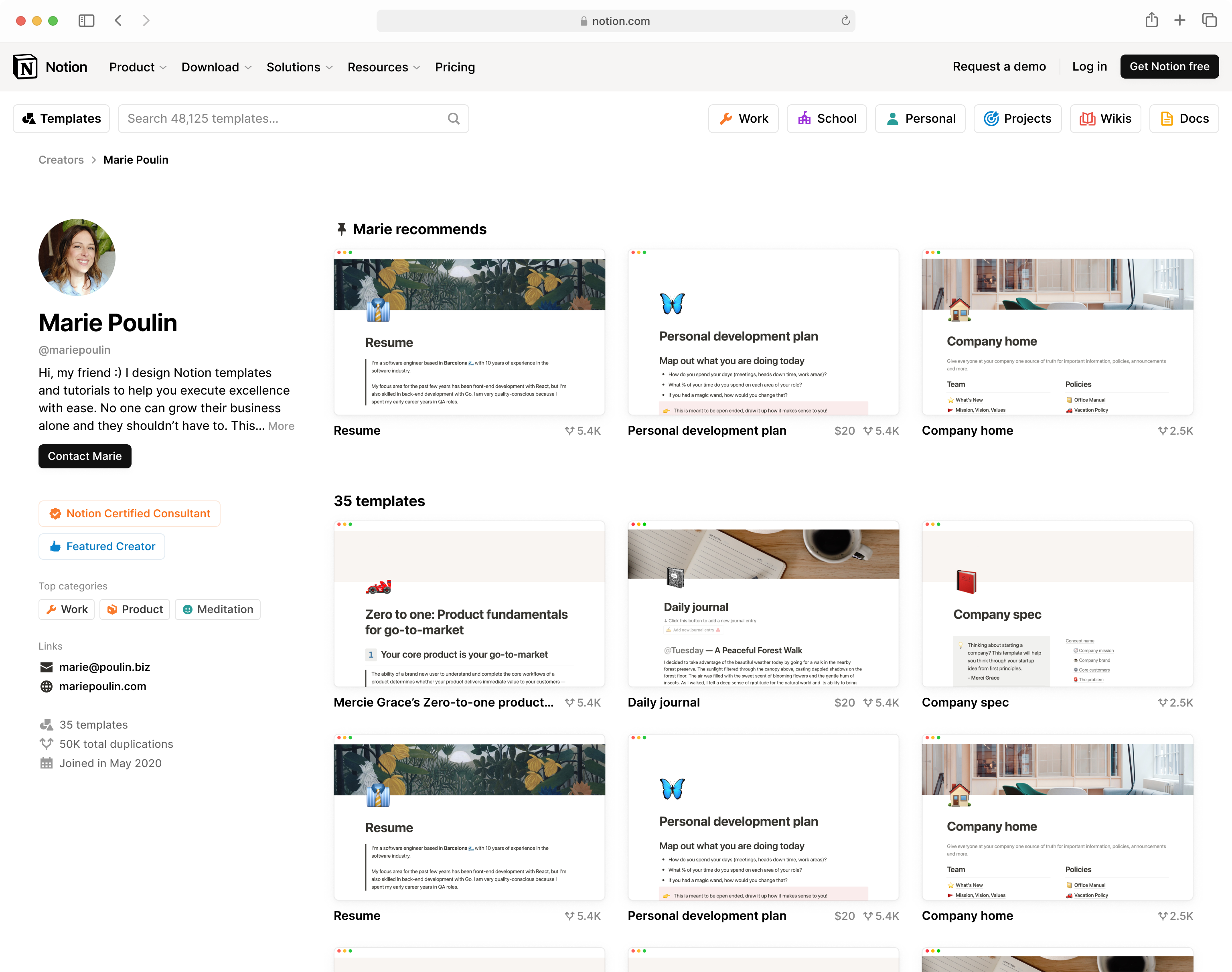
At this point, the conceptual directions became clear enough for a homepage to emerge: a stack of sections previewing top content from templates, categories, collections, and creators. These sections would simply follow the same “row of tiles” visual language.
Website design system
The Notion website’s design system used to be mostly graphic elements, e.g. bento grid blocks and illustrations. In redesigning the Template Gallery, we started adding interactive elements such as toolbars and modals to the system, and refined them as the project continued. Given their reusable status, I took extra time drawing redlines for handoff to make sure they’re as right as could be.
Compared to Notion’s utilitarian app, its website affords a bit more visual flair. Websites are also often on a larger scale than desktop applications, with bigger font & image sizes. These two reasons were behind this design system’s look and feel—similarly strict and deferent as the app, but more spacious and airy.
Below are a small part of the redlines I delivered.
60%
2.46m
800k