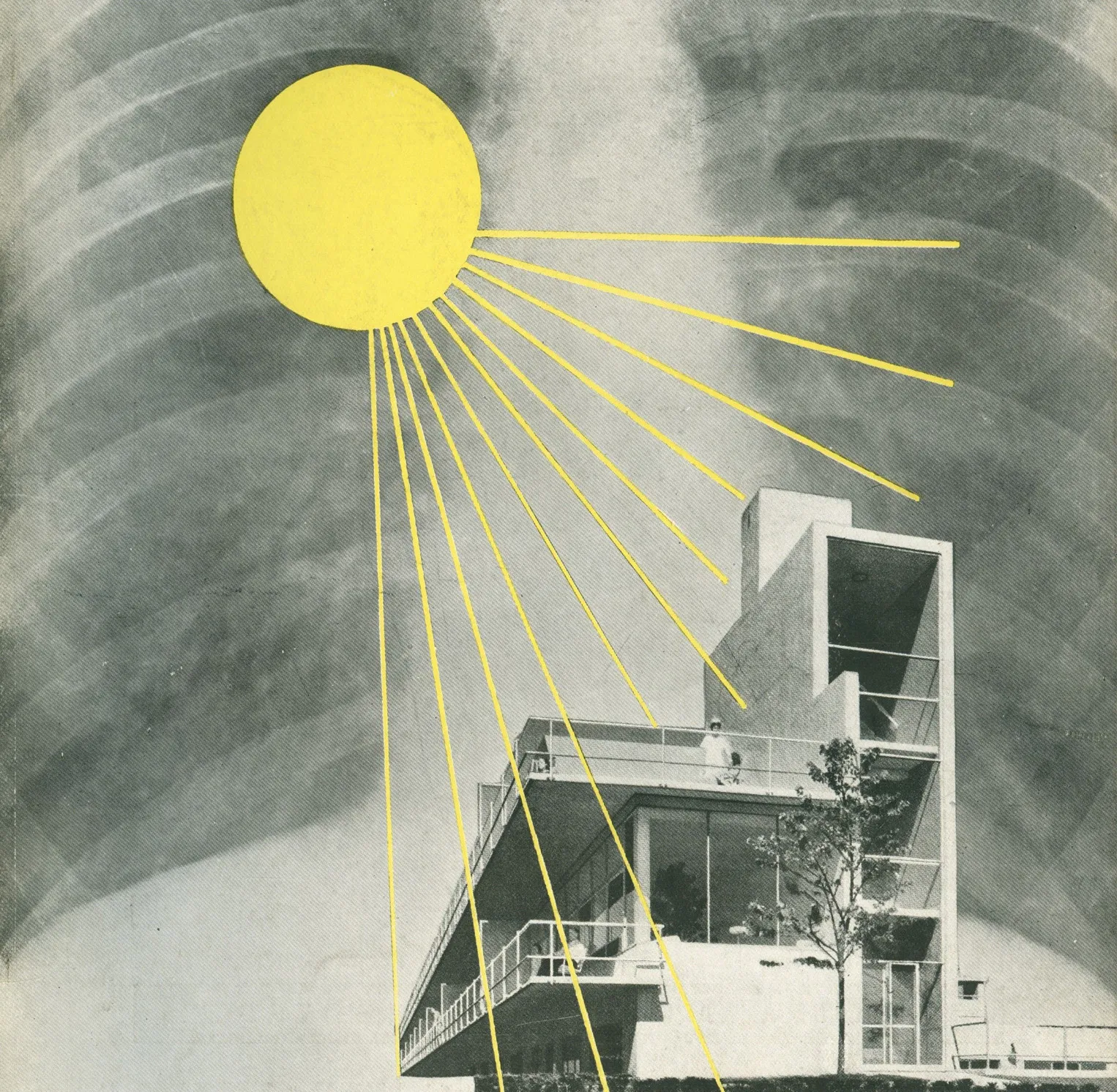
Transparency, Asepsis, and Purity: Modernist Design’s Obsession for Order
The concept of transparency is no stranger to graphic and industrial designers. In graphic design it can probably be traced back to Beatrice Warde’s The Crystal Goblet in the early 20th century, or the “neutrality” of typographic layout as medium of information heralded by a host of mid-century modernist masters. In industrial design, this concept enjoys even wider popularity. Since Adolf Loos’s publication of Ornament and Crime, the quest for transparency seems to have only enjoyed increasing traction before culminating in the form-follows-function doctrine at HfG Ulm. To paraphrase a review from the design blog Hi-ID, an object’s transparency in industrial design is achieved by a unity between how it’s made and how it’s perceived. That is to say, transparency is not only physical in the sense that something can be seen through, but is also phenomenal in that the structural logic is simple enough for abstraction and comprehension.
However, we must return to architecture to truly investigate such endless obsession with transparency. As Beatriz Colomina elucidated in her book X-Ray Architecture, the transparency of glass enabled a whole-new sensory experience for architecture in the early 20th century. Mies van der Rohe, for example, revealed in his concept sketch for Friedrichstrasse Skyscraper (1921) a palpable lust for a structure that uses steel frames as “bones” and glass as “skin”. Furthermore, the fascination for transparency stems from, perhaps unexpectedly, the tuberculosis (TB) that ravaged Europe, and the proliferation of X-Ray imaging technology during the same period. No obstructions other than internal organs can stand in front of the lens of X-Ray machines. Naturally, Mies made his sketch look like an X-Ray image of a “prototype skyscraper”. Glass, married with the X-Ray machine’s see-through vision, produces an “architectural X-Ray” that is deeply entangled with medical technology and human life.
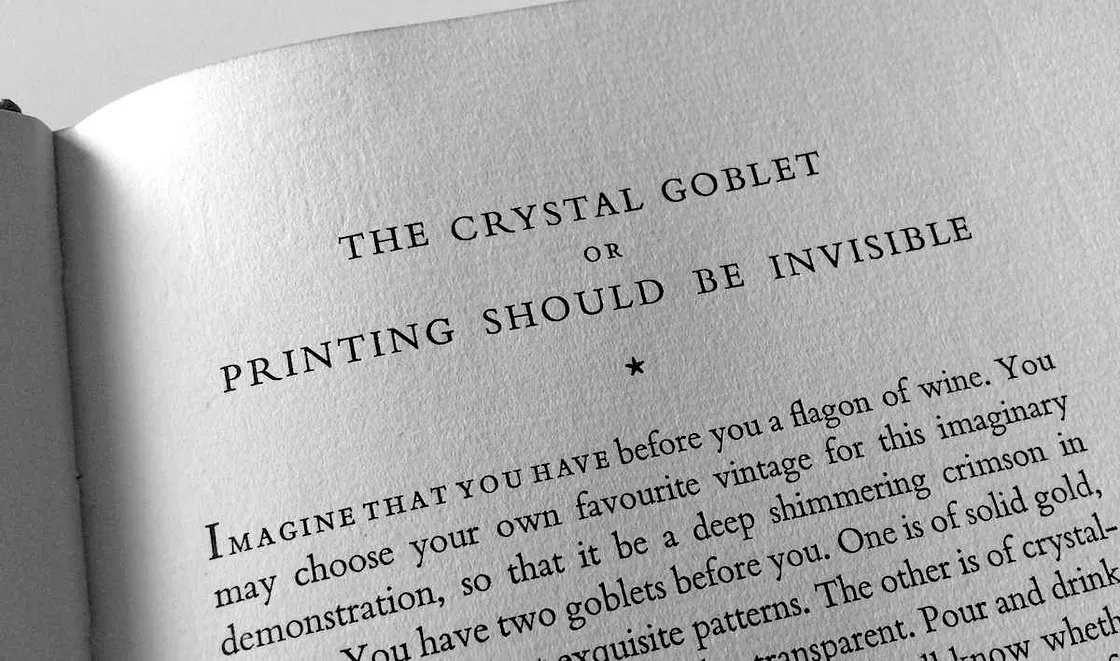
Source: Matthew Butterick
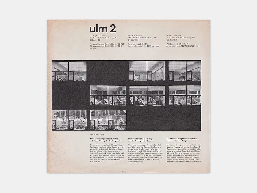
Source: Monoskop
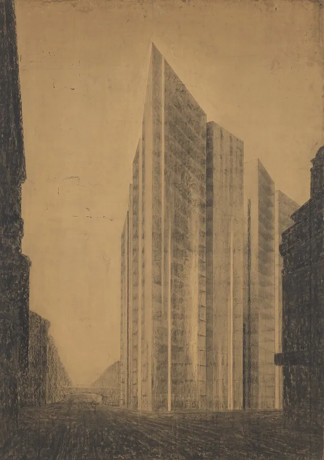
Source: MoMA
From sanatoriums to the New York subway: the lure and authority of transparency
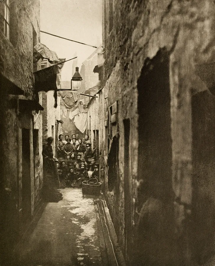
The lure of “see-through” as a physical property can be understood in conjunction with the lives of average Europeans in the late 19th and early 20th century. The immaturity in urban planning strategies, the explosive development of capitalism, and the rapid erection of new factory buildings all contributed to a wet, filthy, polluted and crowded living condition for the poor working class. If William Morris’s return to middle-age pastoral life seems excessively reactionary, architects’ and interior designers’ fondness for white walls, white rooftops, and glass houses seemed more progressive. After all, these characteristics of architecture and interior design originated from nowhere but hospitals and sanatoriums with an aim to make visible dirt and pathogens. As easy as it is now to associate Corbusier’s “building as machine for living” dogma with a blinded fetish of instrumental rationality, we can read in context another subtler meaning: a building designed with consideration of lighting and ventilation is a life-supporting apparatus whose dictates were to be appreciated and obeyed.
Source: Getty

Source: Alvar Aalto Museum

Source: Wellcome collection

Source: Wellcome collection
Before the 18th century, classical architecture bore its weight with walls, attempting at monumentality and creating levels of symbolic order with thick, gargantuan volumes. Architecture designed in the modern movement on the other hand joined a revolt against authority, using the column-floor system to liberate walls from load-bearing responsibilities, thus making façades light and even appear to be floating. However, with the aid of Foucault’s biopolitical lens1 we can easily discover that transparent façades, though appearing to stand for the opposite of authority and order, has in fact become the very manifestation of them due to medical technology’s increasingly granular mastery of the human body and life. What’s worse, the sensorial experience of transparency has now made authority and control more opaque and undetectable.
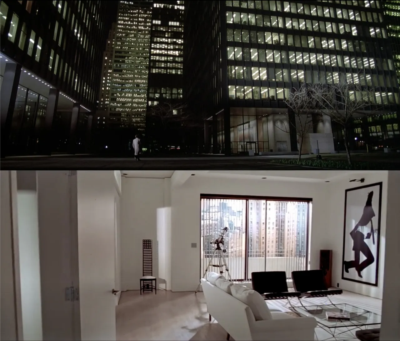
Mies’s Farnsworth House is a vivid example. Despite its monumental fame, the house stripped of the inhabitant all sense of privacy because of its four walls of glass, not to mention the material’s undesirable thermal characteristics that prompted excessive indoor air conditioning afterwards. Mrs. Farnsworth later even complained that neither did she dare to change clothes inside the glass house, nor did she even keep a trash bin under the sink, for its “ugliness” would shatter the glass box’s holistic beauty when seen from the outside2. The Farnsworth House’s design has not only involved itself in the user’s life, but also subconsciously conditioned it; that is to say, constructing transparency requires the cooperation of an “enlightened” user.

Source: Carol M. Highsmith

Source: Carol M. Highsmith
A similar conceptual turn is observable in graphic design.
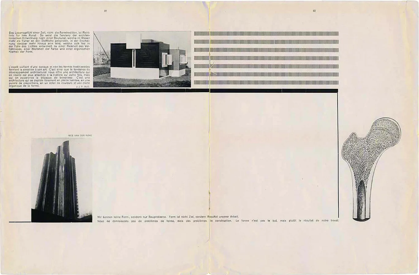
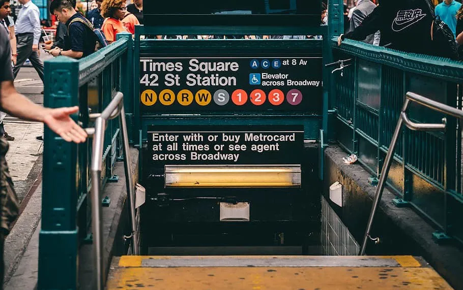
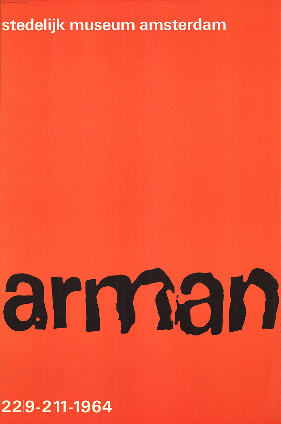
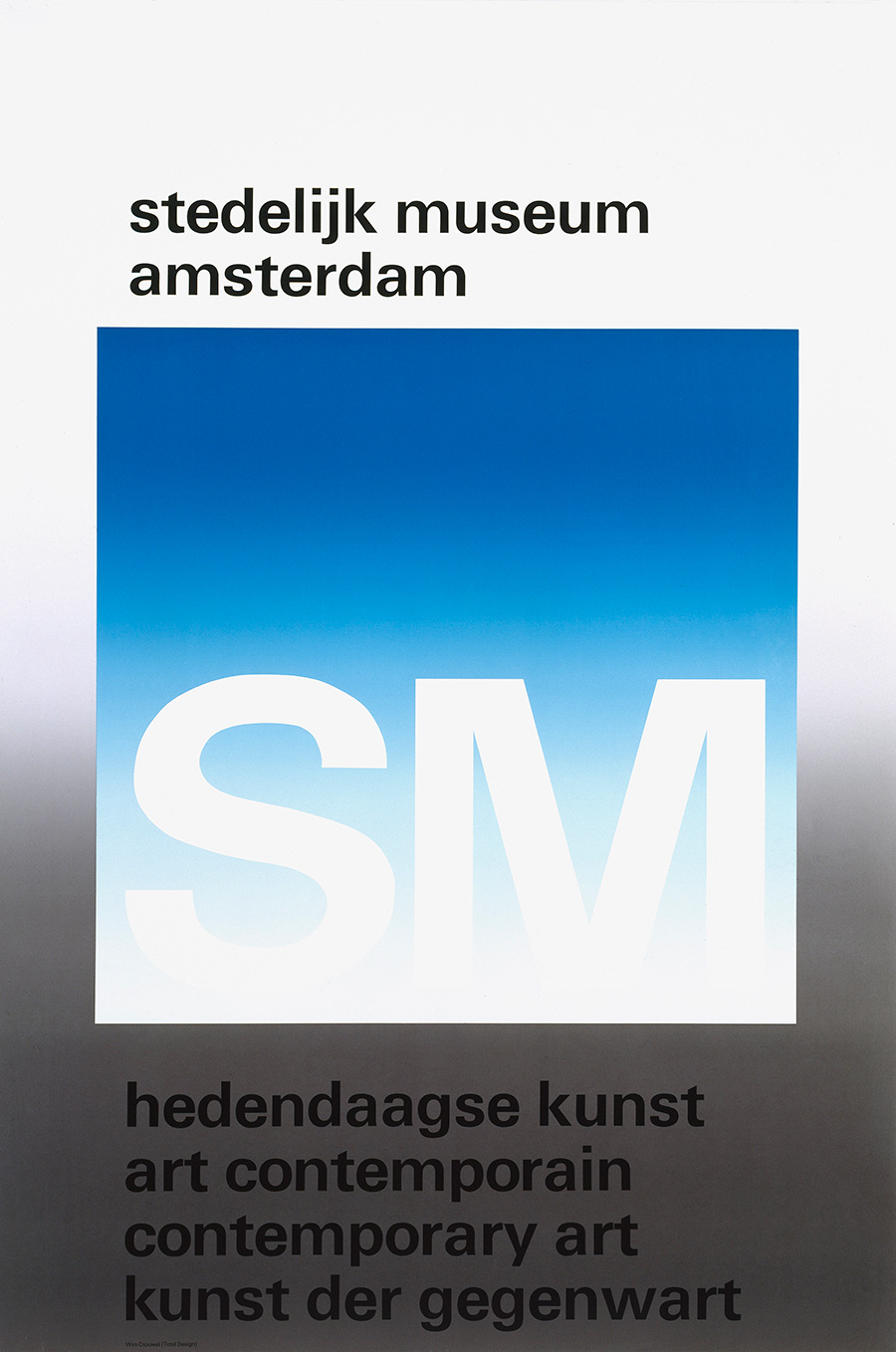
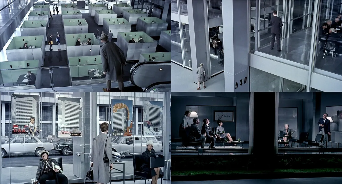
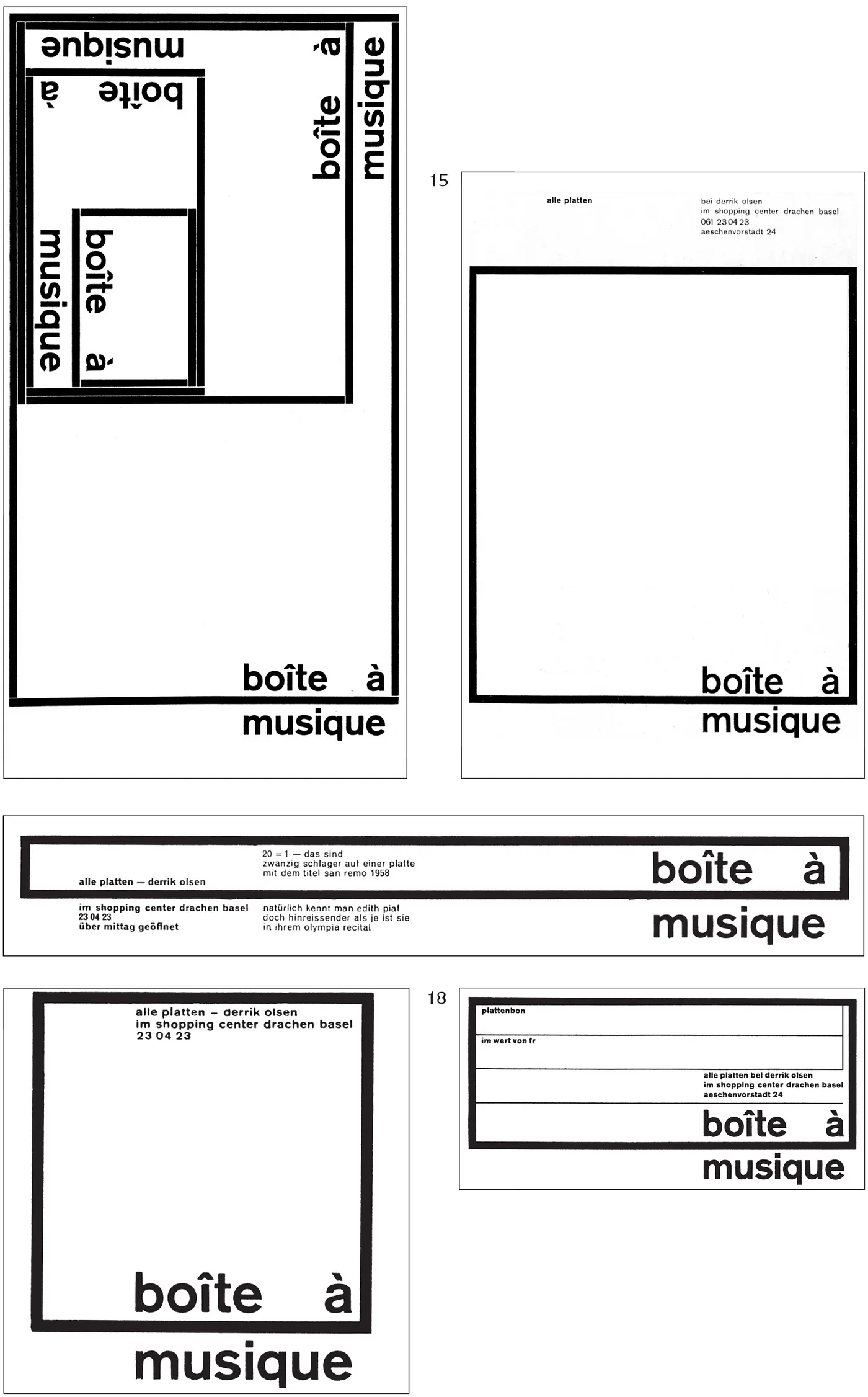
An array of modernist masters in the 20th century collectively denounced the symmetry and stability in classical and neo-classical typography, calling them “expensive”, “authoritative”, “unsuitable for mechanical mass production”—in short, the visual synonym for feudal backwardness. However, the truth was that Jan Tschichold admitted after his directorship at Penguin Books that symmetrical alignments were quicker and more convenient to typeset, as they eliminated the need to calculate line breaking and expedited the process of snug-fitting lines with spaces. Naturally, many of Tschichold’s former fellow modernists detested his “betrayal”, since they mainly operated with flush-left alignments and arrangement of two-dimension volumes. Among them, Max Bill even went to such extremes as to accuse Tschichold of being a Nazi3. Represented by the likes of Wim Crouwel and Massimo Vignelli, postwar corporate modernist designers heralded an anti-authority slogan about how graphic design should be a mere medium for information, yet at the same time were perfectly happy to construct an aesthetic high ground with source materials that directly originated from abstract expressionist art, essentially replacing an old version of authority and control with a new version that provided the ground for revolt when a younger generation of designers came on stage in the 1970s and 80s. To take Vignelli’s most famous work for the NYC Subway as an example, there is a stark contrast between the suffocating congestion of the subway cars and the cathartically pure letterforms of Helvetica and Akzidenz-Grotesk, and between the jawdropping chaos on the platforms and the uncompromising austerity of the placards’ visual composition. Abused by age and filth, these placards nevertheless remained enchanting in popular imagination thanks to nothing else but the designer’s strategy to confront physical corrosion with conceptual asepsis.
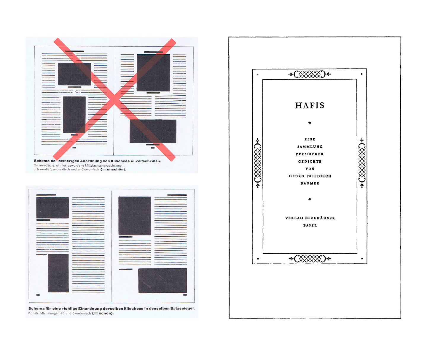
Graphic designer and critic Jeffrey Keedy penetratingly observes that actually carrying out the anti-authority slogan would mean that different kinds of information gives rise to different kinds of graphic form, not the one and uniform kind of “Swiss International Style”. In fact, if we disregard the cursory loan of talking points from cognitive psychology, what remain with this style are nothing but the authors’ narcissistic yearn for viewers to appreciate their form-giving processes and the entire profession’s silent mutual reinforcement of a singular aesthetic front. To phrase it differently, there remains a common phenomenon of transparency that requires viewers to notice (and likely to appreciate) the formal operations with which the designer arrived at the current visual outcome. In a Crouwel monograph published in 2015, the author honestly commented on his posters for the Stedelijk Museum: “translation of art into graphic design made [his] posters and catalogues idiosyncratic and also occasionally impenetrable.”4 For someone who spent over half of his life advocating for “functionalism” in graphic design, impenetrability is undoubtedly the most acidic irony.
Source: Stedelijk Museum
Source: typeroom.eu
Source: Frieze
Source: Instagram
From industrial design to pop culture: biochemical aesthetics being loved and maligned
The HfG Ulm aimed to cultivate an elite formation of technocrats for running West Germany’s capitalist democracy. Today, the specter of technology, authority and control continues to haunt the popular imagination in the form of an obsession with asepsis.
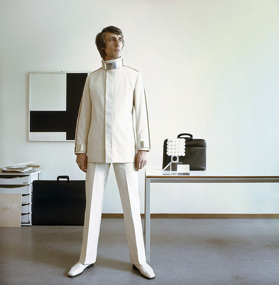
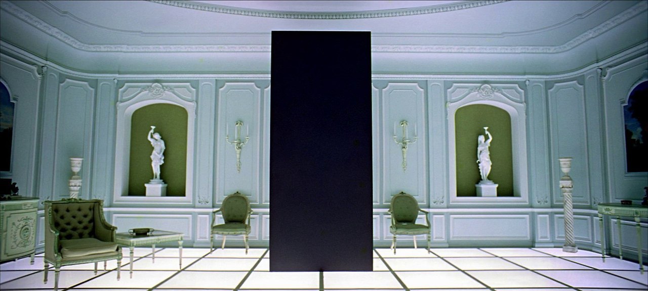
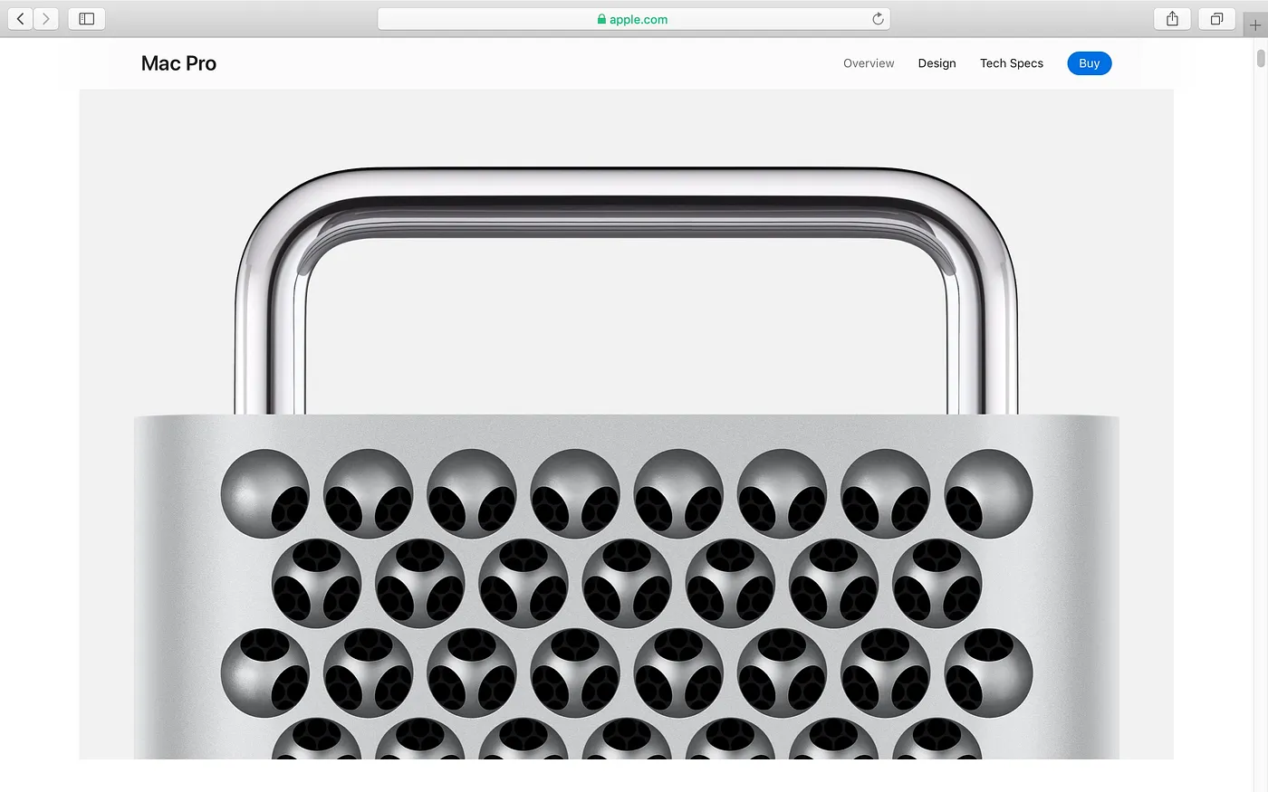
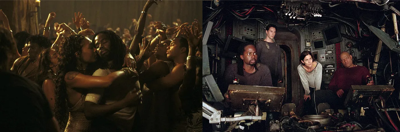
Setting aside the clichéd glass façades already widely adopted by corporate headquarters, the future in popular imagination is almost without exception a technological one, and is almost always drenched in silver and white colors, e.g. the transitory “bedroom” scene in 2001: A Space Odyssey or the “TV room” where Neo faced The Architect in The Matrix. A similar obsession is vividly traceable in popular culture, as can be seen in some forms of vacuum consumer product packaging, which imitated the aseptic enclosures originally engineered for astronaut food. Whether it is the Hummer SUV-truck or the tactical streetwear fashion trend, everyday life now increasingly takes on traits transplanted from military technology. Even something as innocent as Apple product ads are no exception: the iPhone X uses “surgical-grade stainless steel” as its outer frame, and the new Mac Pro’s promotional webpage features images of clean, icy-cold stainless steel handles with reflections so ethereal that the product appears to exist in a hyperreality immune to fingerprints and oily smudges. Samsung or Pixel smartphones and the black, boxy Thinkpad laptops5 fare poorly in visual comparison, for their dirt-collecting plasticky and woven materials would look nowhere as expensive and luring as the inherently filth-repellent stainless steel or anodized aluminum.

Source: NASA


Source: Hypebeast
Interestingly, if the biochemical and the orderly in films often represent evil, authority and control, their opposite’s resilience is associated with vagueness, dirt and chaos, all of whose spiritual core is no different from that of the 1970s and 80s graphic designers who revolted against their corporate modern predecessors.
From transparency to vagueness: unreliable modernity
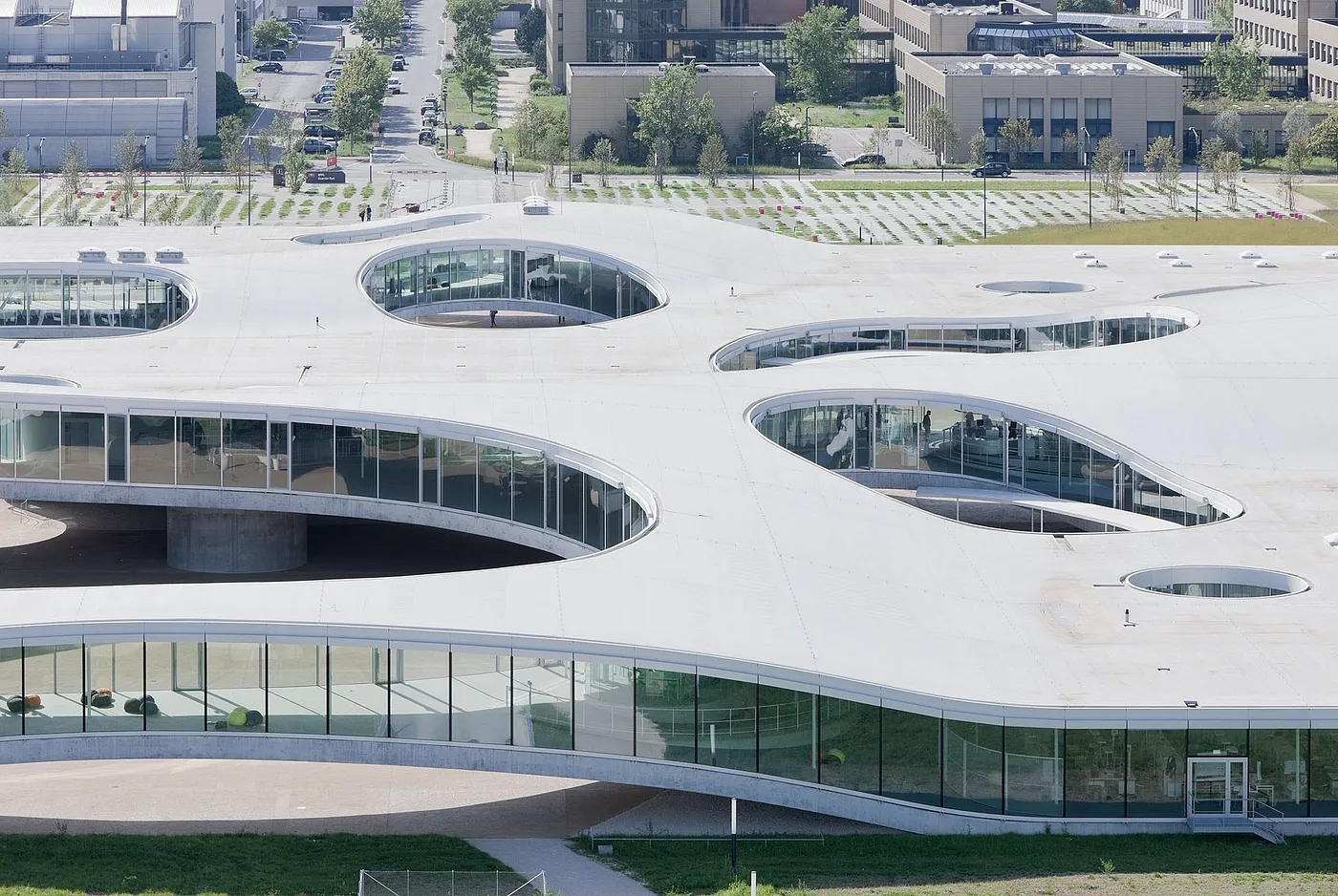
Whereas Mies-style transparency and clarity implied 20th-century authority, order, and stability, transparent architecture in the 21st century starts to readjust itself in the face of doubts and challenges. Just as Zygmunt Bauman has pointed out, modernity in contemporary society is fluid: the traditionally long-lasting social orders have been replaced by fragmented and transient human relationships that are unreliable, uncertain, and even unsafe for some. Embracing this novel fluidity, contemporary transparent architecture employs a strategy that strives for clarity on the macro level but ambiguity and flexibility on the micro, as had been exemplified in Junya Ishigami’s KAIT Workshop at Kanagawa University. Occupying a similarly radical position, Toyo Ito also observes that contemporary society has become a land of “disposable buildings” where a building is considered old after merely 20 years.
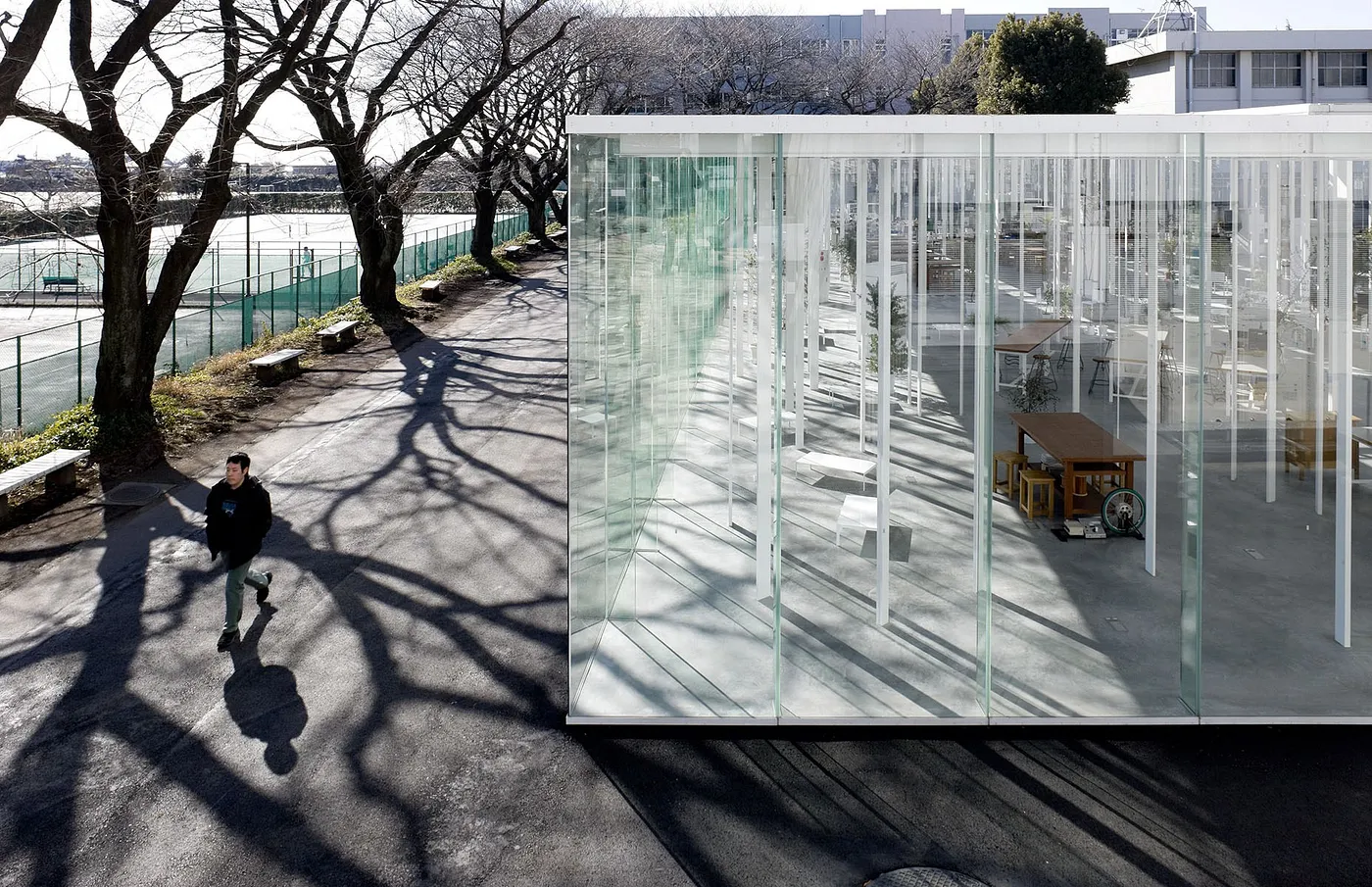
More directly inheriting from Mies, Kazuyo Sejima and Ryue Nishizawa (SANAA) not only strive to minimize the sense of volume from their buildings’ pillars and walls, but also attempt to reduce the very sense of spatial and visual order inside them. Transparent from far yet ambiguous when near, SANAA’s buildings retain the same dramatic interplay between light and shadow, but have relaxed control and order. No longer aiming to fulfill a certain desire for eternal monumentality, they hope to adapt to the multifarious human activities that occur in their buildings as well as the fluidity of modernity itself.

Source: Wikimedia Commons

Source: August Fischer
Photography: Iwan Baan

Photography: Iwan Baan
Photography: Iwan Baan
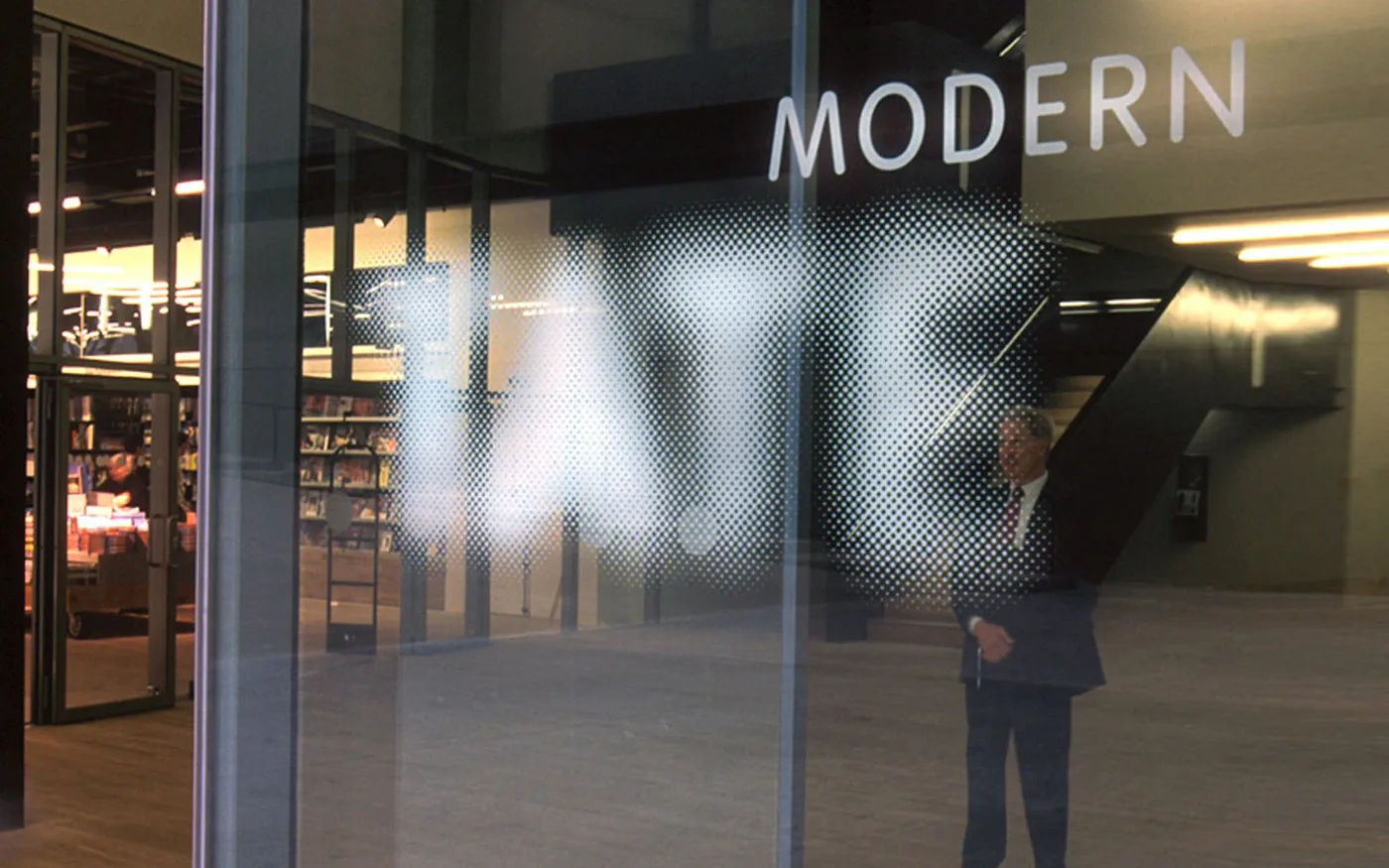
Graphic design has shorter production cycles and much more lenient realistic constraints than architecture, and its symbolic nature is the most prominent among all disciplines of design. Consequently, graphic designers probably have already predicted and engaged the SANAA-like strategy of relaxation and ambiguity. If Karl Gerstner’s conceptual graphic design from the previous century was still too much enamored with good composition and proportion, Experimental Jetset’s visual identity for the Whitney Art museum in 2013 more wholeheartedly embraces such strategy. Without a conventional logo or wordmark, the identity stretches and compresses a capital W to fill whatever two-dimensional space left for the brand mark in any composition, sometimes even sacrificing overall compositional balance for conceptual execution. The transparency in such dumb simplicity is beyond doubt. Despite its filaments of connection with postwar abstract expressionism, it looks much looser in comparison with its predecessors’ detailing, grid alignment, and strict proportion control. The W-only core concept is also flexible enough to deal with the myriad of use cases in an art museum’s daily graphic production.
Source: Designing Programmes: Programme as Typeface, Typography, Picture, Method, Lars Müller Publishers

Indeed, the Whitney visual identity provides immense flexibility. But the best example of vagueness and ambiguity would be Tate Britain’s identity system. Designed by Wolff Olins in 2000, the logo itself is composed of a collection of differently-sized dots, and the four capital letters “TATE” can only be discerned from far away. As a system-level concept, the gradating sizes of these dots afford maximal adaptability, from something as small as a promotional brochure to something as large as a wall decor in the gallery gift shop, thus establishing a sense of “uncertainty within certainty”. When plastered onto the gallery building’s glass façade, the white logo from far away looks like it has been masked with a sheet of semi-transparent paper yarn, its ambiguous contour shape creating a sense of dazzling visual drama.
Source: Wolff Olins
Contemporary graphic designers are relying less and less on their work’s mere utility to justify their professional value; therefore, form—a concept their predecessors repeatedly skirted with but could never directly touch on—has again come to the foreground. When fluidity substitutes for certainty and vagueness for clarity, the transparent and see-through properties of form is becoming increasingly irrelevant. We could even predict that since the glass boxes and Helvetica have come to aesthetically represent the bourgeoisie, a new popular aesthetic trend would emerge, characterized by a misty sense of transience and a minimized sense of technology and control.
Conclusion
As purely physical properties, transparency and asepsis are indeed useful in many occasions. A chemist would want to see what the solution in a tube looks like, and a doctor would like to use scalpels that can resist corrosion and rust. However, we must confront the fact that technology is never truly “pure” because it is the crystallization of human activities. Just as Habermas has demonstrated in Technology and Science as Ideology, the inner logic of biological science and medical technology under late capitalism has colluded with ideology due to the solutionist tendencies in political life, thus becoming the common logic that everybody in a society has to follow. It is essentially no different from other manifestations of ideology, e.g. the media, but its enchanting power is much stronger since it is also a sensorial aesthetic experience.
If the clarity in the ’50s and ’60s was a thesis and the chaos in the ’70s and ’80s was its antithesis, the vagueness, ambiguity, and uncertainty of the new millennium looks like their synthesis. It has retained the original pursuit of cleanliness and asepsis6, but has softened the aloof and cold order characteristic of medical and biochemical technologies, and completely done away with the classical monumentality that 20th century modernist architecture always wanted to covertly revive. The aesthetic is the politic; the most apt annotation to this equivalence might be what Fredric Jameson said in his evaluation of Bertolt Brecht:
NotesWhenever in Brecht you started with aesthetics, by the time you came to the end, you came to politics; and whenever you started with politics, at the end you came to aesthetics.
Michel Foucault, The History of Sexuality, vol.1, Éditions Gallimard, 1976 ↩︎
Nora Wendl, “Sex and Real Estate, Reconsidered: What was the True Story Behind Mies van der Rohe’s Farnsworth House?”, ArchDaily, 2015 ↩︎
Christopher Burke & Robin Kinross (ed.), “The dispute between Max Bill and Jan Tschichold of 1946, with a later contribution by Paul Renner”, Typography Papers 4, p.57–90 ↩︎
Fredrike Huygen, Wim Crouwel, Modernist, Lecturis, p.224 ↩︎
Jonathan Olivares (ed.), Richard Sapper, Phaidon, 2015 ↩︎
And yet it is not easy to maintain the white-silver aseptic look. SANAA‘s buildings would quickly look dirty and dilapidated even with just the slightest slip of maintenance. ↩︎