Task view
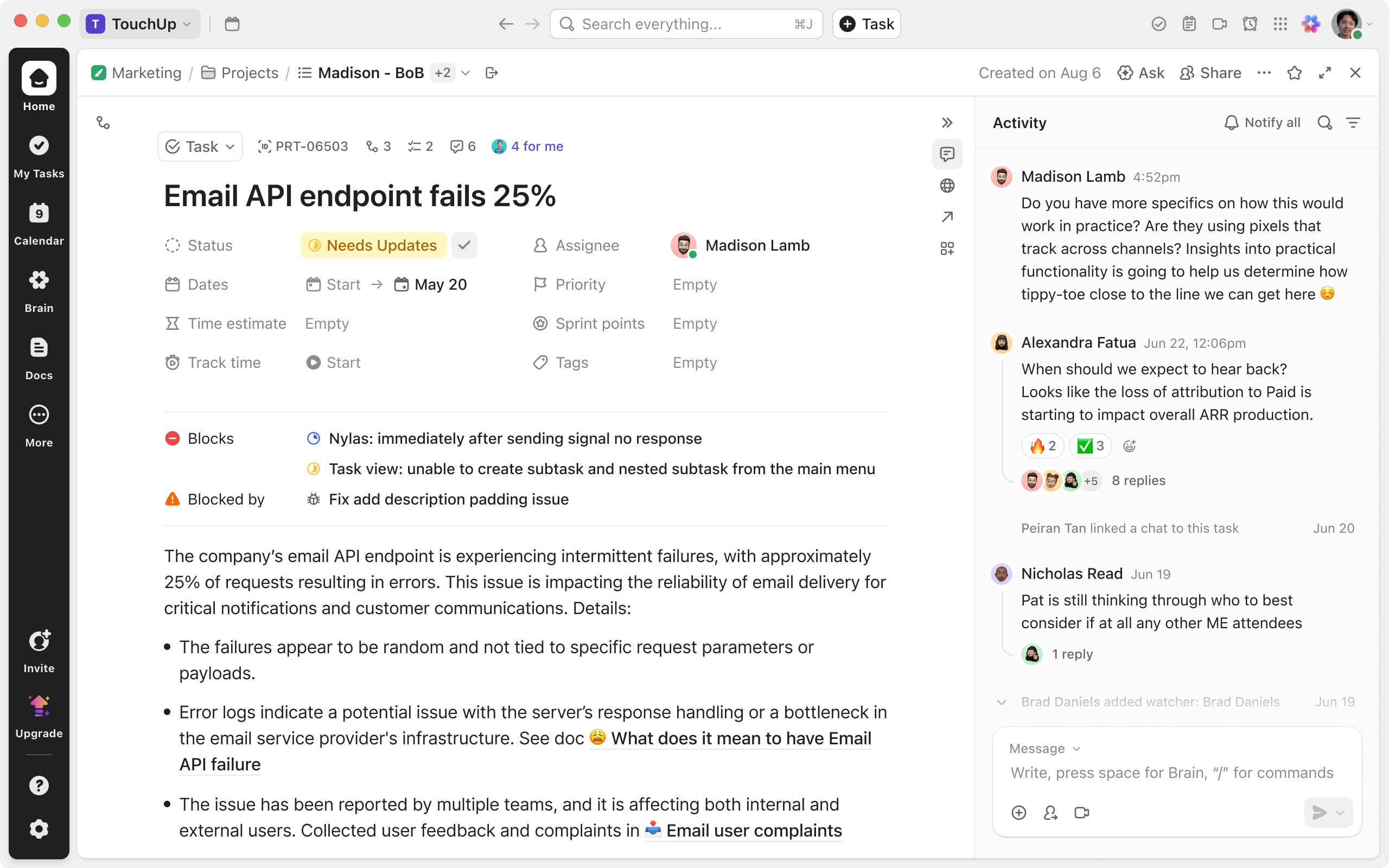
Tasks sit at the center of ClickUp’s productivity suite, connecting sibling products like chat, docs, and calendar. Coaxing insitutional change, I led a redesign of task view, substantially improving its customer satisfaction score.
Raina Ahuja, product manager
Ivan Villa, product manager
Dylan Israel, engineering manager
Dustin Goodman, engineering manager
John Wenzler, engineering manager
Sheldon O’Conor, senior engineer
Maciej Wojcik, senior engineer
Johnny Val, senior engineer
Joe O’Connor, senior engineer
Brent Evans, Engineer
Maggie CY Chan, VP of design & research
Hemant Kumar, senior director of PM
Dean Philips, CPO
Zeb Evans, CEO
2014.11–2025.11
Overview
ClickUp is a “super-app” that hosts many office apps such as docs, tasks, chat, and calendar. In 2023, the company reached its limit of horizontal expansion, and started to invest in quality.
When I took over, task view was plagued by a pair of interlocking problems: lack of product clarity led to chronic under-maintenance, and the poor software quality kept the team endlessly firefighting, further muddling the former. I realized no matter how good the designs looked in Figma, they could not be shipped if the institutional behavior didn’t change.
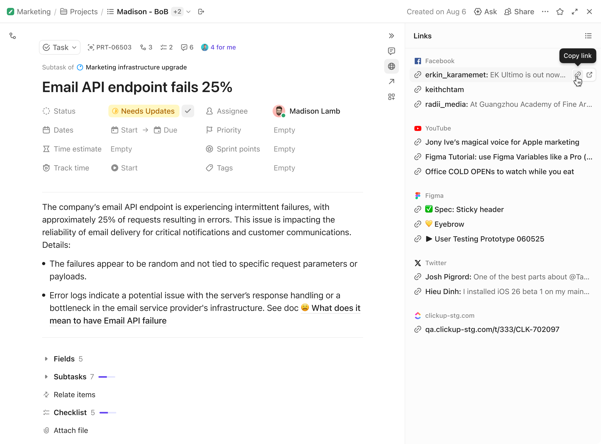
After some design interventions, we shipped the first phase of improvements. In a week, more than 155,000 people (99.96% of task users) voluntarily upgraded. Within a month, task view’s CSAT score jumped from 74 to 94—the largest increase in company history, and the highest score a ClickUp product has ever been rated.
155k
0.04%
+20
A modular vision
To set product direction, I ran intensive user interviews with my PM to understand how people used task view. Unsurprisingly, we found that different personas prioritize conflicting areas on the same interface. For example, an automotive parts manufacturer prioritizes related tasks and properties, but a screenwriter wants to hide them in favor of a larger description text area.
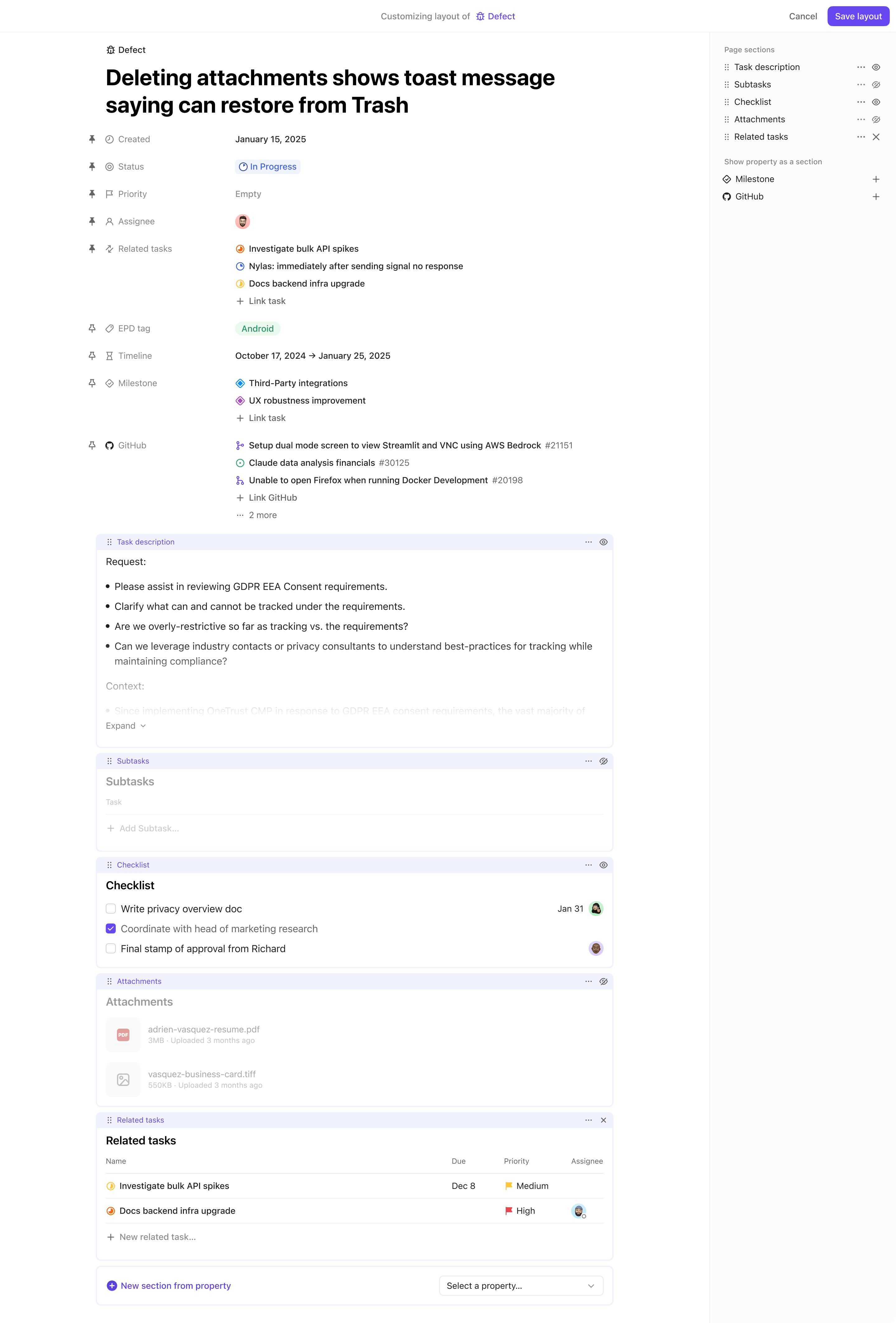
Naturally, the most impactful solution became some kind of modularity that allows the user to compose different interfaces to their liking.
However, a common complaint of many modular software is too much modularity: the user can build anything, but also has to build everything. While it worked for consumer lifestyle software, ClickUp’s pure enterprise customers can’t afford to build all the scaffolding before starting to use it.
How much modularity do we need, so that task view can cater to conflicting use cases but not require the user to build out everything?
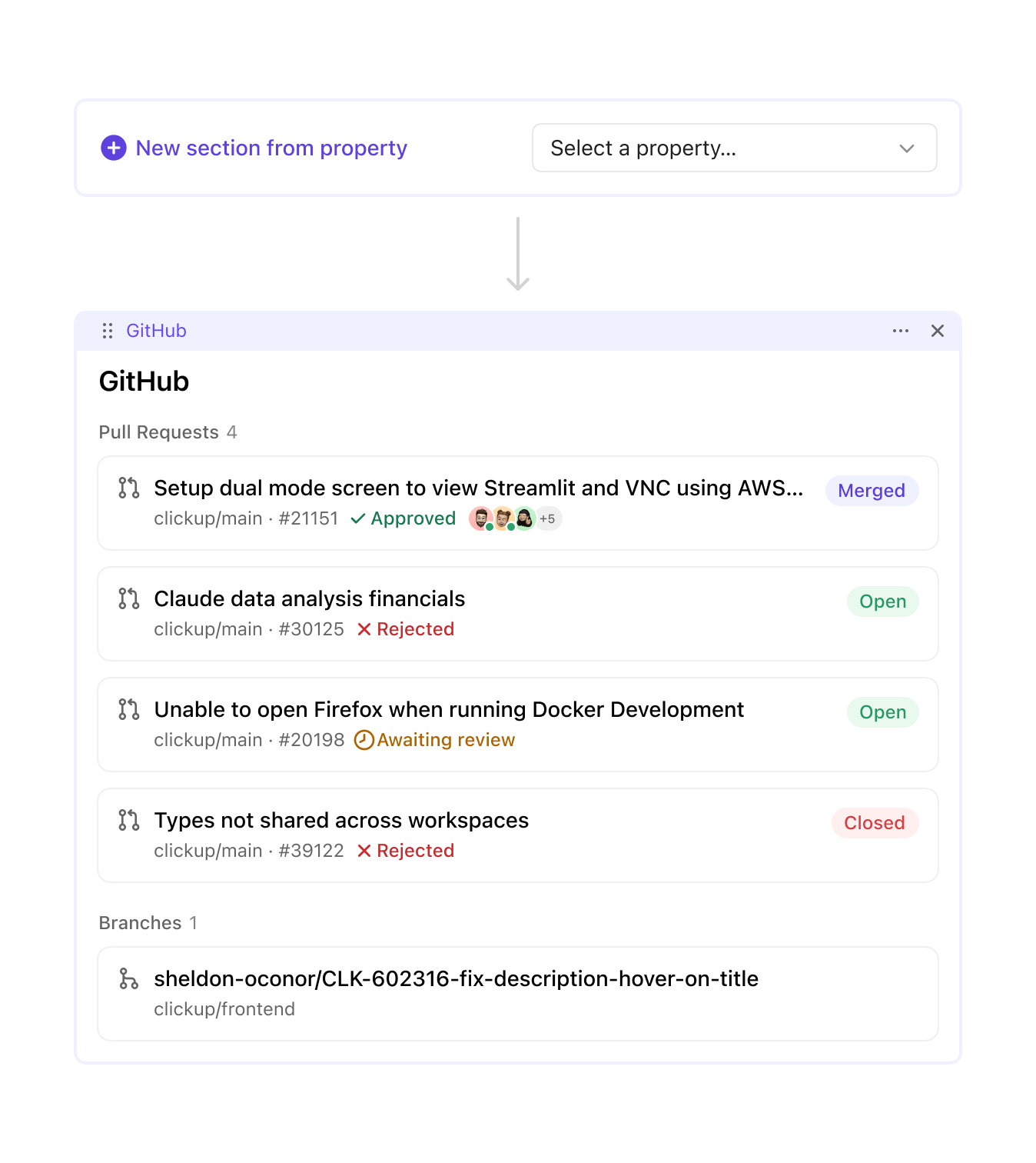
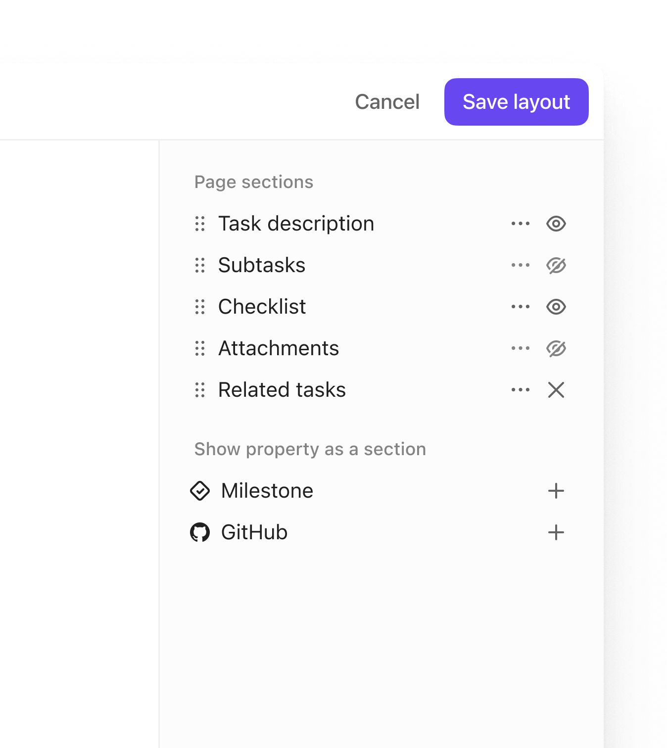
Looking back at the user research, we discovered a common theme: “I don’t care about X, and I want Y to be more prominent instead.” By allowing users to simply hide or show certain UI sections, we could meet this demand, but make it not too permissive.
Refining scope
Leadership was uncomfortable with the idea. What if users found the customization too overwhelming? What if it was too complex to maintain? The CEO also commented that the empty state didn’t feel minimalistic and welcoming enough, nor did the interface variants feel self-evident for their use cases.
I corrected to a safer course. To make task view truly feel “purpose-built”, we would ship highly-optimized, fixed interface variants that are baked into the task type. They’re cheap to build because we effectively took away user customization.
My PM and I tallied task view’s largest use cases, then did another round of in-depth interviews with these customers to extract the most typical UI pattern in their workflow. From there, I worked backwards to come up with several “archetypes.”
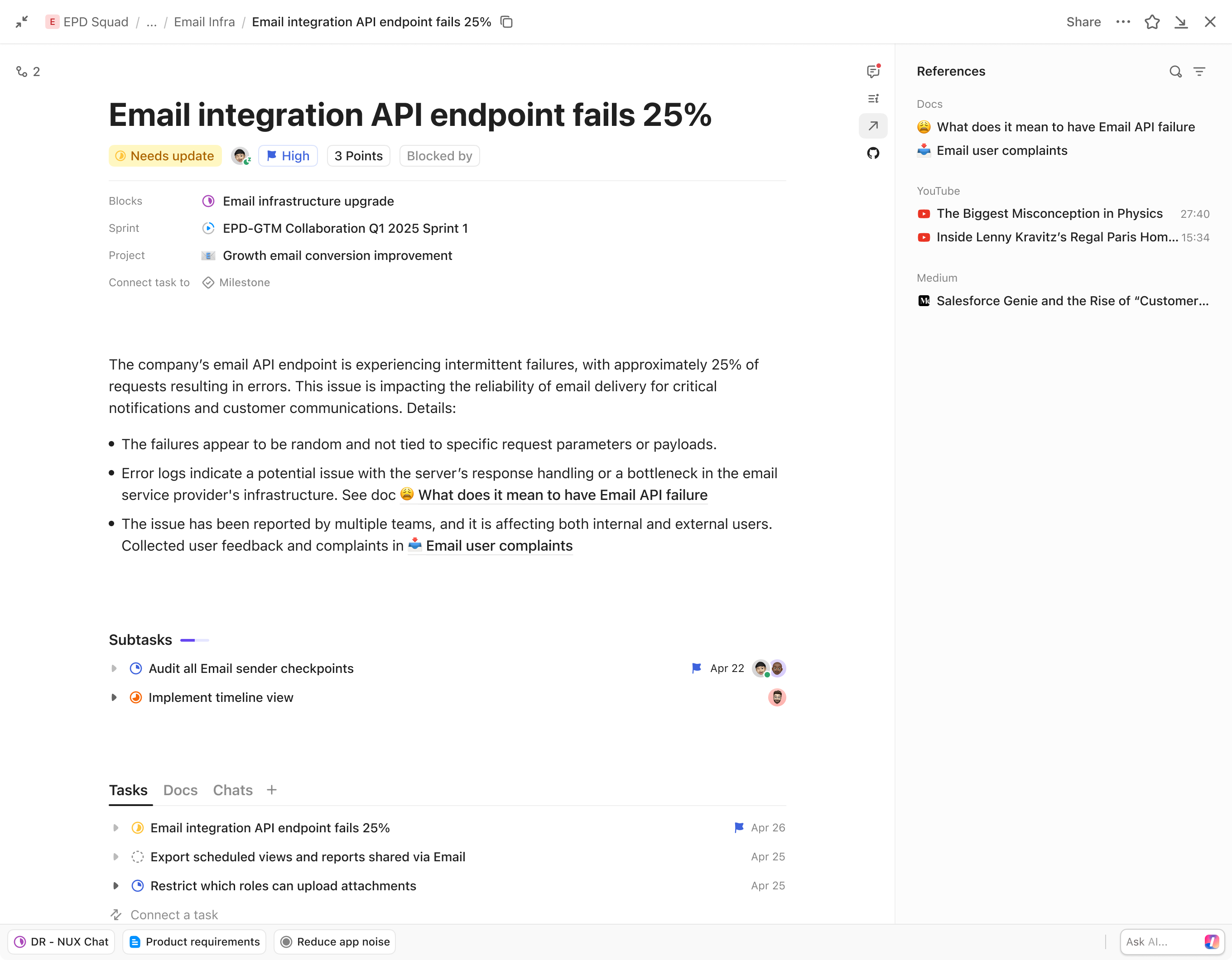
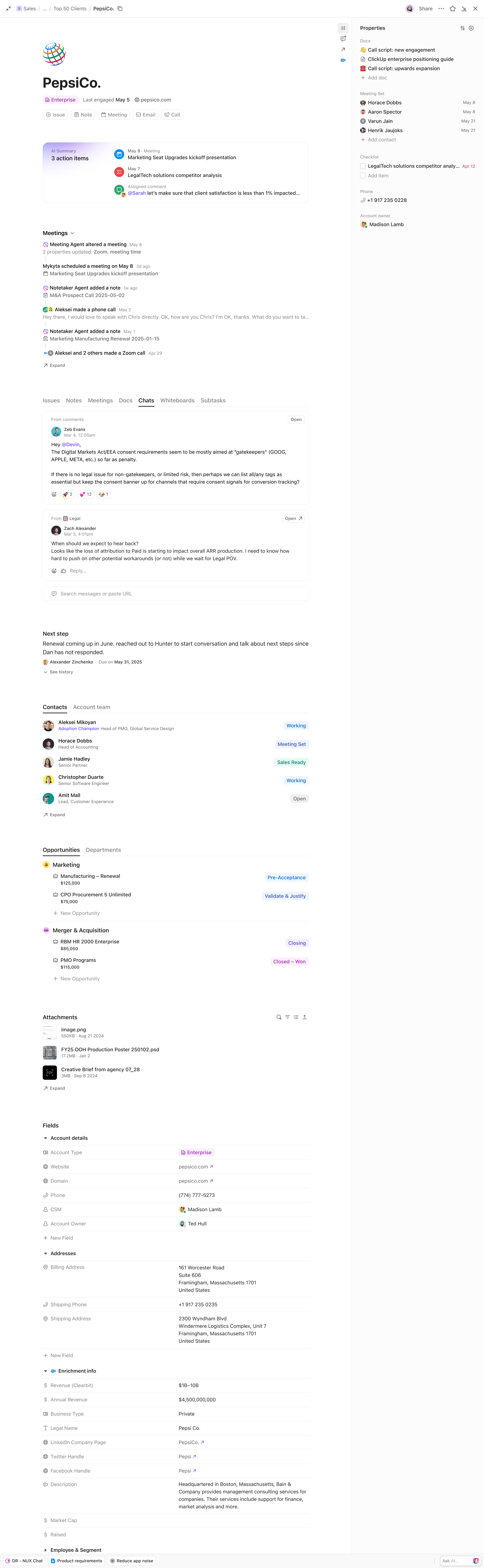
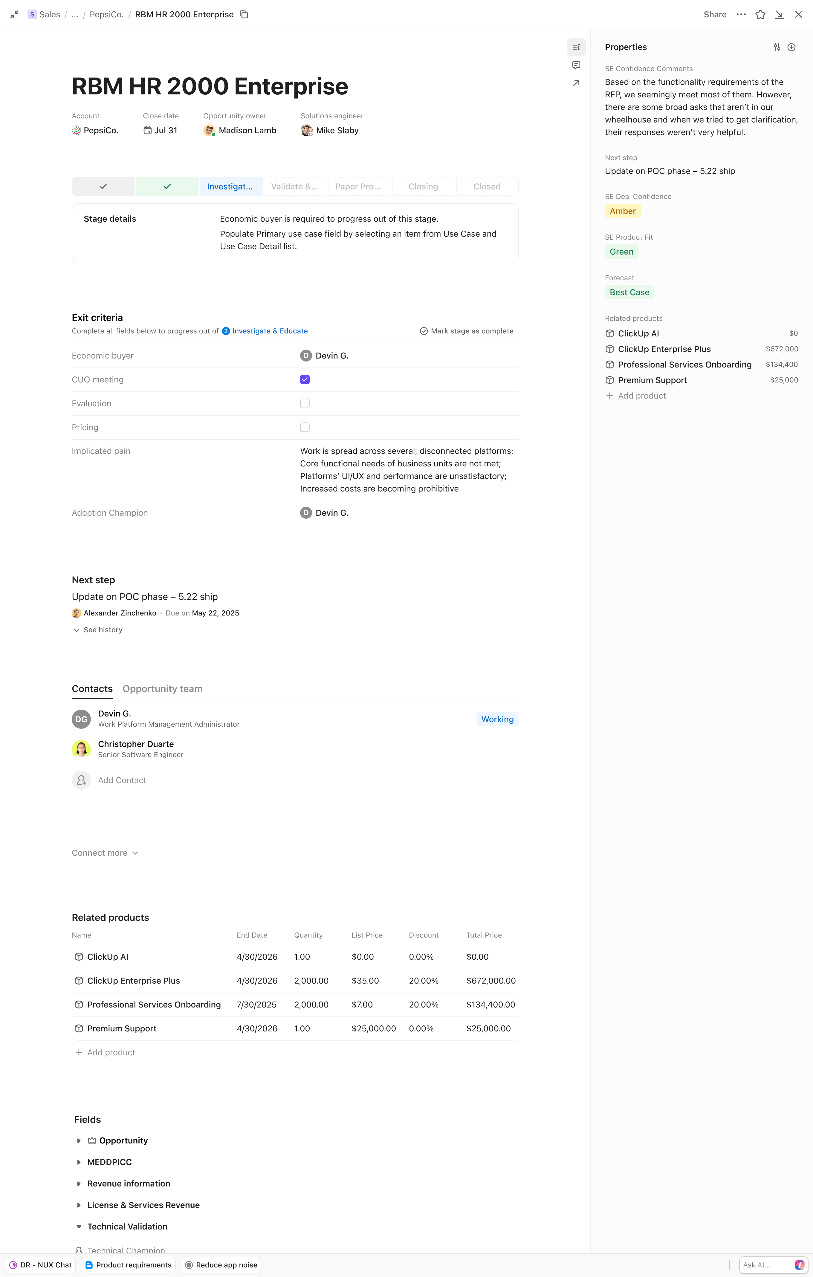
In this process, I discovered some commonality between these disparate interface archetypes. There’s only slight variation among their top areas. Discounting attachments like quick actions or dependencies, top areas all have an object name and some properties.
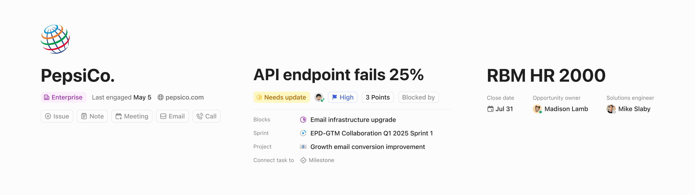
More strikingly, the differing sections are all about relationships—a company is related to its contacts and deals, just as a software project is related to its milestones and bug reports. My PM and I aligned on a 3-step plan:
-
Move relationships from right sidebar into the main body. Relationships in the main body instead of the sidebar can host richer, dense information; then
-
Allow different relationships to be composed into different sections. Dedicated sections for different purposes are what makes the UI feel “purpose-built”, e.g. a “people” section composed of contacts, project leads, and counsel, or a “leads” section composed of tabs for each stage. Then, as a nice-to-have, we would
-
Render each section and tab with appropriate views. Currently, all relationships are shown in tables, but for example, contract entries are suited to table rows, but file attachments deserve a gallery card view.
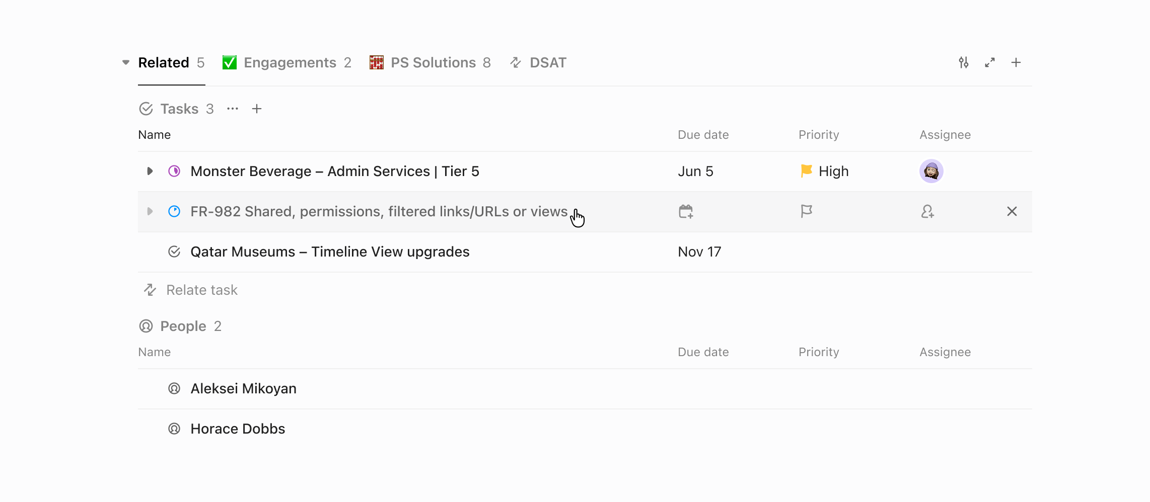
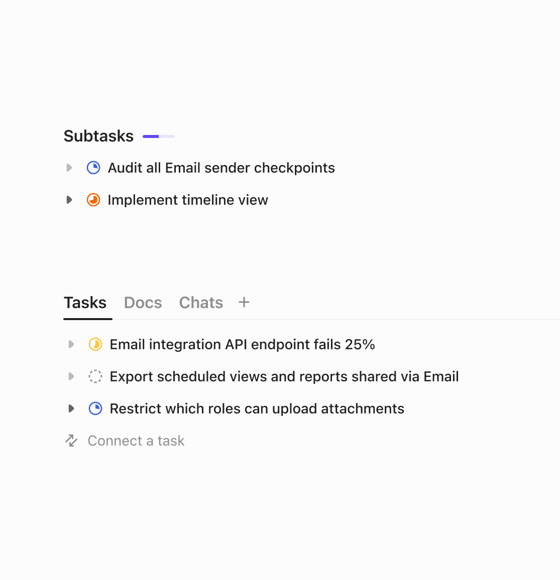
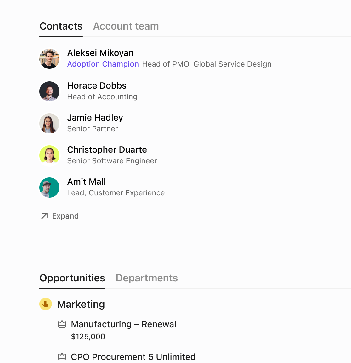
This plan appealed to the team because it was surgical—all it meant was moving stuff over and breaking it into sections (that we tightly control), then draping on readymade views. It avoids user customization, does not alter the UI structure, and the required ingredients were cheap to implement.
Narrowing down
Another round of presentation was met with negative feedback. Leadership were also uncomfortable with the idea of interface variants, and I sensed that they were more resistant to change than they would admit.
I realigned with the team to focus on one fixed interface. The top area stays the same, and we would only optimize the body sections to make them minimalistic and welcoming to new users.
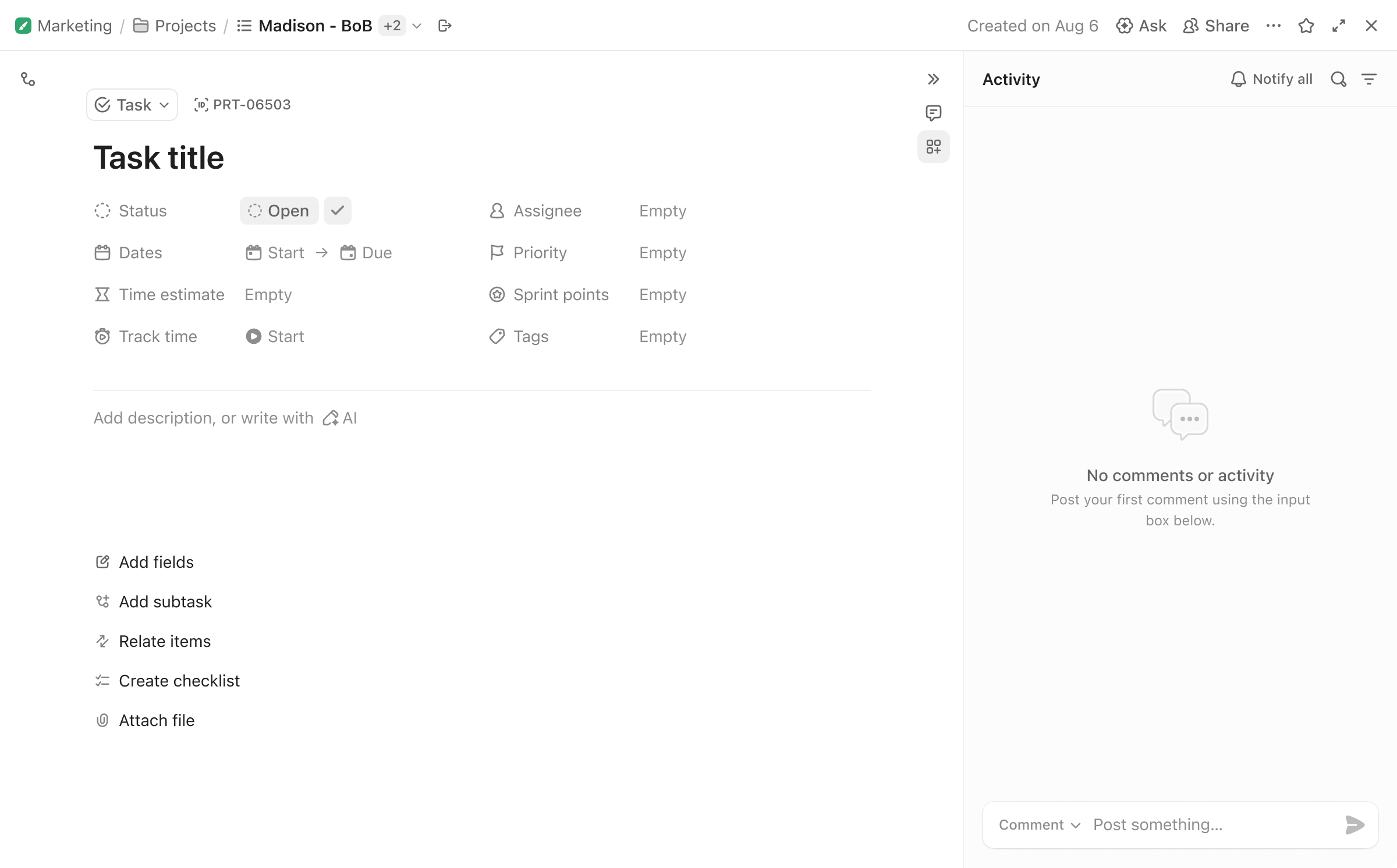
I divided the preparation into two phases. To gain middle management support, I first ran a new user test with a rough, live prototype vibe-coded with v0, since they were open to discussing ideas and flows without pixel-perfection.
The prototype was a landslide success for all participants. With middle management’s confidence, I then ran another test with a painstakingly hand-built, pixel-perfect Figma prototype that emulated all hardware inputs, but that only covered the core interactions, so that top leadership would be reacting to the most “real” results.

After the general direction was approved, I realized that both rounds of review sessions quickly descended into aimlessness, since the participants often drifted to debating irrelevant details that weren’t visualized.
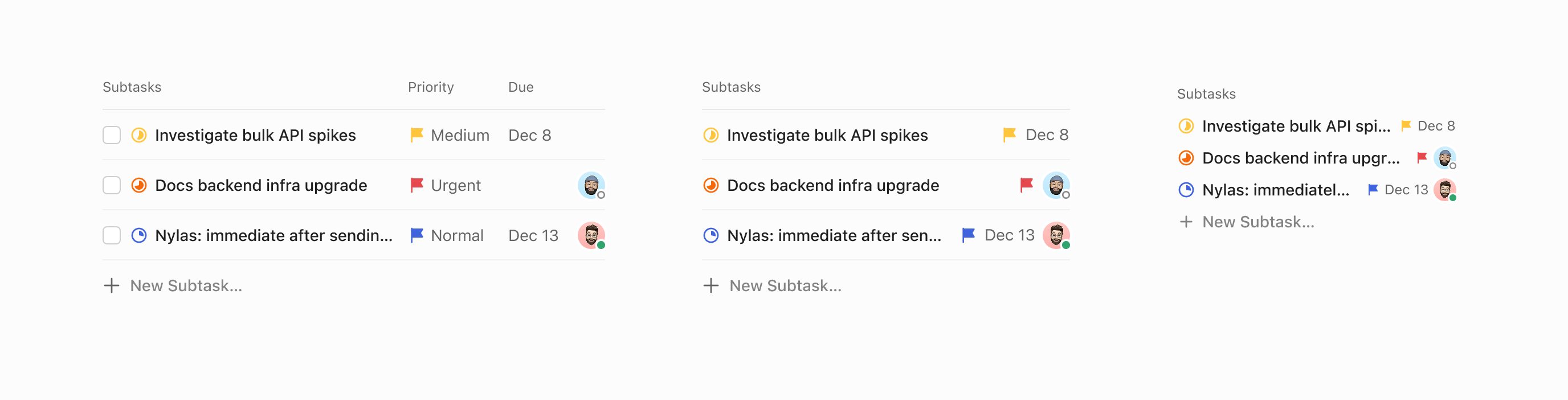
To sustain the project’s momentum and steer conversations, for the next round of finalizing review I made a matrix to help the room lock down a concrete IA structure. Options were exhaustively demonstrated in empty, lightly filled, and heavily filled states, as well as the task opened in different modes.

Finally, we hyper-focused on the interactions of how people create content sections, such as subtasks, checklists, or attachments. The options below were appreciated but ultimately abandoned because we could not build free section ordering in time.
Design interventions
With stakeholders aligned upstream, we started to build a beta to test with some power users whom we host in a guest workspace.
In this process, another vicious cycle emerged. Concerned that any UI change could disrupt their workflows, they pressured the team to edit back key facets of the design; accommodating their piecemeal requests thrashed engineering work and caused more bugs, and this in turn made them even angrier.
Shrugs shoulders. Not sure what it’s trying to accomplish or improve… made relationships even worse… Having to click through a different tab for every set of relationships is horrible.
Having explored their suggestions, I reckoned that accommodating all requests simply wouldn’t work. But my PM and I did sense a deeper frustration that, unrelated to concrete UI changes, these people simply hated the fact that change was done to them, not with them. Quelling their anger didn’t mean building features exactly as they described (which was a prior habit), but involving them more in the process.
To boost their sense of participation, we did two things:
-
Ship high-visibility changes that did not compromise the design direction. For example, while relationships were moved into the main body, we restored them in the right sidebar under a dedicated tab; and
-
Use polls and surveys to have them decide on small features. We grouped relationships and references in one right sidebar tab according to an overwhelmingly clear user poll—against the CEO’s initial personal preference.
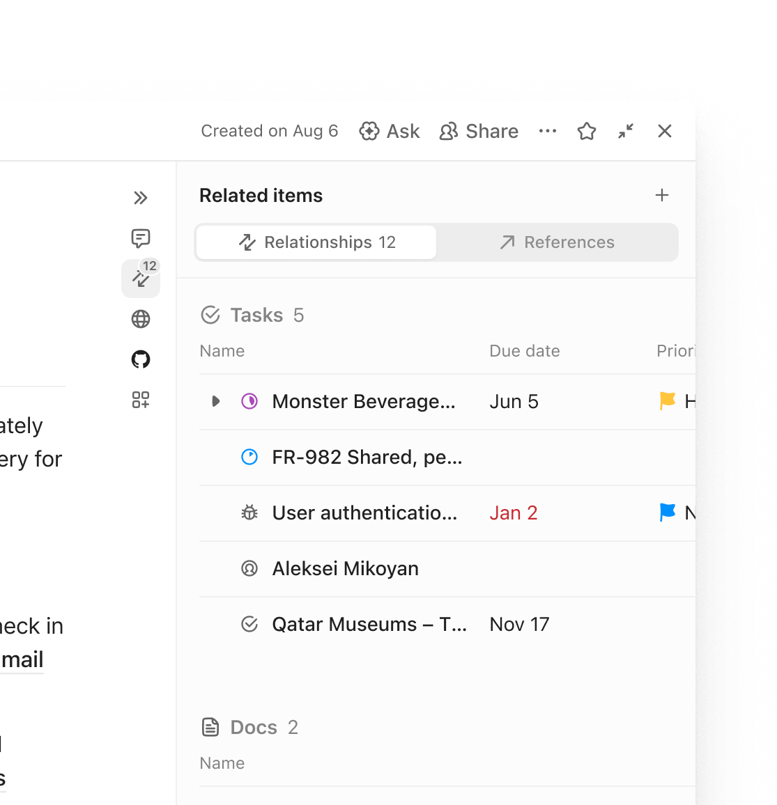
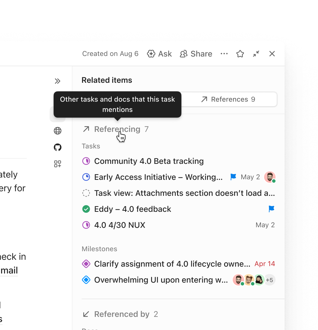
Alongside my PM, we evolved task view’s design and shipping processes—both internal and external. For leadership, we learned to tactically present comfortably definite changes, while always keeping a grander vision in the back pocket. For power users, we would involve them early and strategically. These institutional learnings introduced some long-needed stability and predictability into a habitually chaotic team, crucially enabling us to deliver the rest of the designs to spec.


155k
0.04%
+20