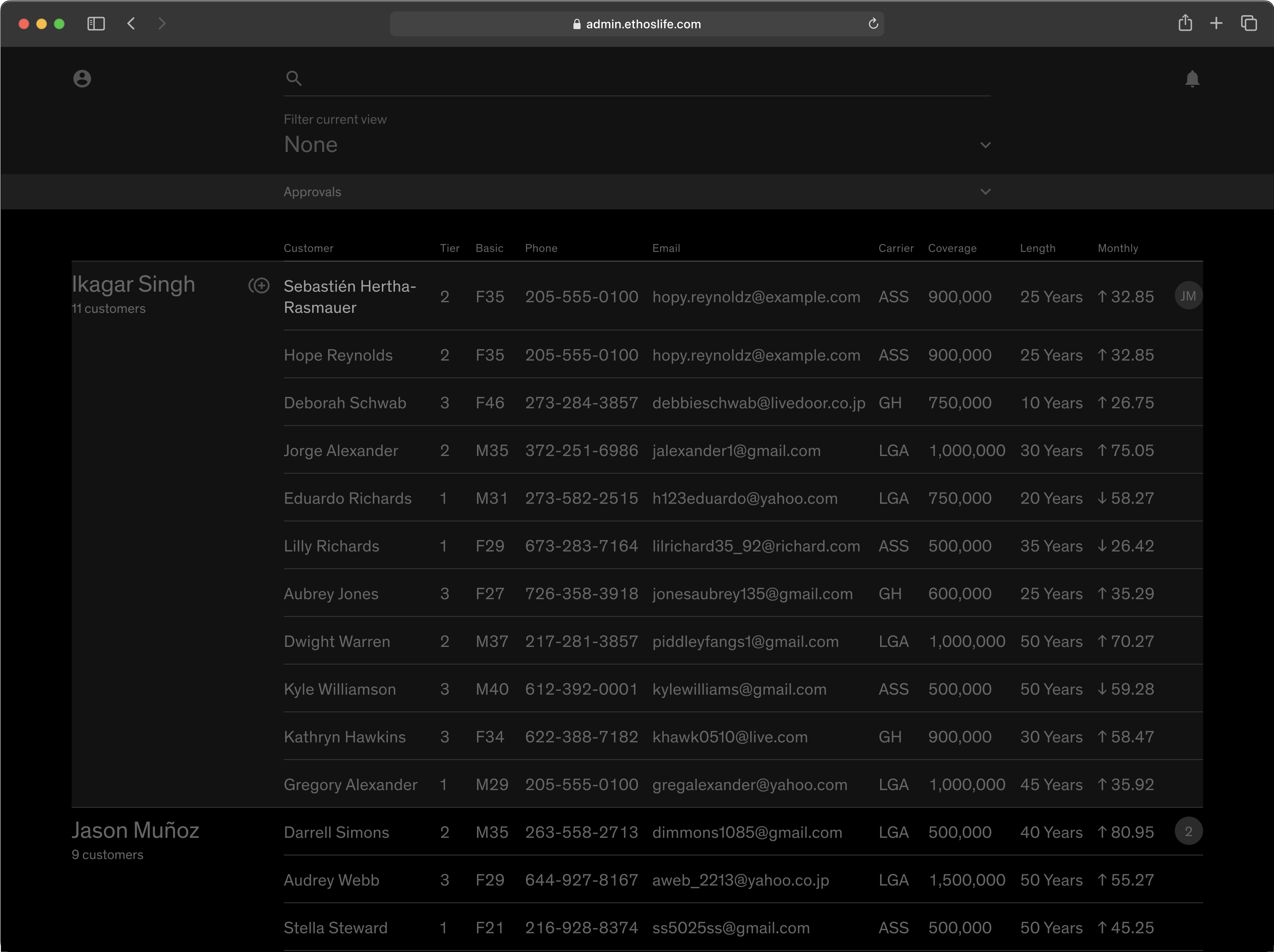
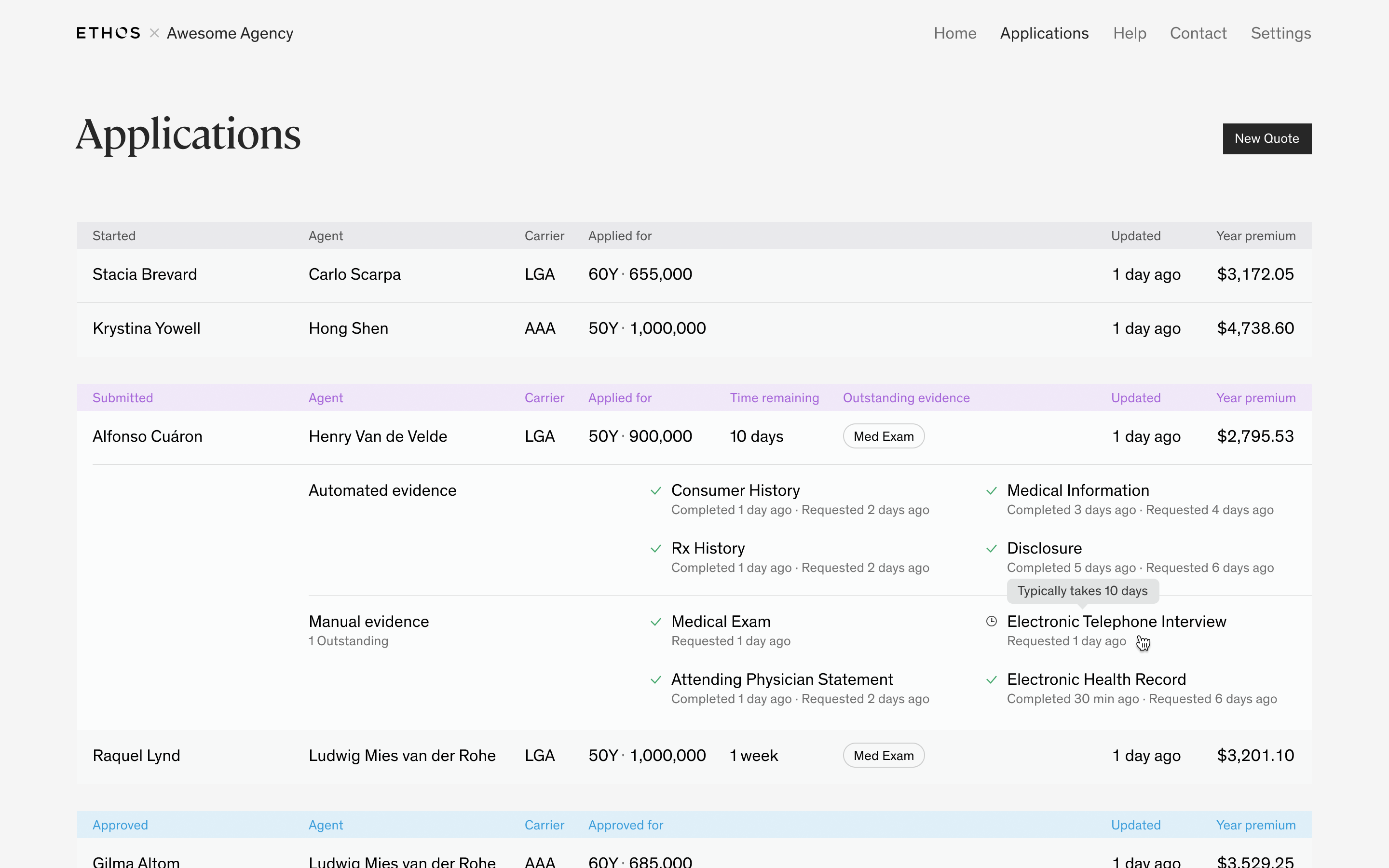
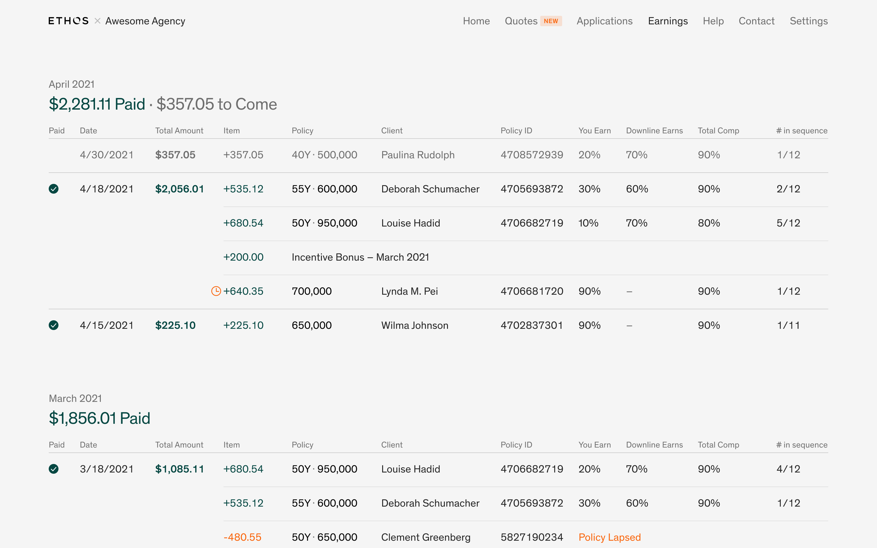
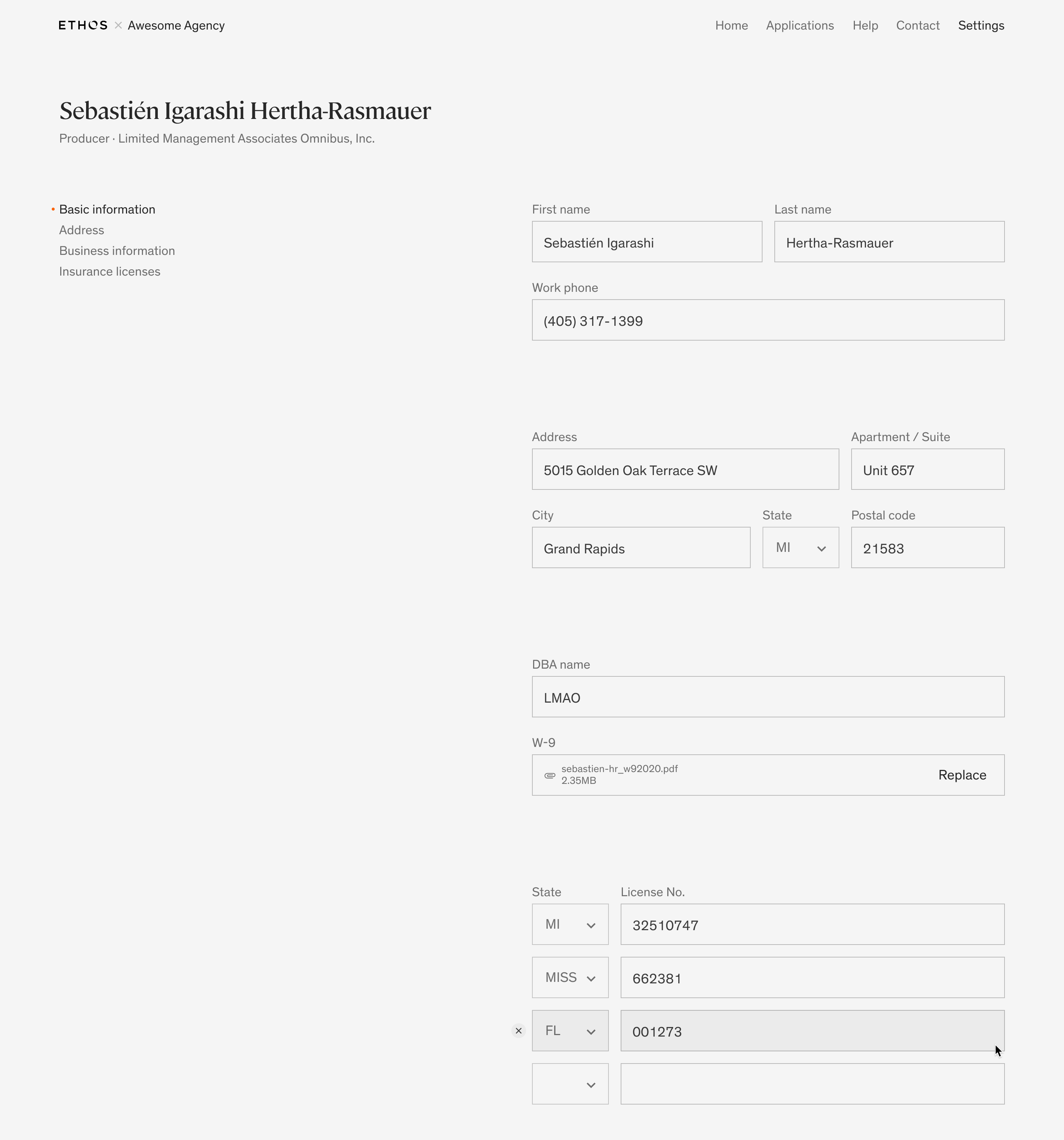
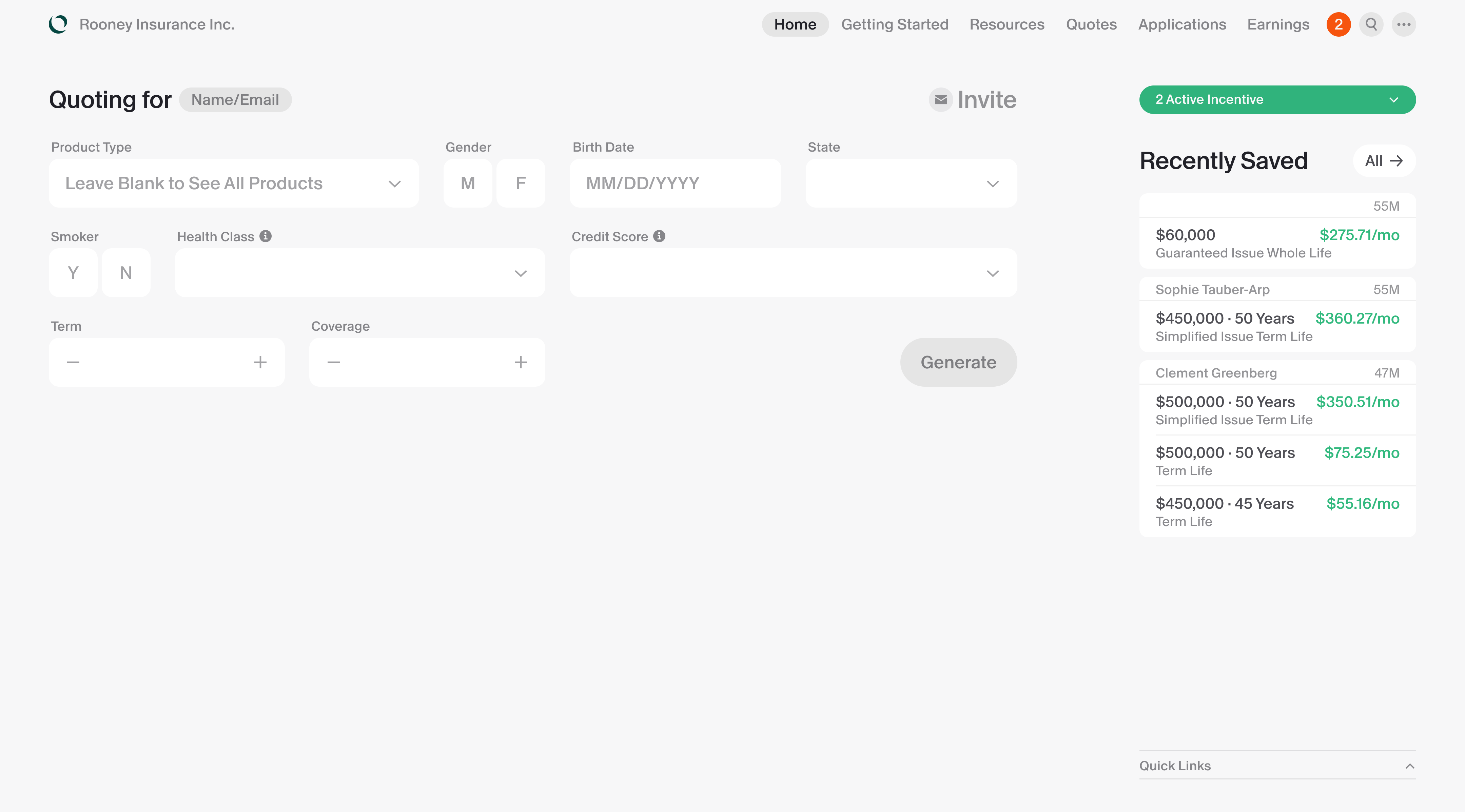
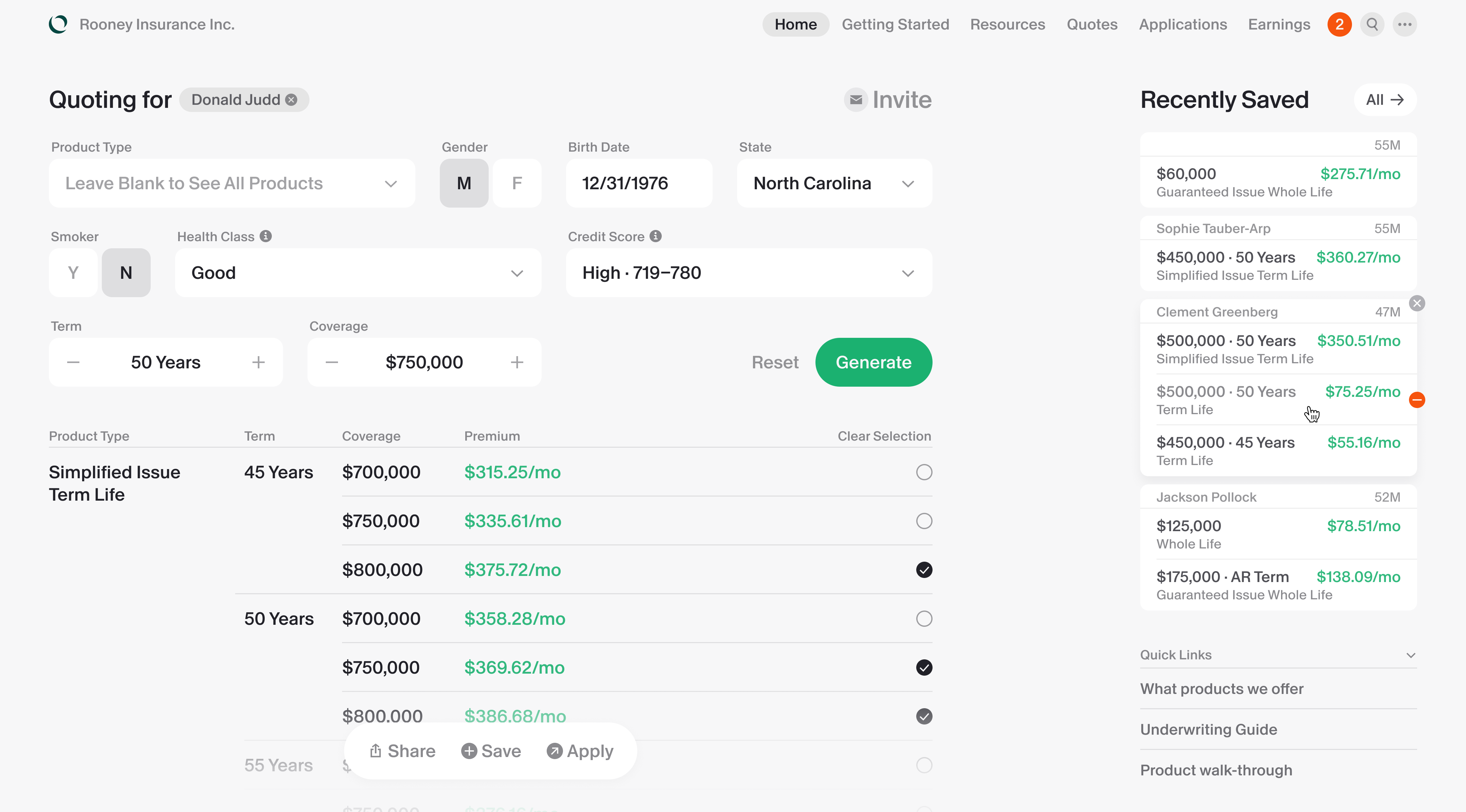
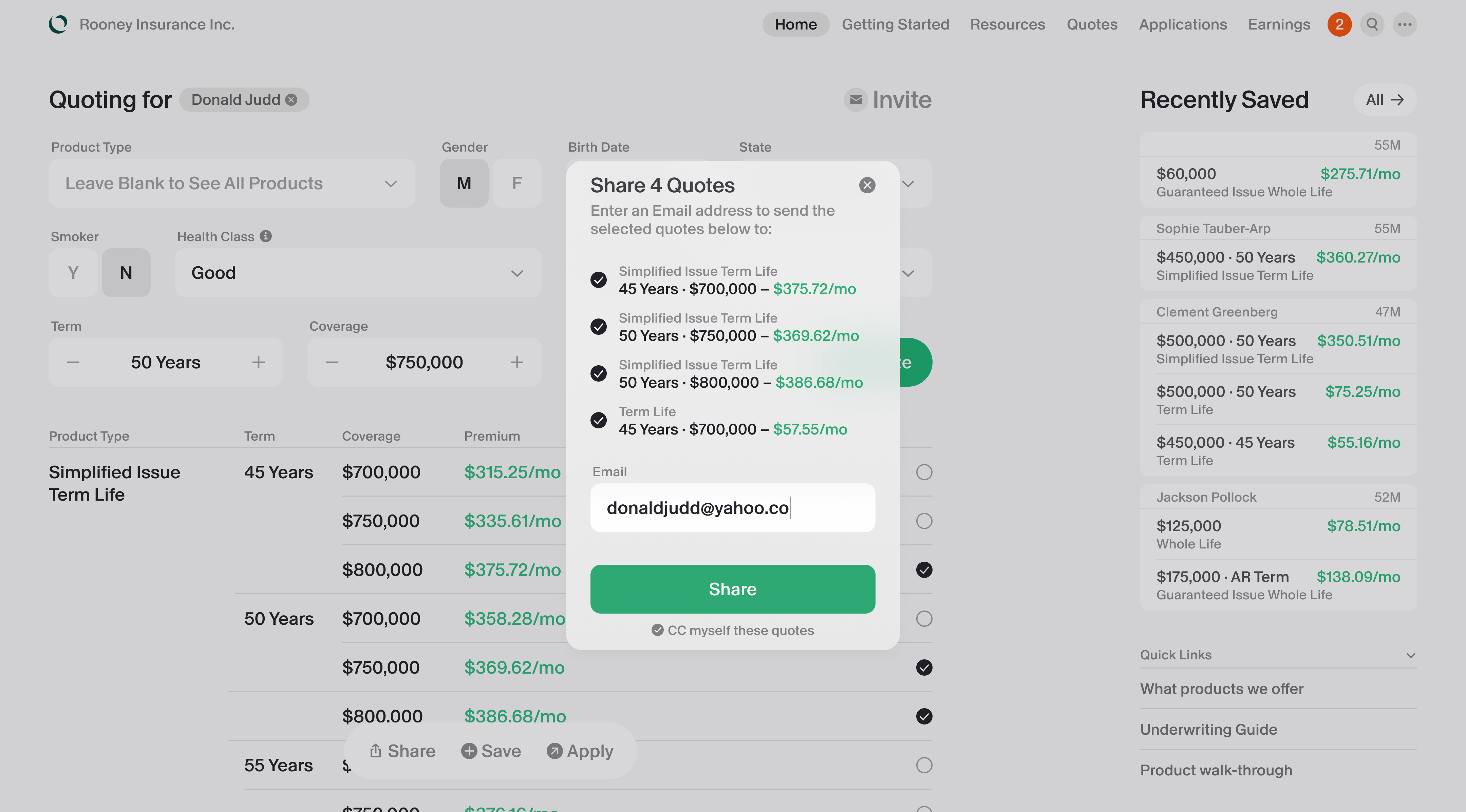
Agent portal
Ethos started as a D2C life insurance startup, but came to find more revenue in the traditional way of selling policies, through commission-taking human agents. I designed a portal for their insurance agents to manage clients and track payouts.
Spencer Cahill, product manager
Ethan Tran, engineering lead
Percy Batalier, brand designer
Gokul Dhingra, VP of product
2020
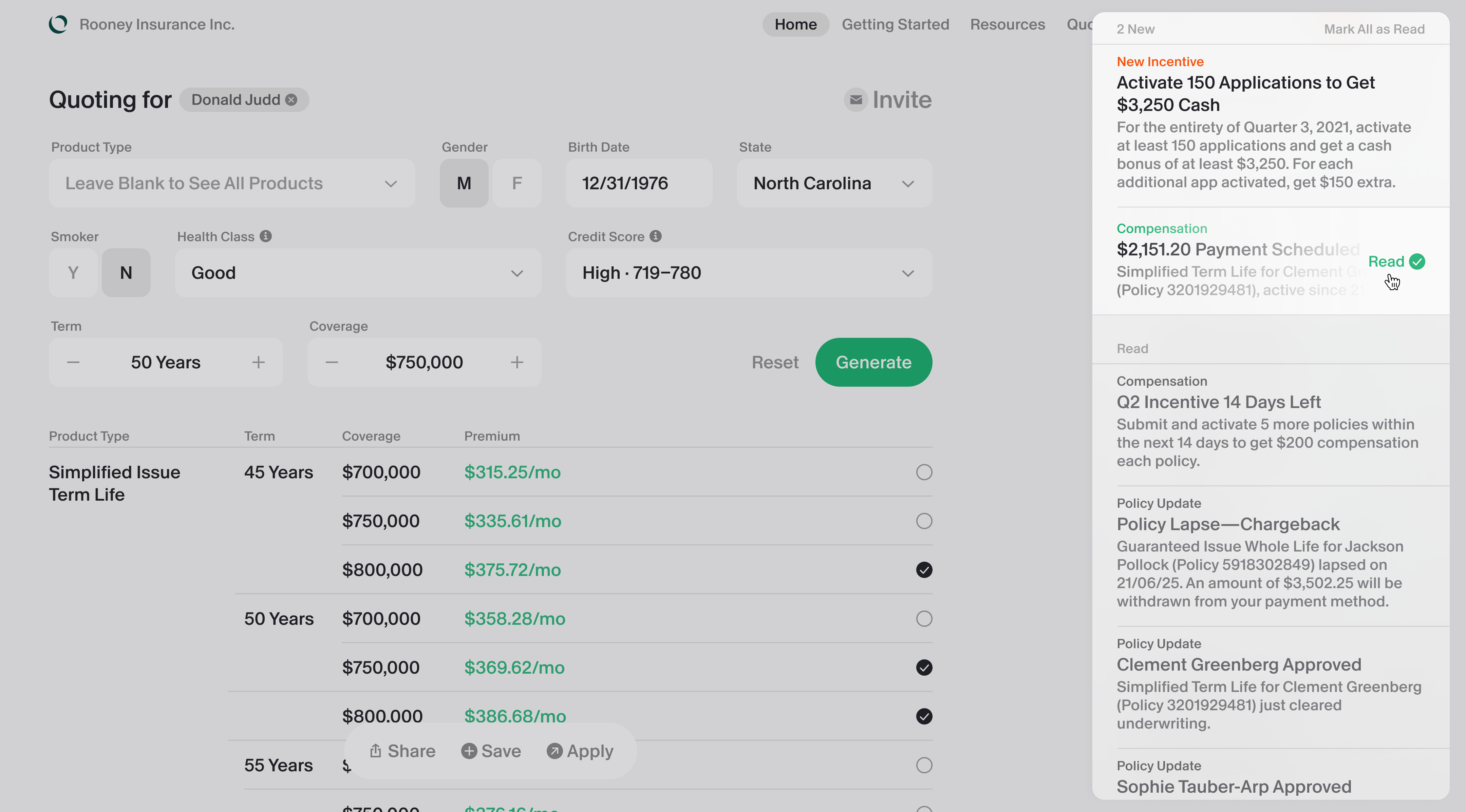
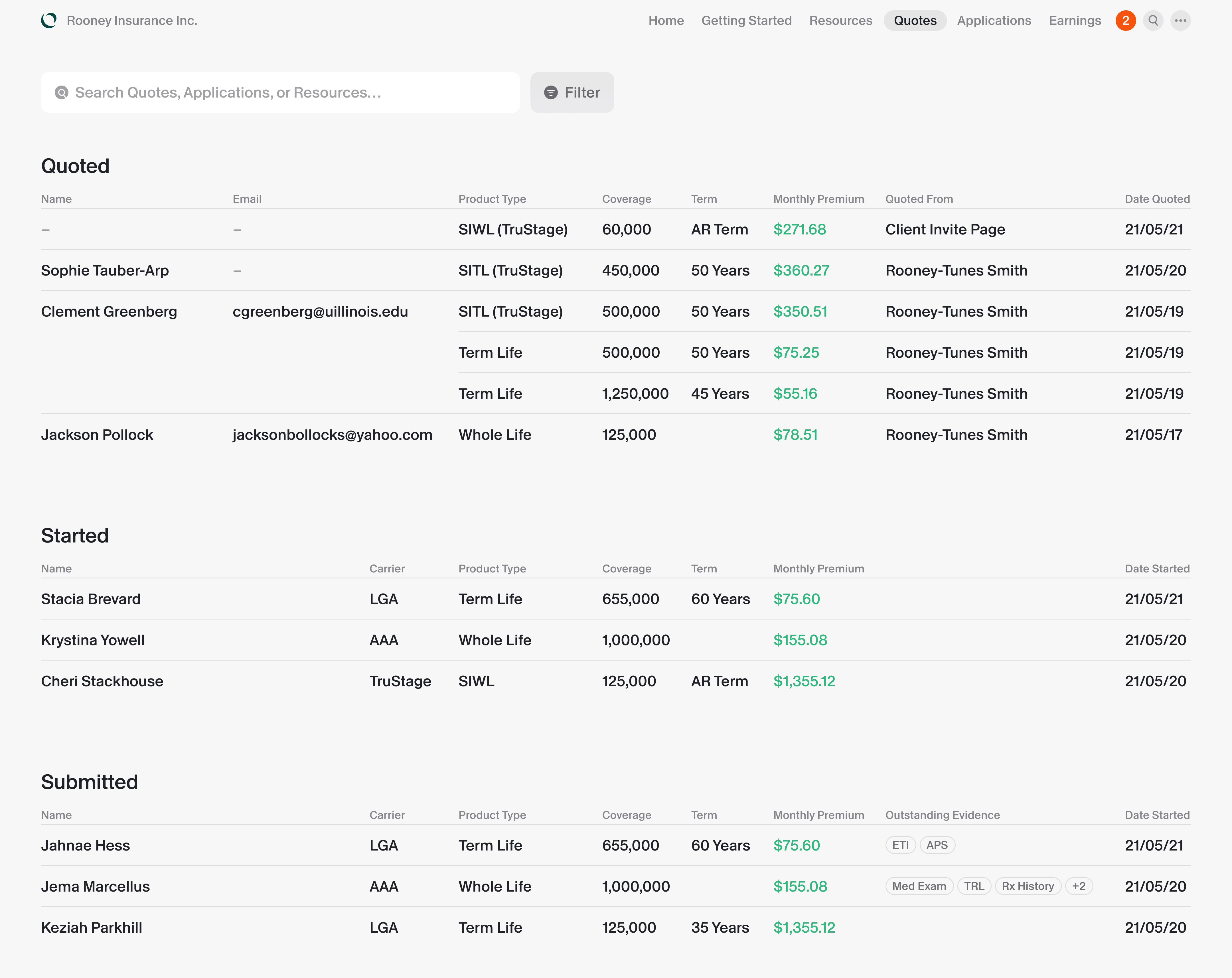
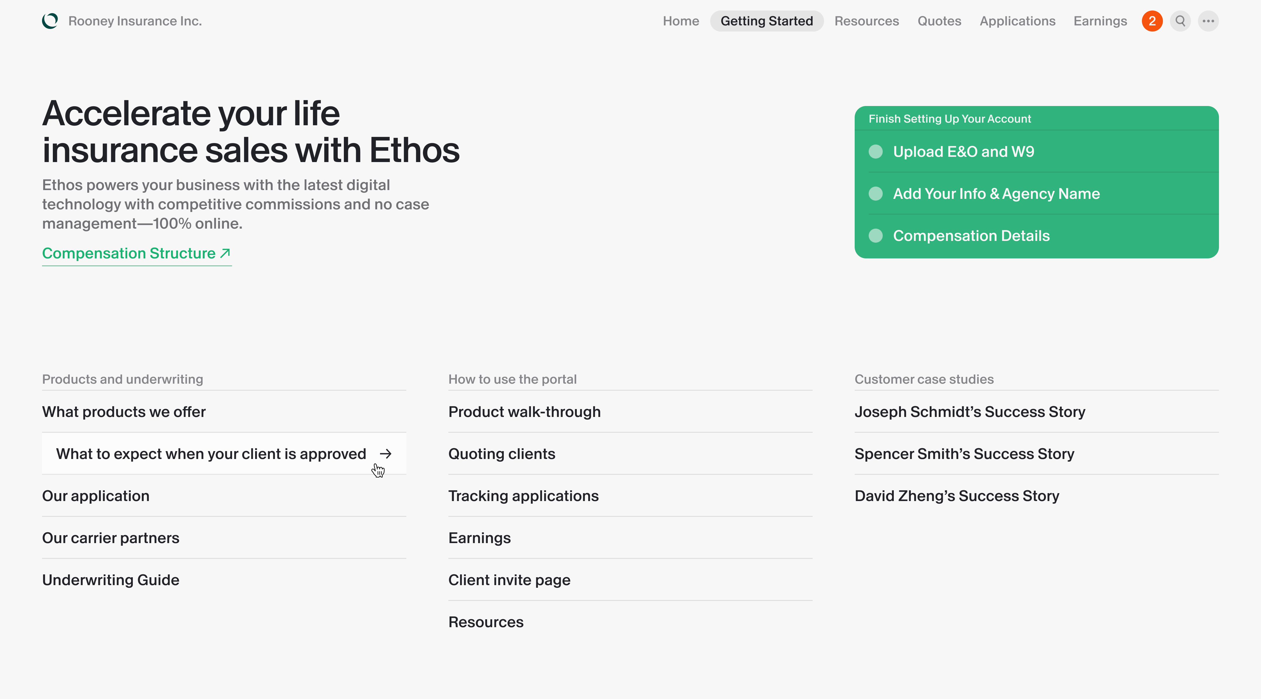
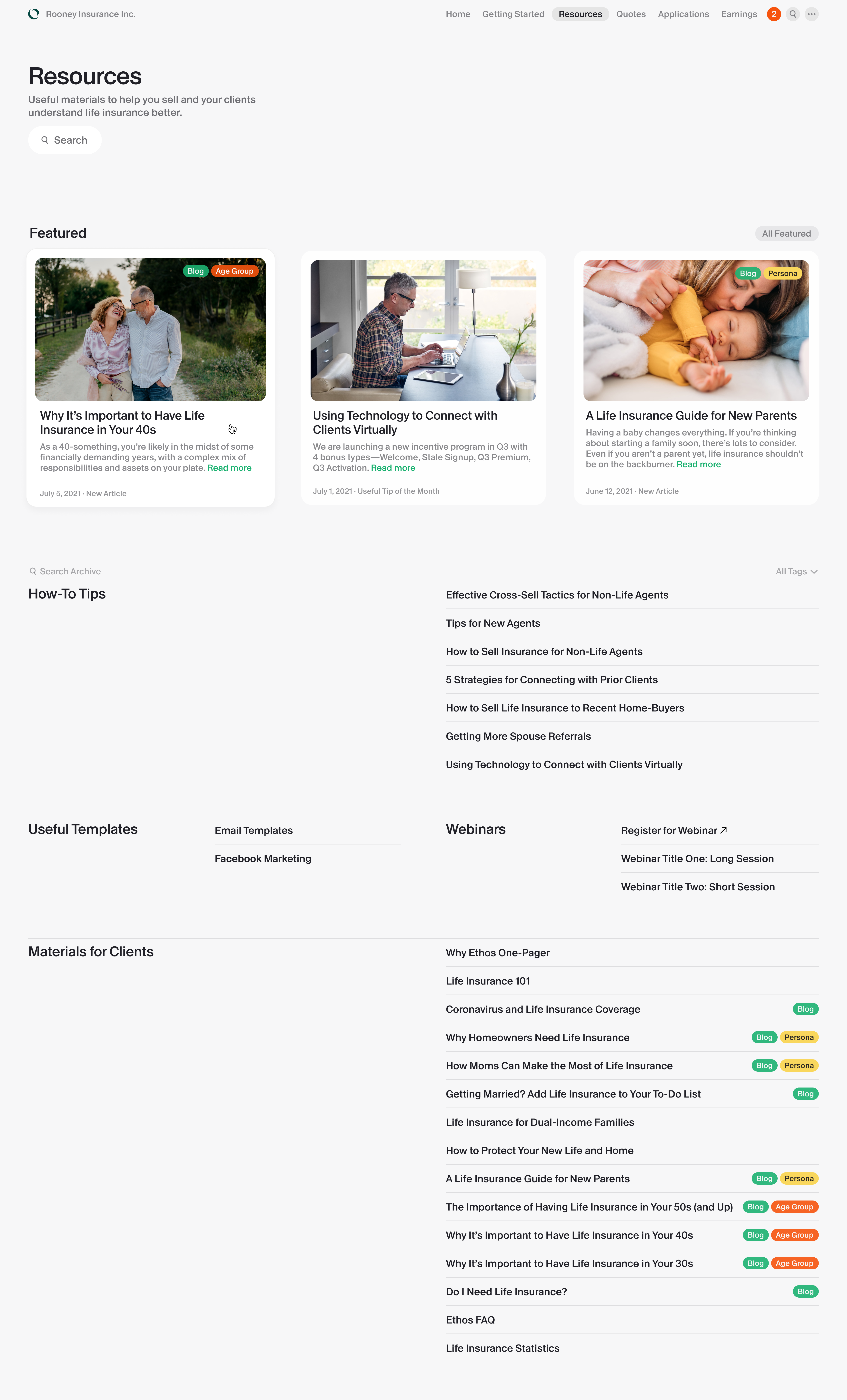
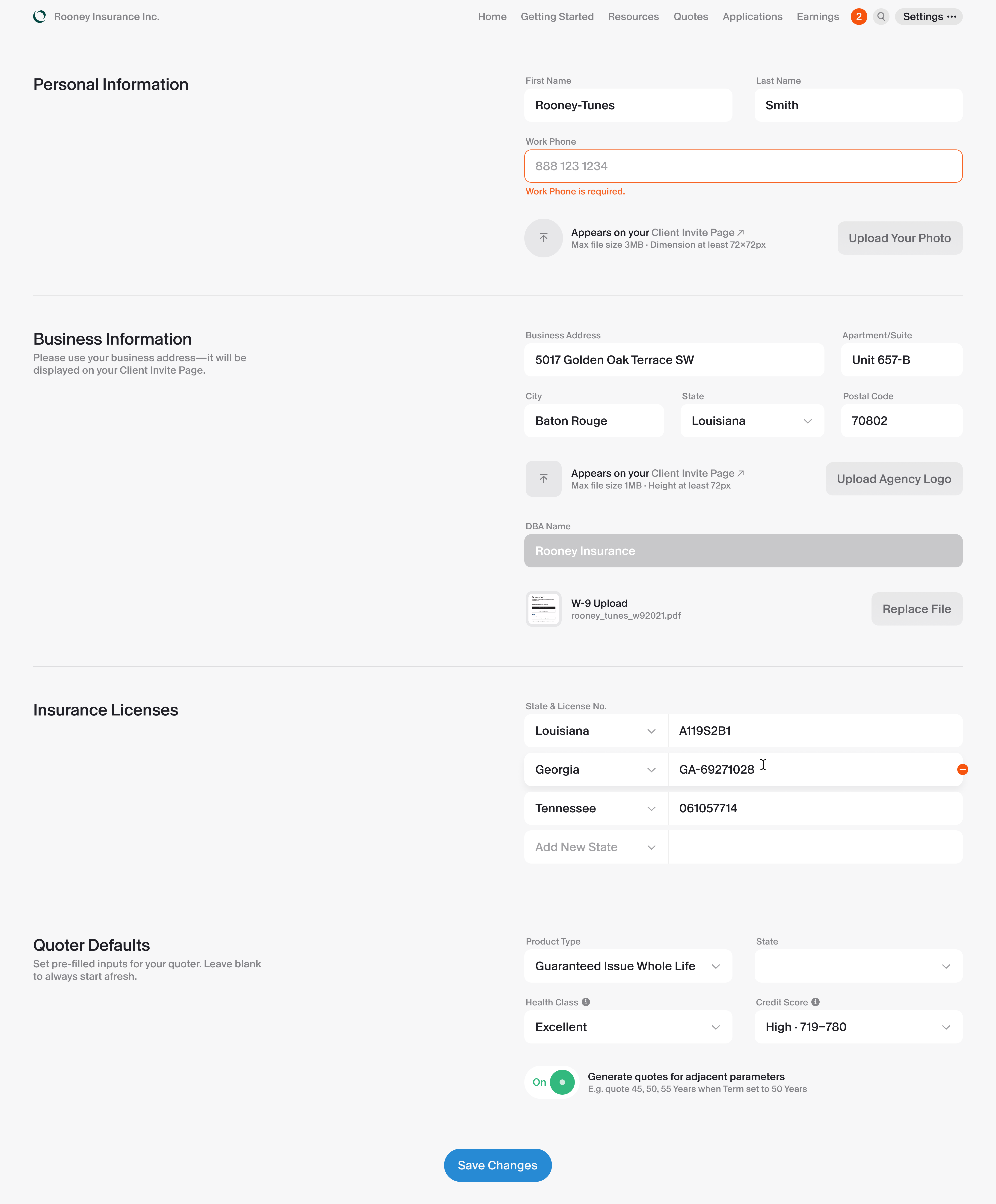
The portal
The top tab bar switches the user into different areas. The stylistic language was quite distinct—an attempt to combine sophistication with practical modularity.
Vision work
I was part of the team establishing Ethos’s brand identity and aesthetic language in 2019, and they felt outdated in the world of COVID lockdown in 2021. The company had an appetite for a refresh, and I kicked off an ambitious project alongside brand designer Percy Batalier.
Our goal was to develop a new aesthetic that was not only visually arresting, but also practical in its product applications. To start, we assembled moodboards and discussed vibes.

For a chaotic world in 2021, the most natural response became metallic sharpness, typical of a surgeon’s scalpel. As a perhaps subconscious counterpoint, both Percy and I gravitated towards something cheaper and warmer.
I noticed that we tended to like images with frosted acrylic and matte polypropylene. They were quintessential industrial materials, but they create incredibly soft and complex diffuse reflections. Compared with everything around us, it felt warm, delicate, yet not childish.
The contrast that makes this work happens between the playful big buttons, the dramatic austerity of the typography1, and the delicacy of the background materials.
The backgrounds are in fact translucent tinted2 gradients (brighter at the bottom to make them floatier) with a thick backdrop blur. When they overlay graphics, the overlapping region interacts subtly with the foreground’s complex treatments, creating a serene, diaphanous effect reminiscent of a pearly polypropylene sheen.
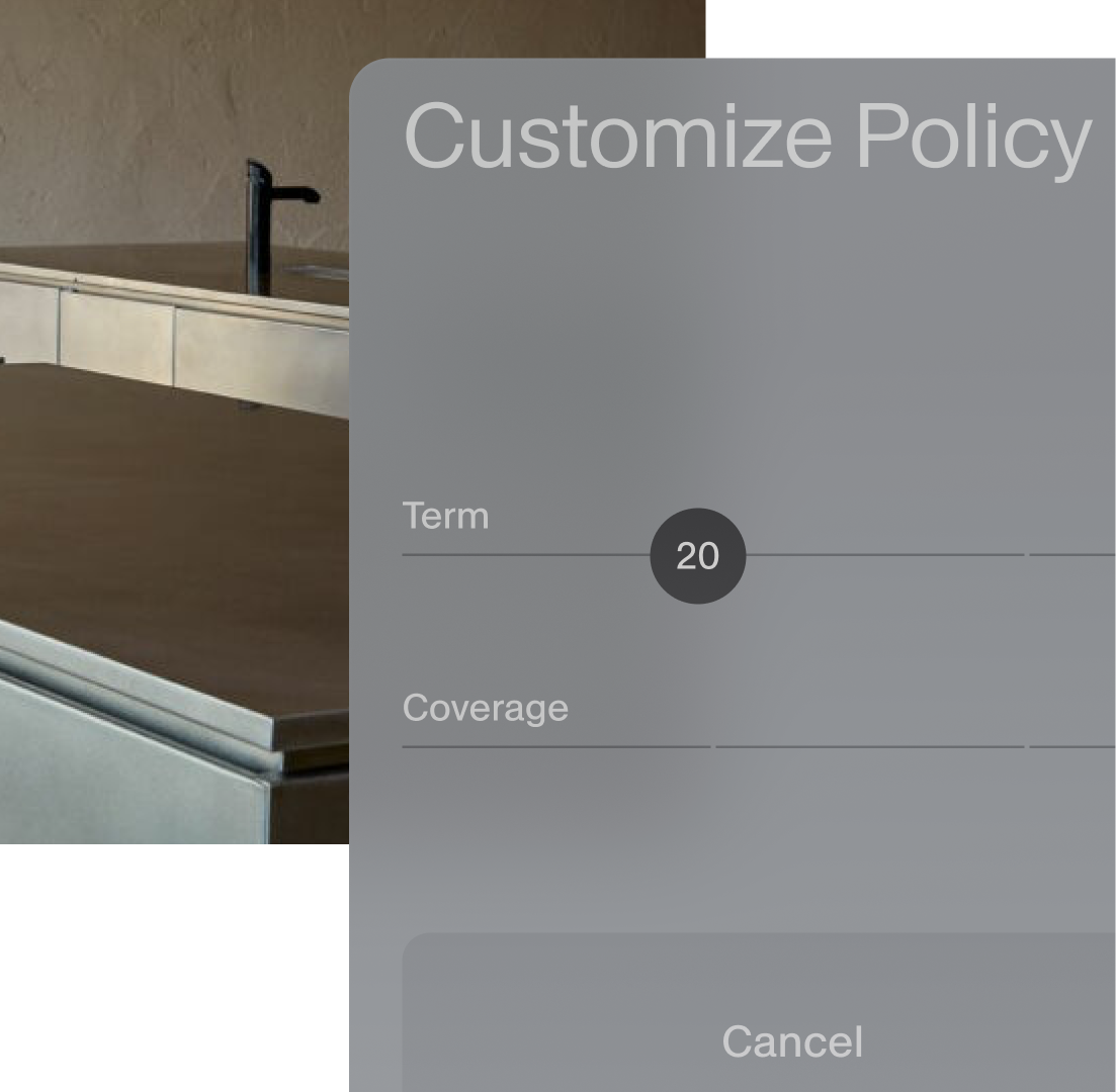
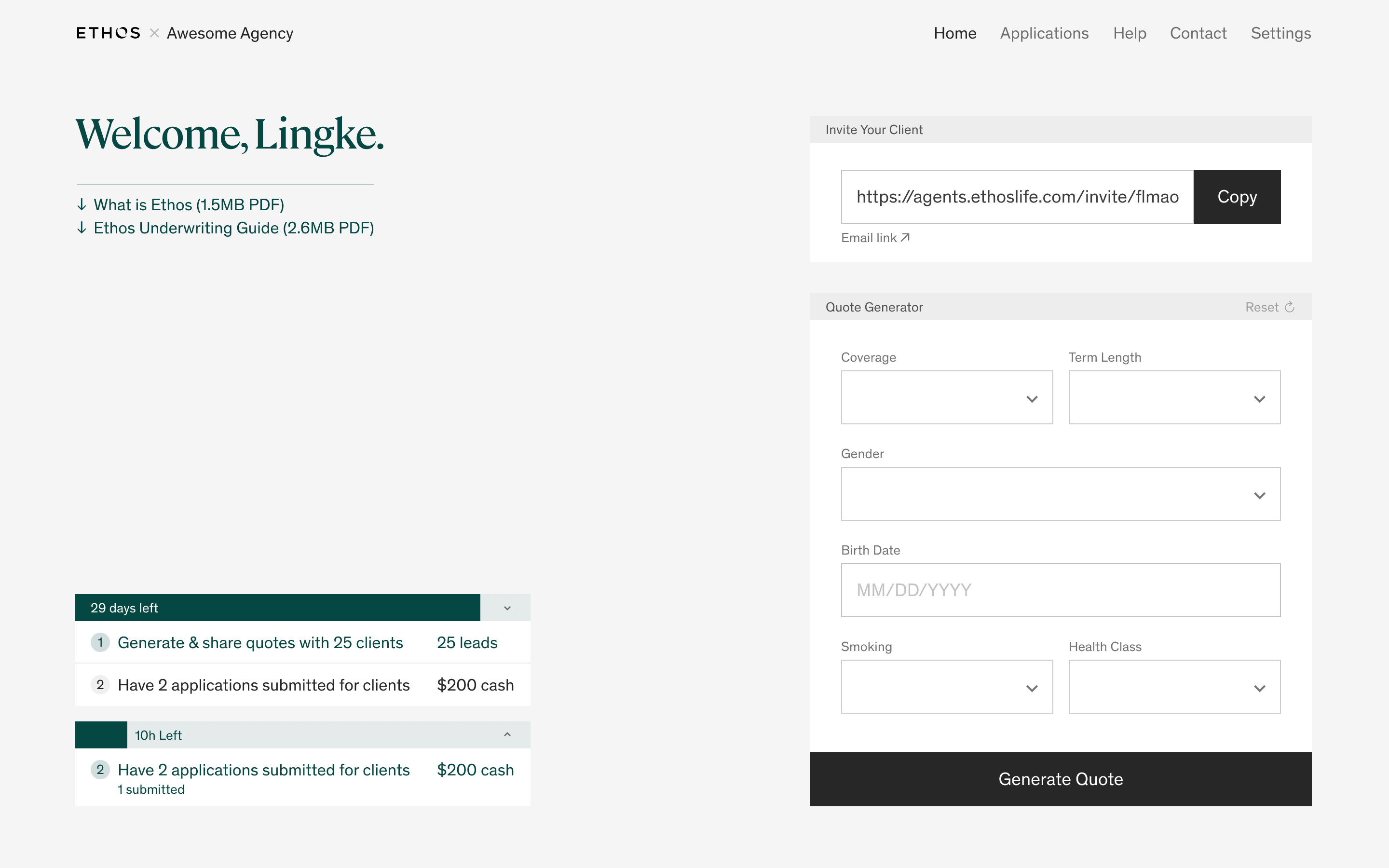
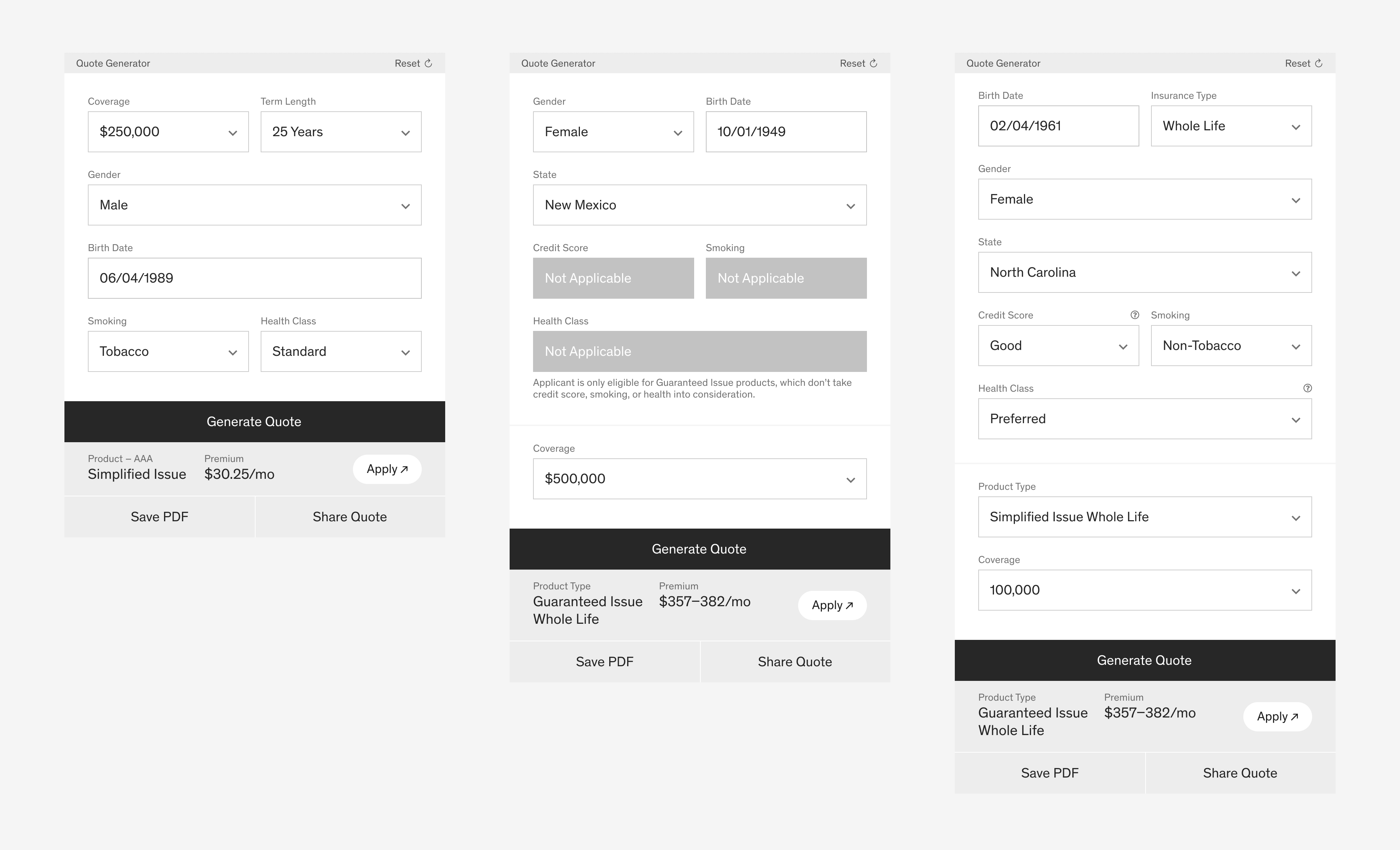
I then applied it onto the agent portal, and redesigned the quoting interaction to make it more robust as well.
At the time, we were the among the first batch of American designers to test drive Optimo’s unreleased Antique typeface (later renamed Antique Legacy for sale), the most faithful Helvetica revival to date. ↩︎
An idea borrowed from Apple’s Dark Mode in 2018, in which the windows are dynamically tinted based on the wallpaper area behind them. ↩︎