Markdown Pagebuilder
On top of notion.com’s CMS, I designed a pagebuilder that directly translates Markdown text into publishable pages, drastically improving the workflow and quality of marketing campaigns.
Eric Nagy, web engineer
Tanner Godarzi, web engineer
2024
Background
The original notion.com website comprised of a few painstakingly hand-coded pages and some page templates with fixed slots for text and images. In 2022, the site was redesigned to follow the emerging “bento grid” format at the time.
The rationale behind this trend was obvious: it eliminated the need for intricate whole-page layouts and reduced design decisions to the block level, cutting design and production cost while maintaining the appearance of craft and polish. As Notion’s need for marketing pages skyrocketed, the bento blocks made economic sense.
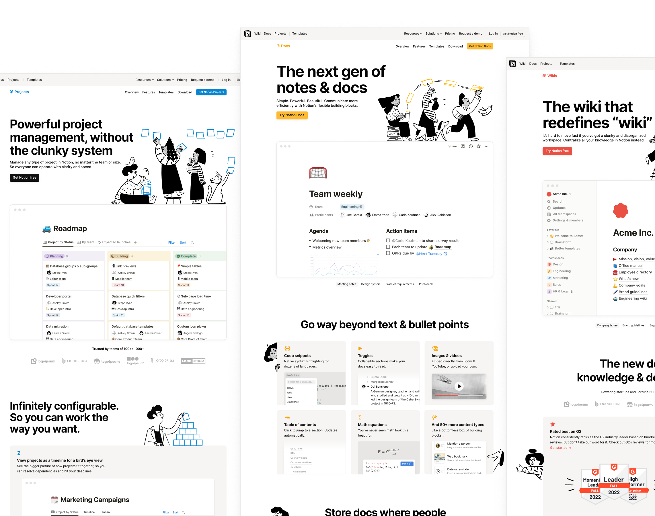
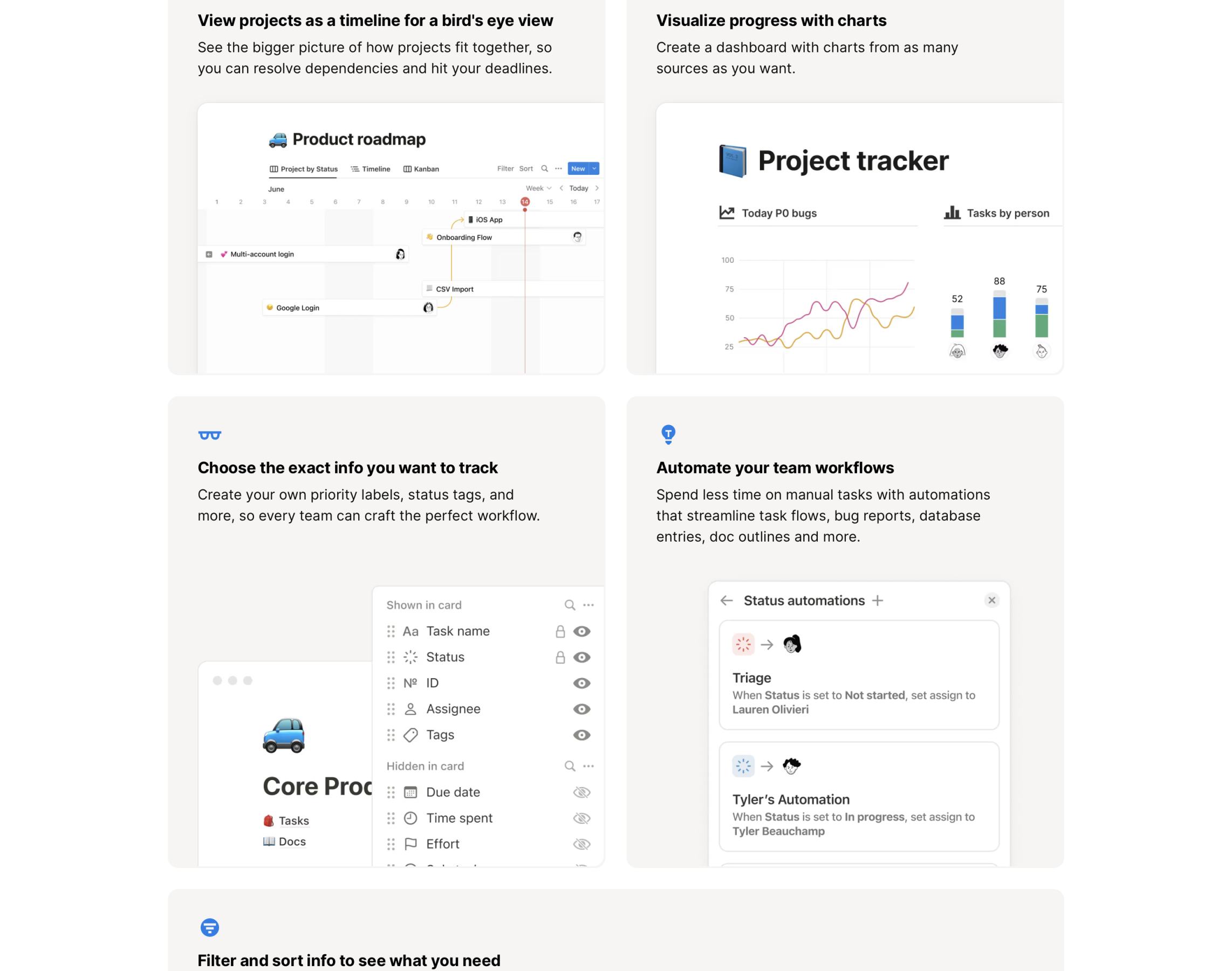
Every block is a React component. Heading and body text are required, and the eyebrow icons and images are optional. Blocks are wrapped in sections with display typography, then stacked to form a full page.
The new pages had hard-coded copy and images, but were soon hooked up to notion.com’s Contentful CMS. Nicknamed the “Super Pagebuilder”1, the CMS allowed theoretically anybody to create blocks and publish pages without having to touch styling and layout.
The problems
Two pain points became the most acute as the Super Pagebuilder was integrated into the web presence team’s work:
-
Web presence staff were still being thrashed. Most marketing partners, except for a few technically savvy, did not learn this tool. It meant the designers and developers still needed to be there to translate content copy into block arrangements. This defeated the original purpose of “self-serve”.
-
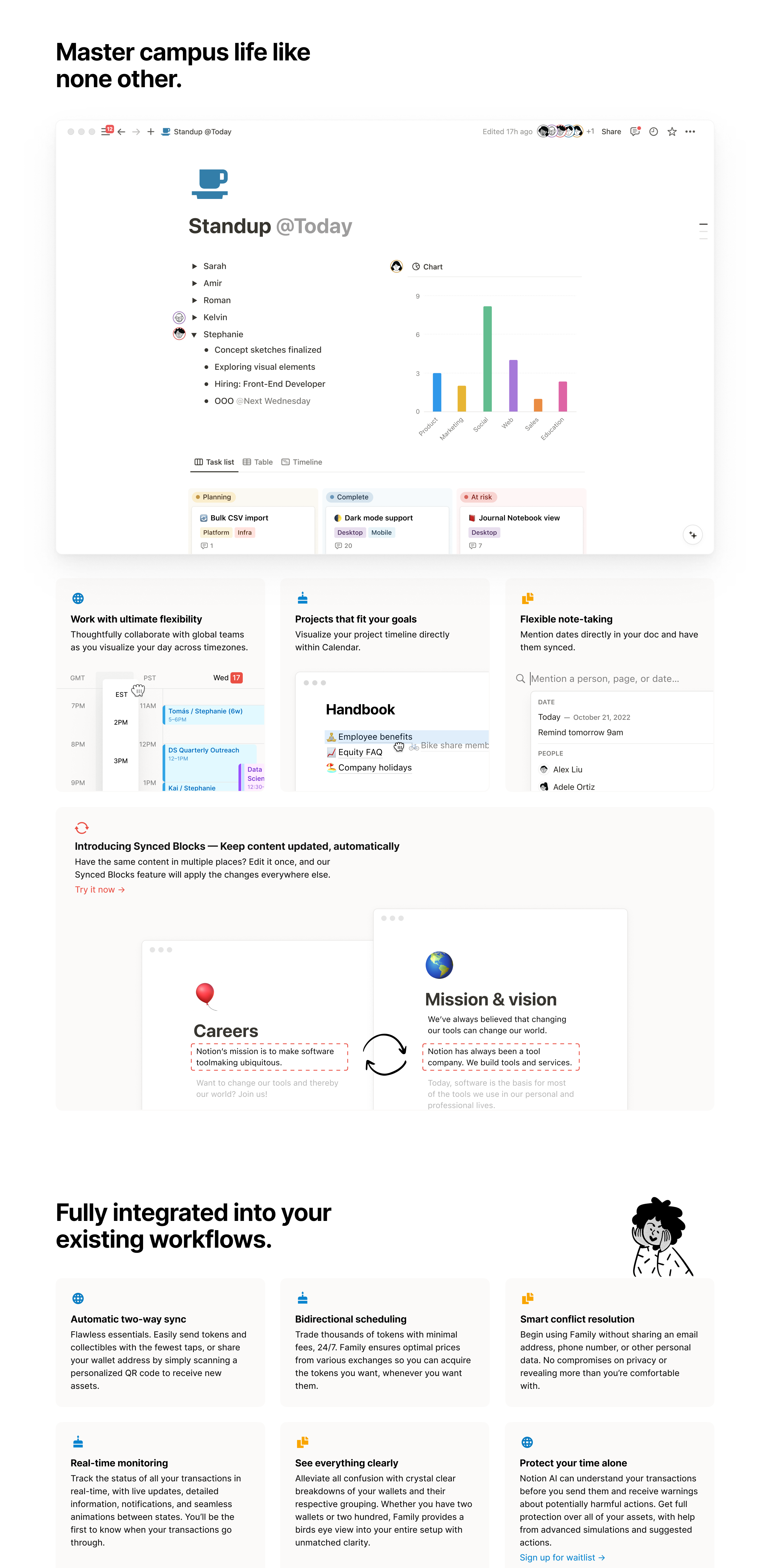
A wall of cream rectangles is visually tiring. Because blocks are the only ingredients available, a page could easily become dense and repetitive even if it was created by an experienced designer.
Although Super Pagebuilder already massively simplified page production, it was still too complex for our marketing and creative partners. “Learning the Contentful content model” already sounded like hassle, so they stuck with the familiar workflows, handing off copy docs for web presence to make into pages.
This setup’s biggest problem was that it fomented the false expectation that page production was cheap and quick (it wasn’t: we still had to arrange the blocks in Figma, draw all the assets, submit for approvals, then recreate the design in CMS), so people upstream started to feel they could take longer time. As a result, we received content and modification requests later and later in the project timeline.
Page generation with Markdown
Upon reflection, we agreed that the root solution was to have content folks upstream author pages themselves, so we could avoid being the bottleneck. So, we needed a pagebuilder so simplified and foolproof that it did not require any training.
One of the web engineers, Eric, proposed we use Markdown to directly generate pages. At first, I thought he was crazy because it sounded too good to be true. But it was indeed the most irresistible solution. Everybody knew Markdown, and since people were handing off text files to us already, this would allow them to complete the author, revise, and publish process without our heavy involvement.
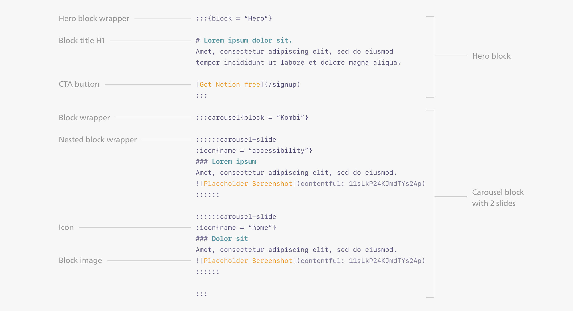
Extending the block
At the time, pages created by the Super Pagebuilder would often fill the page with cream blocks like a brick wall, because every marketing webpage’s job is to communicate bullet points (“value props”), each of which maps neatly to a block.
Quality and flexibility have always been a pair of trade-offs for webpage builders: they offered either beautiful, rigid templates that forced the content to fit, or WYSIWYG control that output ugly pages at scale in the hands of amateurs. With the block system however, I wanted to see if we could have our cake and eat it.
How do we keep the block system, but make it so that the pages it generated doesn’t look machine-assembled?
It dawned on me that even handmade webpages are already designed with modules within a grid—it’s just that our blocks always spelled out the boundaries with background color. Allowing the blocks’ background to be turned off would solve 80% of the problem.
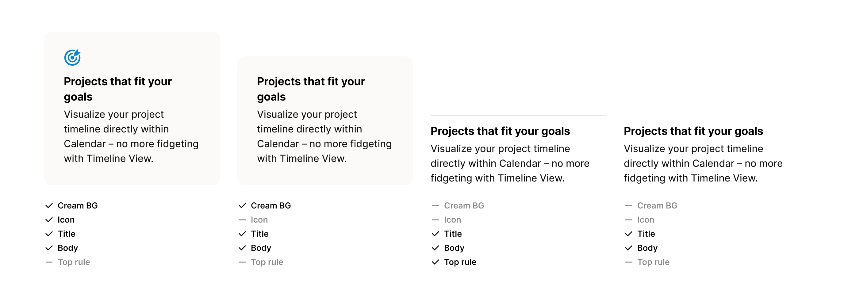
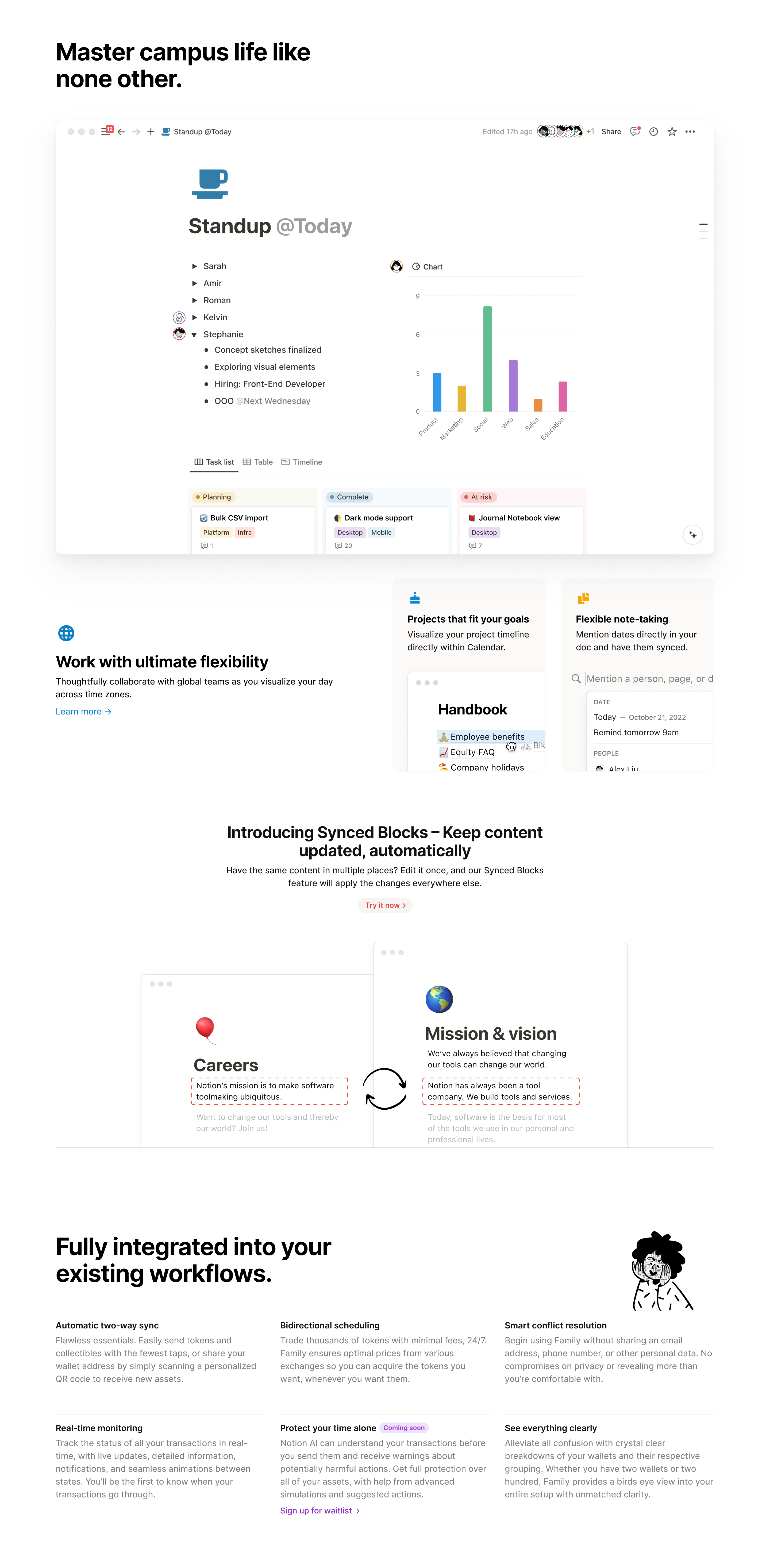
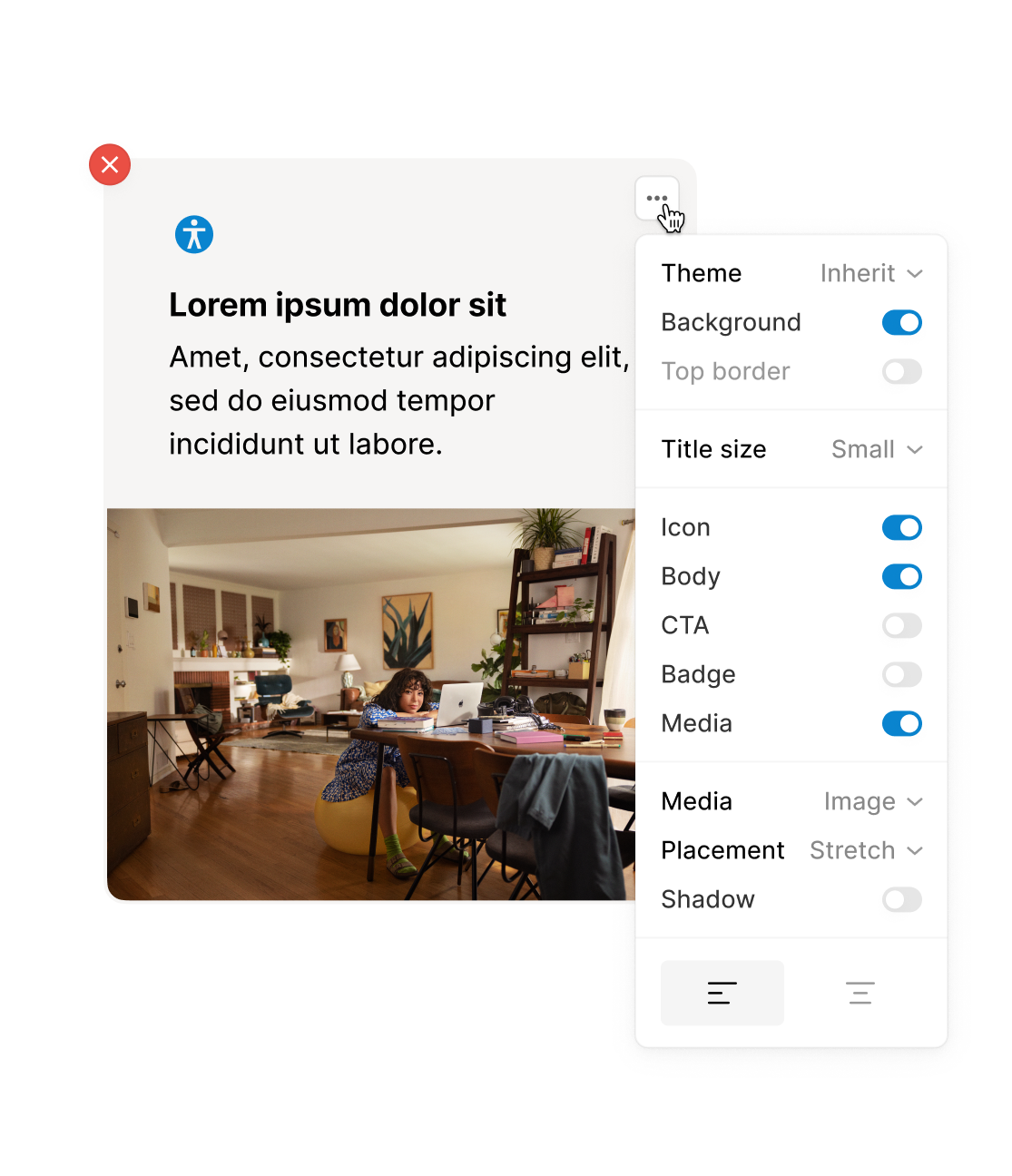
Background, title size, and alignment: they’re low-cost options to build into the block itself, but combined to form a massive difference. Crucially, a page is still composed of programmatic blocks, but it no longer looks like so.
It was at this point that I realized the whole premise of modern graphic design is about proportioning block volumes inside a grid—and we were essentially programmatizing it.
I then started to do some layout trials to see if this set of concepts have legs:
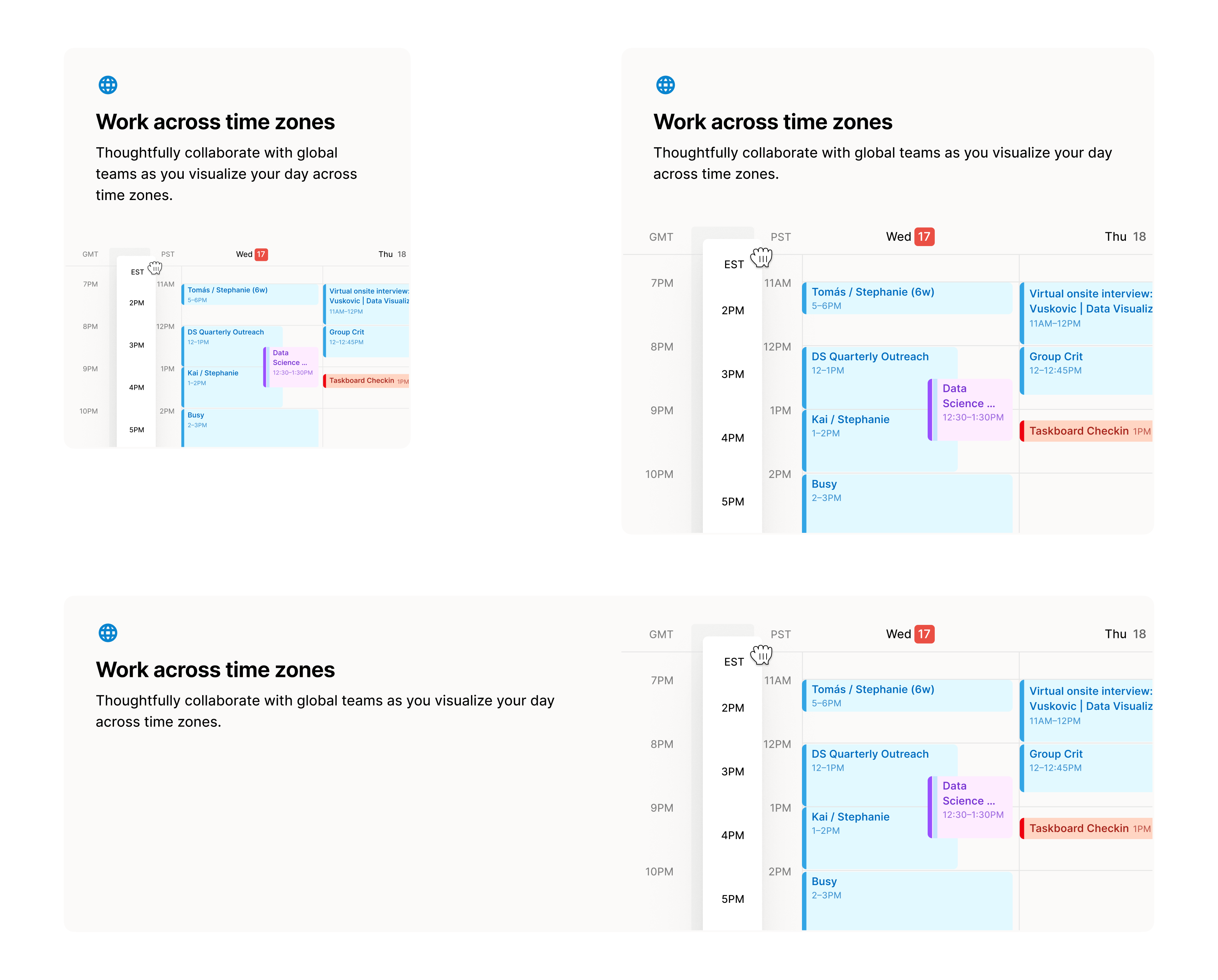
Fluid block layout
Under the Super Pagebuilder, a block was aware of its own size (spanning 3, 6, or 12 columns) because a designer would be hand-making image assets for that block. However, because the Markdown version was intended for non-designers, we expected most users would be selecting from any preexisting asset. This meant an asset needed to look good in any block size it was loaded into.
I found that an image only looked bad when it was dramatically blown up (intended for 3-column but loaded in a full-width block), and it didn’t look too bad if it was scaled down. So, I established a team-wide design practice that all images were to be made at 6-column wide, so that we could use one asset for all block widths.
Putting it together
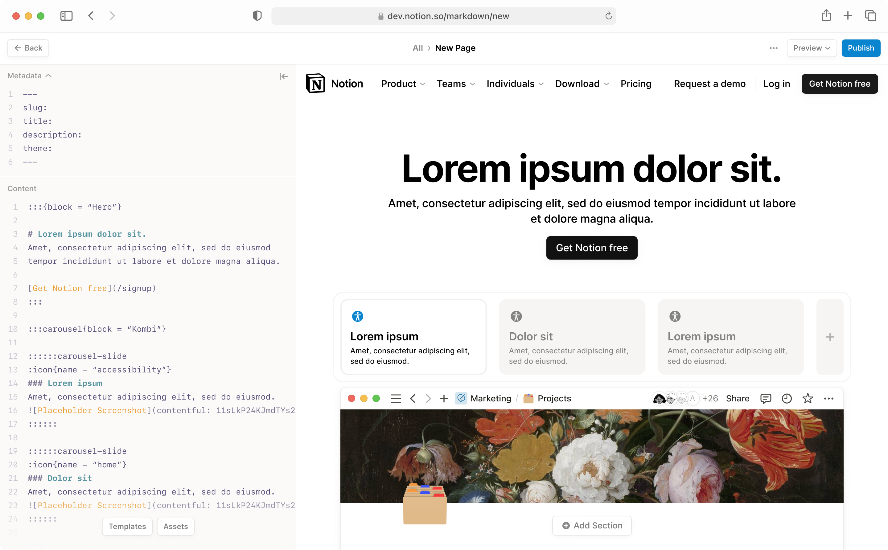
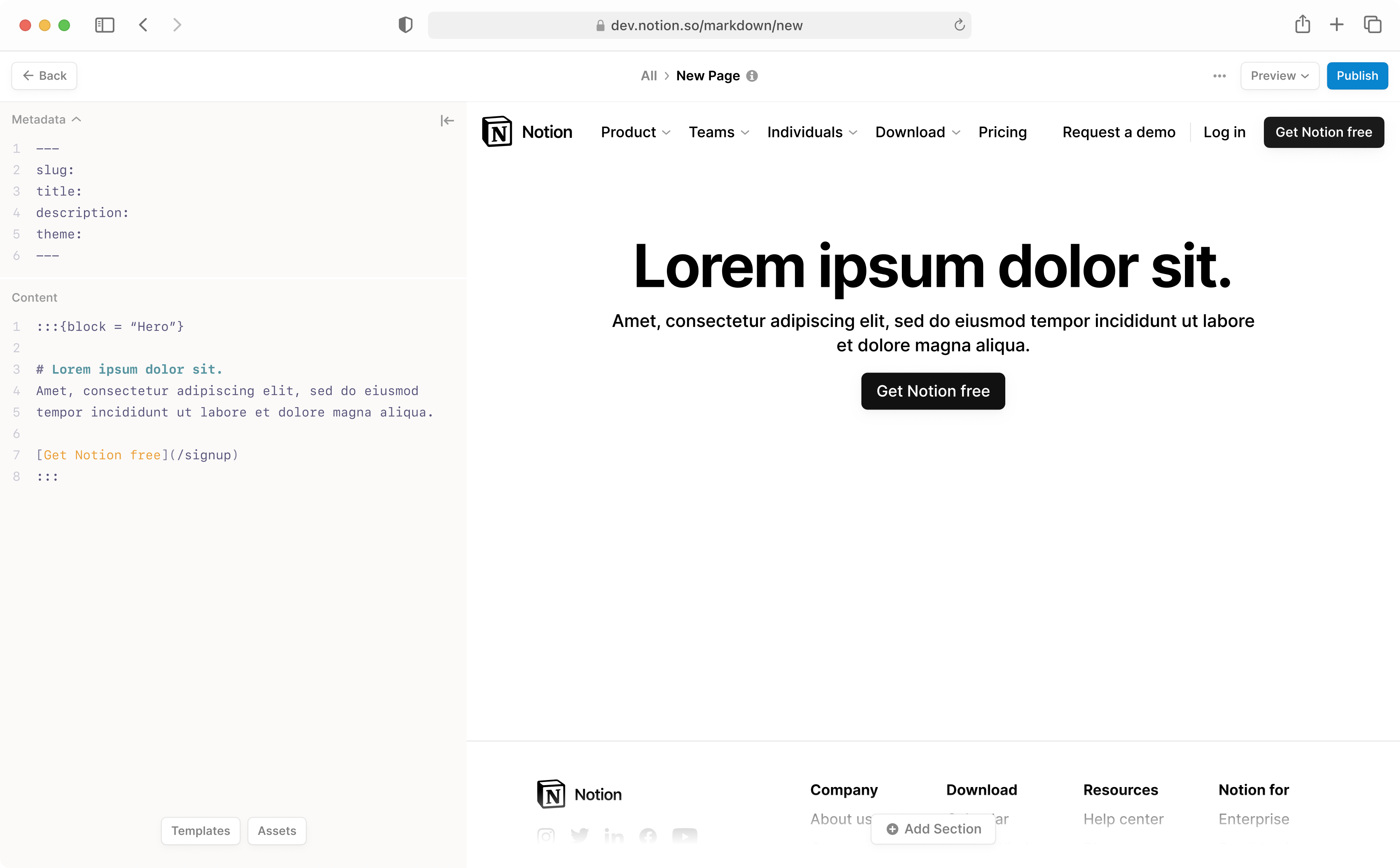
The final interface was simple: Markdown text editor on the left, and live HTML preview on the right. A top bar hosted things like name, path, and the publish button. We initialized every new page with some content in the editor to help people get started, or they could start from a template and edit.
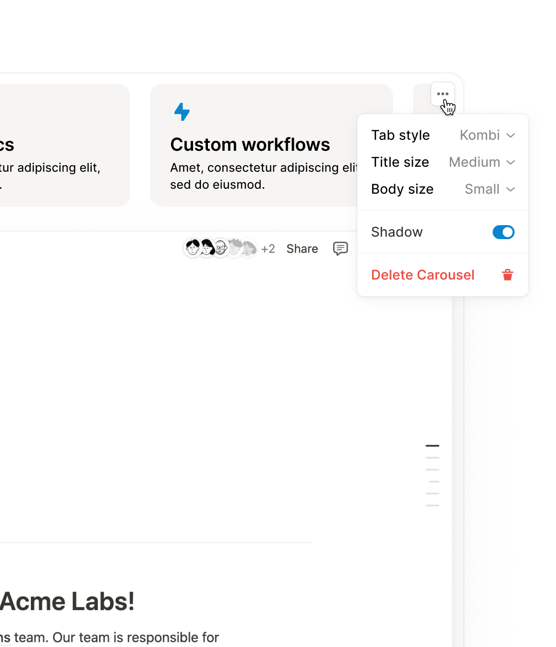
For those who did not want to write Markdown by hand, I also designed some UI that lives inside the preview, allowing people to add rows and sections as well as edit individual blocks.
The UI was nothing fancy: it simply modified the Markdown text. Keeping it as the only source of truth was crucial, because Markdown was dumb and malleable, and people already knew how to write it.
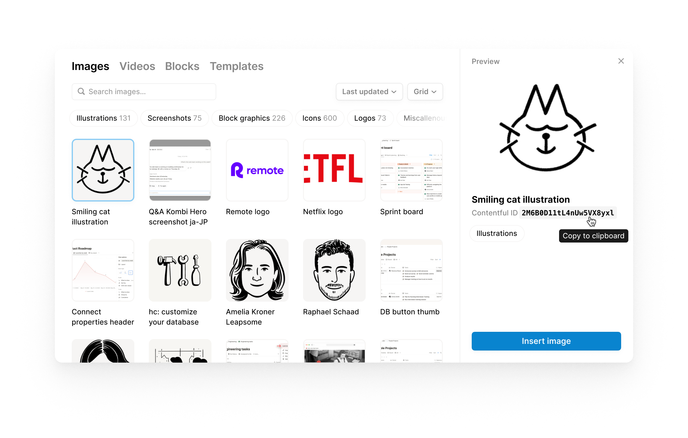
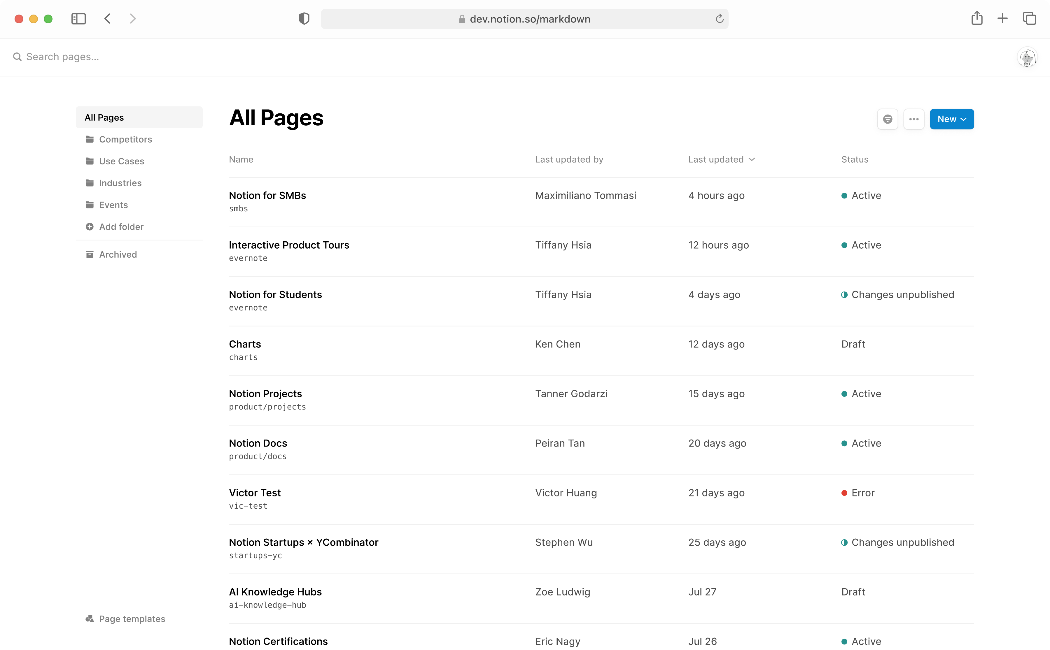
Since it was an internal tool, Markdown Pagebuilder was built with unbelievably little compromise to the original vision. It lives in parallel to the Super Pagebuilder, but immediately became popular as a lightweight alternative, freeing the web presence team to work on higher-impact pages that required more intense design and manual polish.
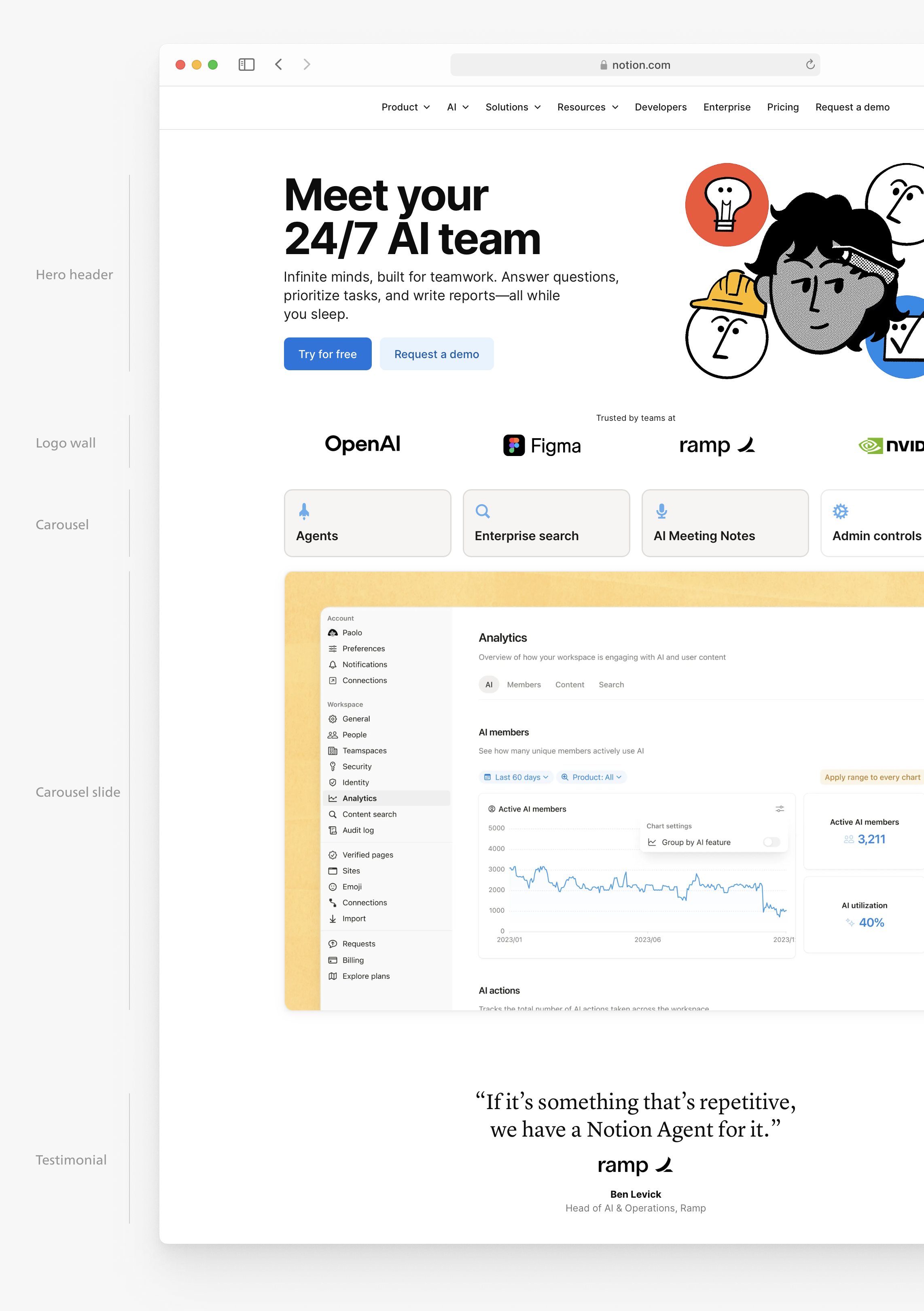
Today, Markdown Pagebuilder has moved out of only generating lower-tier pages, and started to power even the site’s high-touch product launches:
For more detailed thinking and implementation details behind Super Pagebuilder, see the excellent write-up by my colleague, Tanner. ↩︎