Neon Genesis Evangelion
Graphic designer Peiran Tan plumbs the typographic psyche of the celebrated anime franchise.
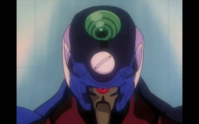
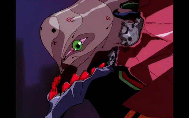
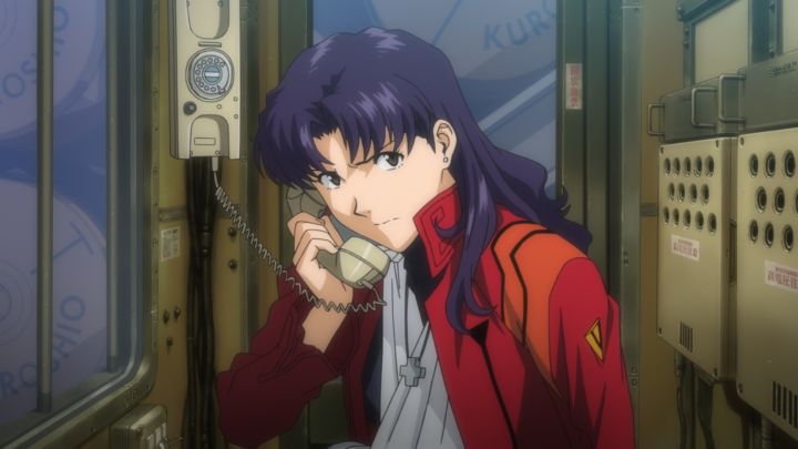
Created and directed by Hideaki Anno, Neon Genesis Evangelion (新世紀エヴァンゲリオン, often abbreviated as NGE or simply EVA) is a Japanese media franchise consisting of four main parts: a twenty-six-episode TV series (1995), two sets of film adaptations (1997 and 2007–), and a manga (1995–2013). Set in the postapocalyptic fortified city Tokyo-3, the series revolves around Shinji Ikari, a teenage boy recruited by his estranged father into a shadowy paramilitary organization known as NERV, for which he and other teenagers must pilot giant biomachines (“Evangelions”) to defeat incoming monsters (“Angels”) who threaten another apocalypse (“Impact”).
After starting out as a typical mechanical-robot (“mecha”) anime, Evangelion gradually evolved into an existentialist deconstruction of its own genre, immediately winning critical acclaim. Its sustained popularity through the years spawned a plethora of spinoff mangas, novel adaptations, games, advertisement tie-ins, and even pachinko gambling machines, leading it to permeate Japanese culture and eventually become a worldwide sensation. Many of its visual motifs became cultural lexicons, including its identity typeface: Matisse EB.
Matisse EB and the original Evangelion
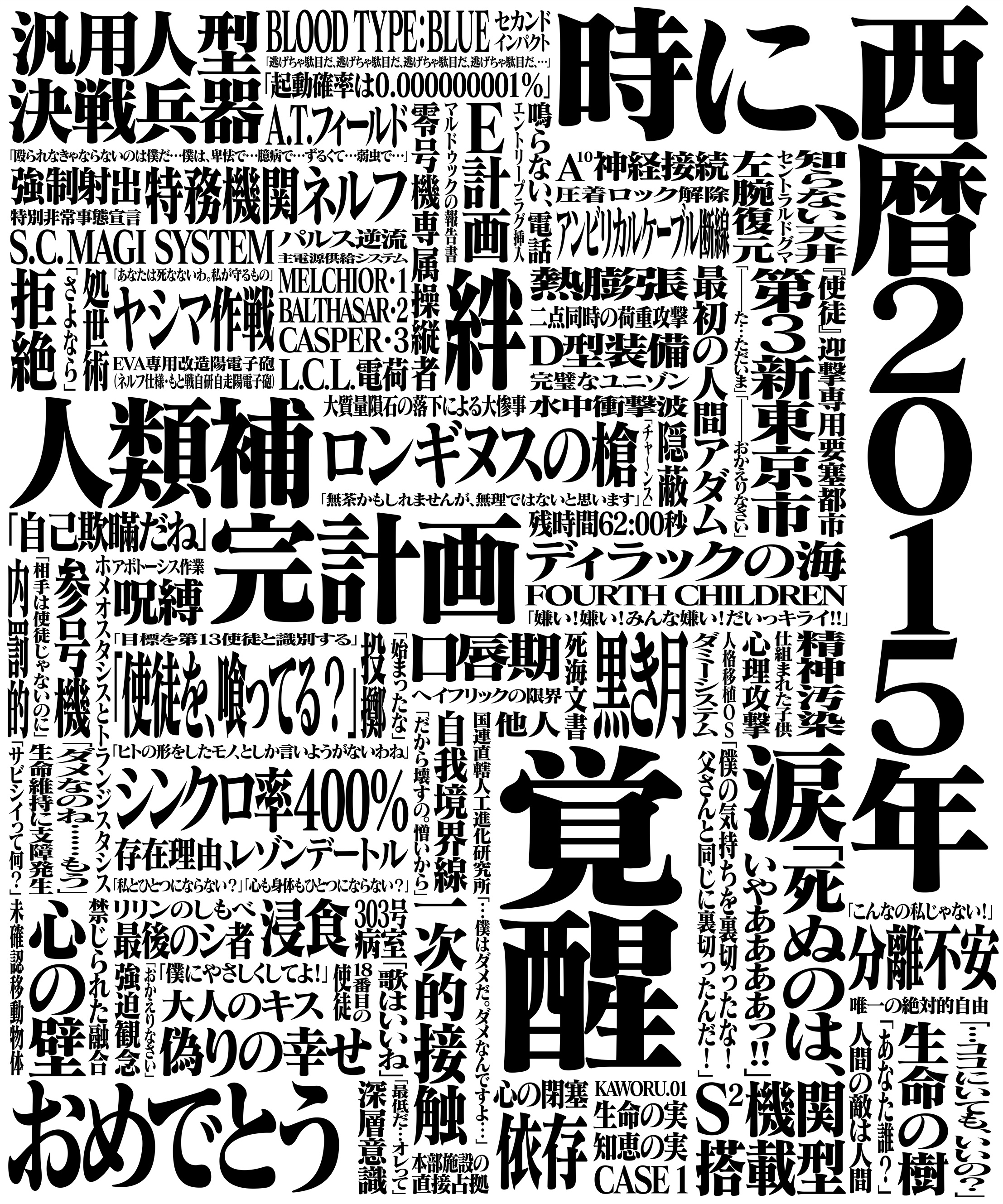
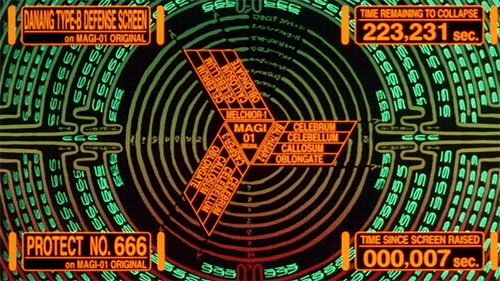
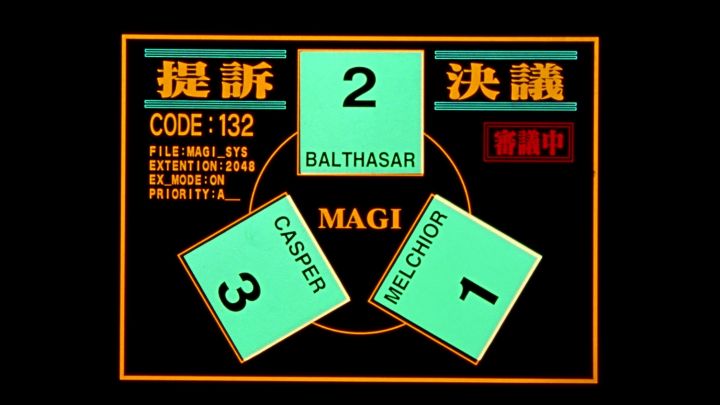
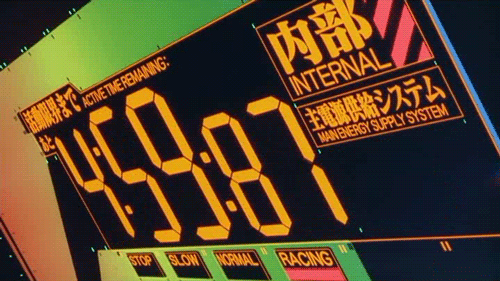
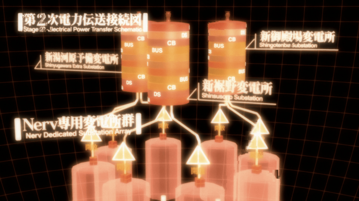
Evangelion was among the first anime to create a consistent typographic identity across its visual universe, from title cards to NERV’s user interfaces. Subcontractors usually painted anything type-related in an anime by hand, so it was a novel idea at the time for a director to use desktop typesetting to exert typographic control. Although sci-fi anime tended to use either sans serifs or hand lettering that mimicked sans serifs in 1995, Anno decided to buck that trend, choosing a display serif for stronger visual impact. After flipping through Fontworks’ specimen catalog, he personally selected the extra-bold (EB) weight of Matisse (マティス), a Mincho-style serif family.
Just as every mature metal type foundry in the West had to have a Garamond, Matisse was Fontworks’ answer to the Mincho genre for desktop typesetting. Since few computer typefaces existed at the time, completing the face quickly was paramount; stylistic exploration could come in later releases. Furthermore, because the typeface’s initial designer, Francis Chow, was working with inexperienced colleagues at the time, he wanted a direction simple enough for them to follow. A combination of haste and inexperience gave Matisse a plain look and feel, which turned out to make sense for Evangelion. The conservative skeletal construction restrained the characters’ personality so it wouldn’t compete with the animation; the extreme stroke contrast delivered the desired visual punch. Despite the fact that Matisse was drawn on the computer, many of its stroke corners were rounded, giving it a hand-drawn, fin-de-siècle quality.
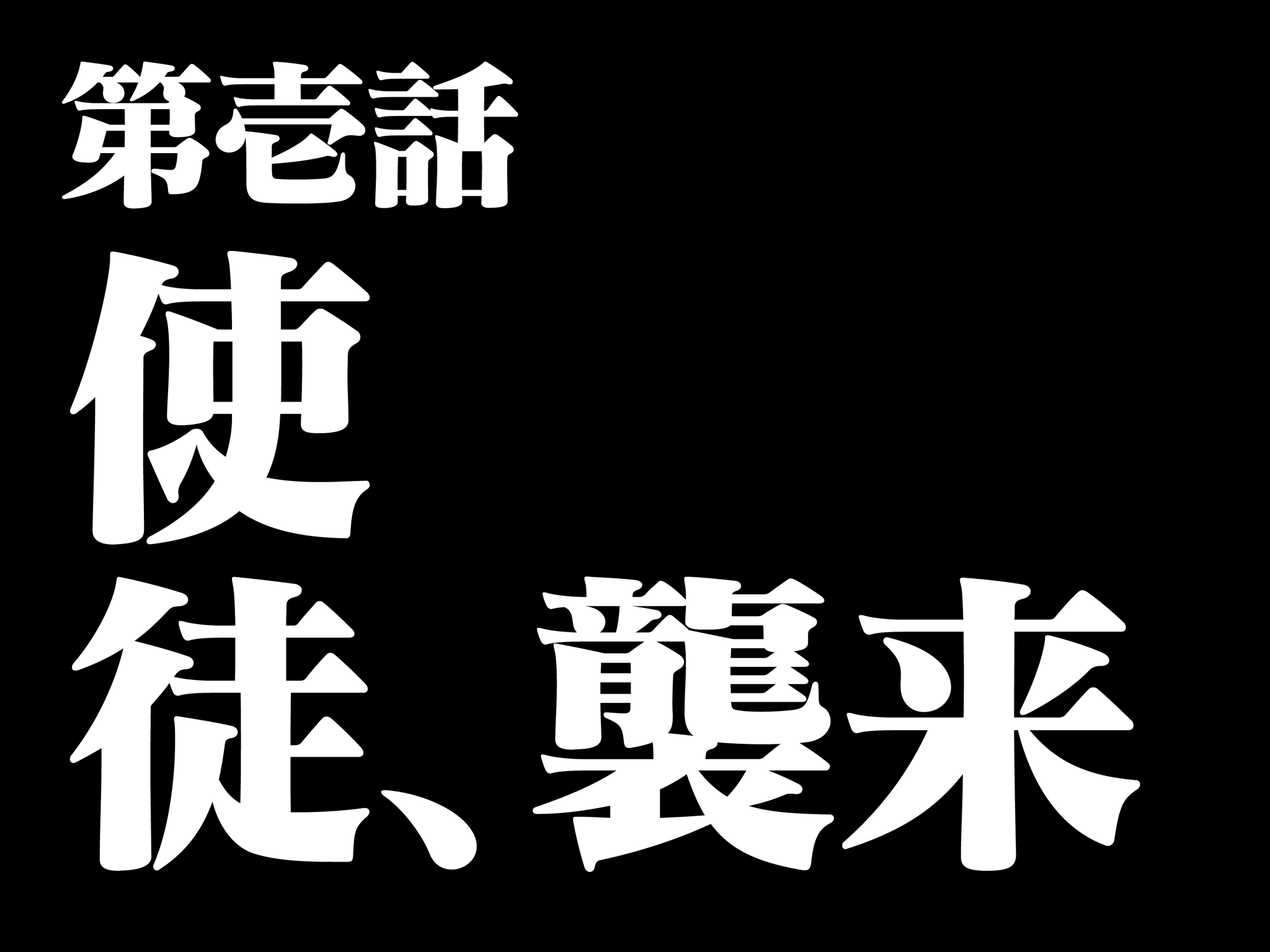
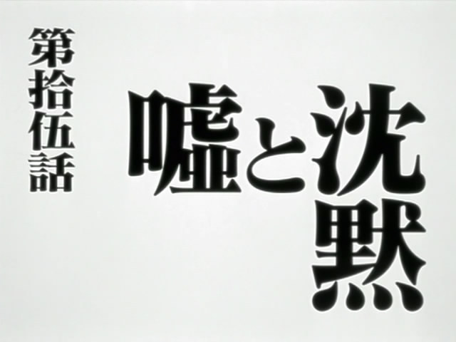
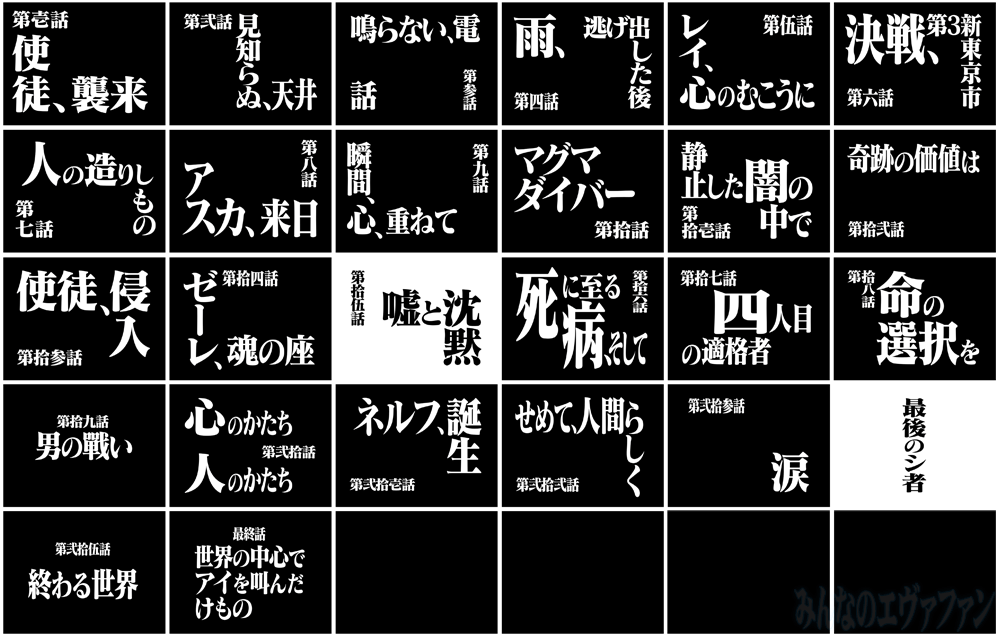
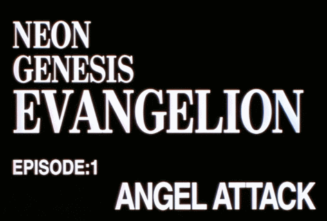
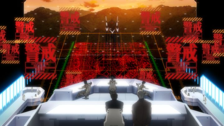
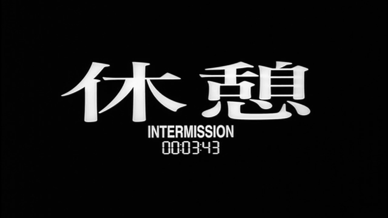
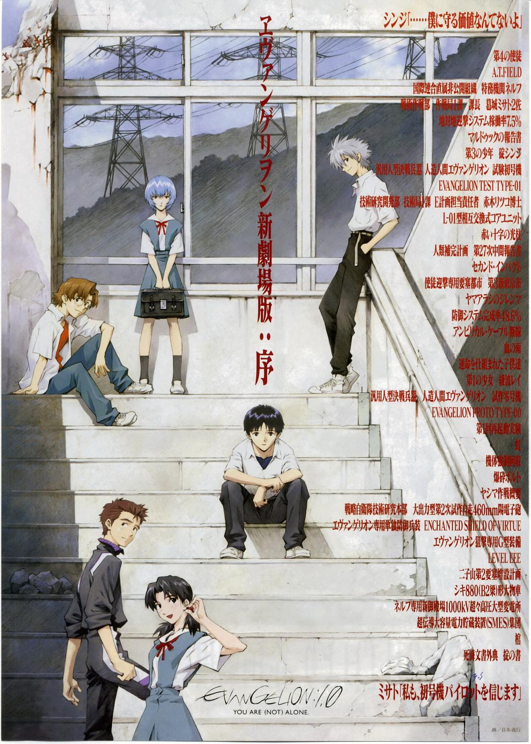
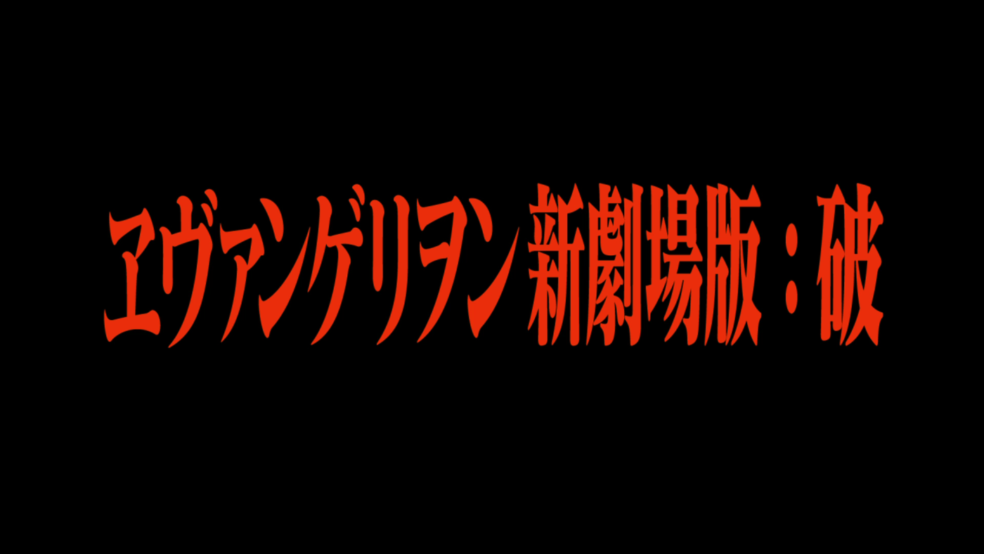
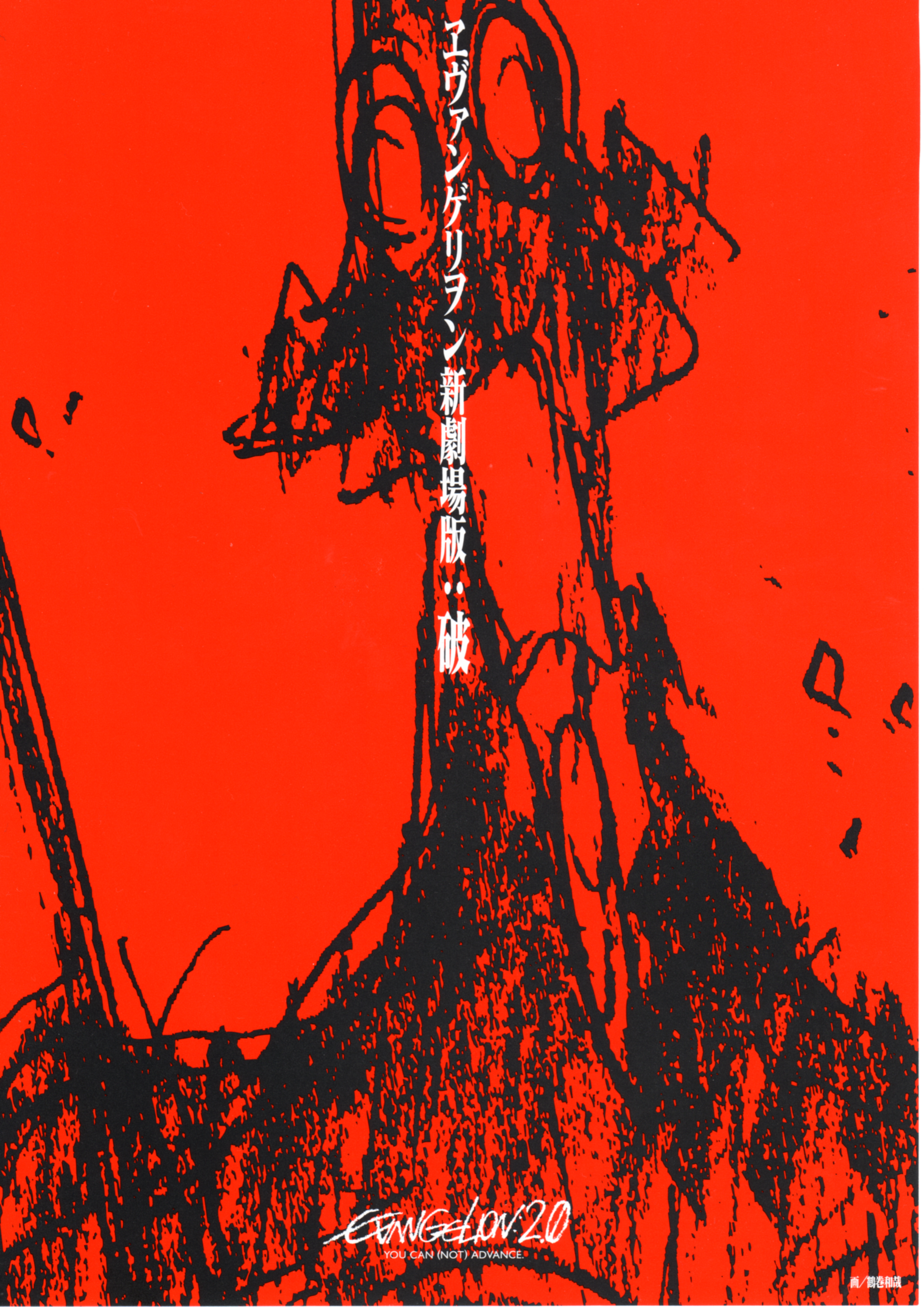
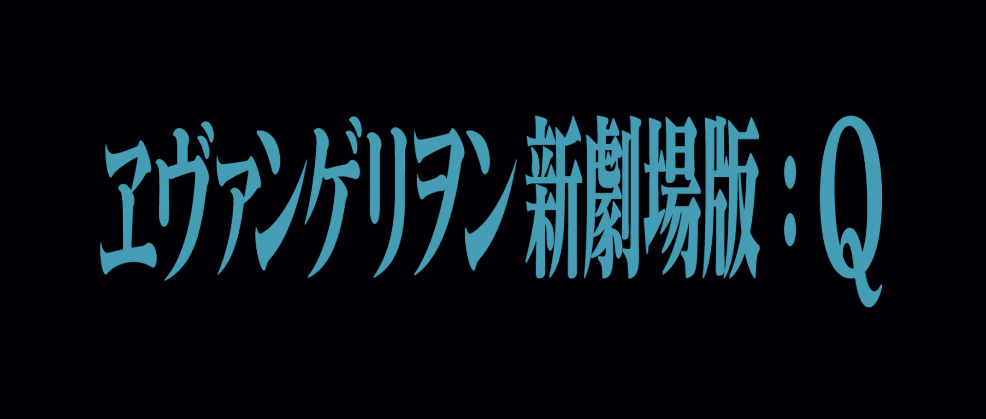
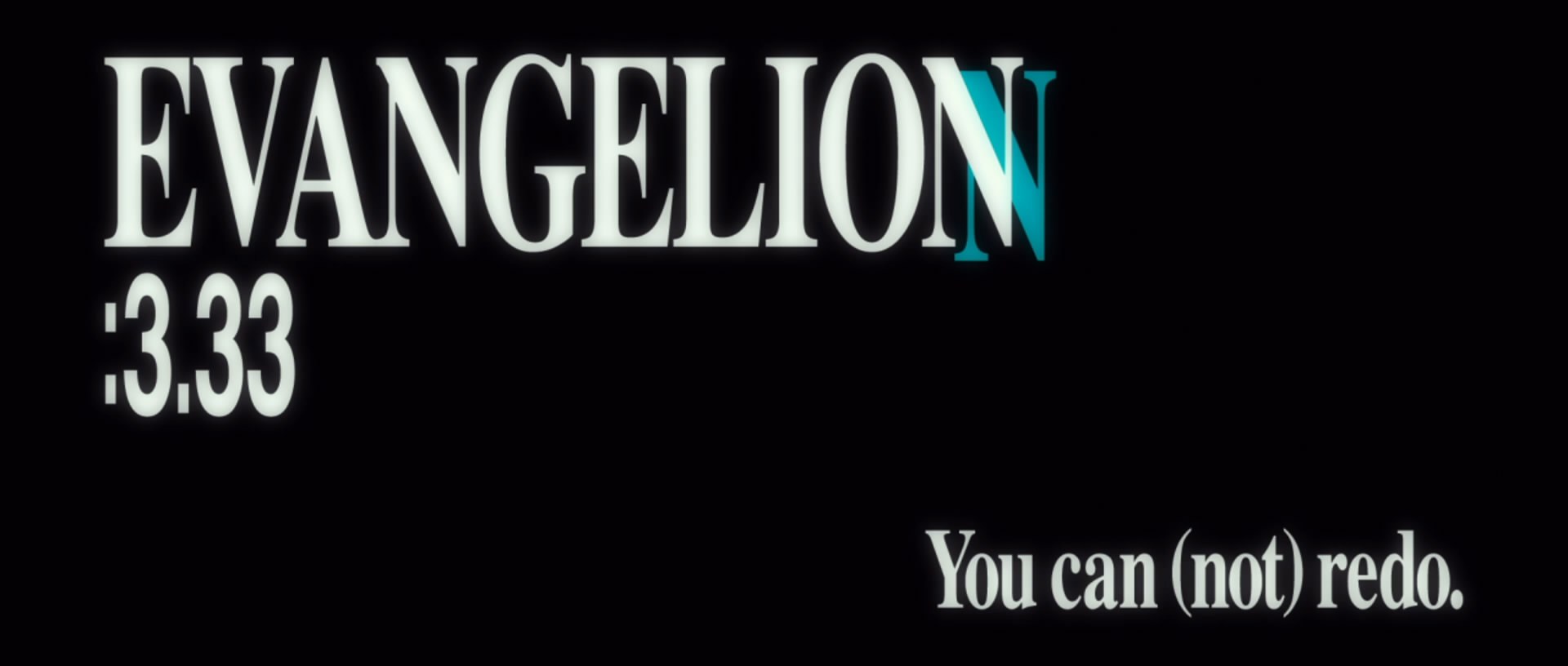
In addition to a thorough graphic identity, Evangelion also pioneered a deep integration of typography as a part of animated storytelling—a technique soon to be imitated by later anime. Prime examples are the show’s title cards and flashing type-only frames mixed in with the animation. The title cards contain nothing but crude, black-and-white Matisse EB, and are often mechanically compressed to fit into interlocking compositions. This brutal treatment started as a hidden homage to the title cards in old Toho movies from the sixties and seventies, but soon became visually synonymous with Evangelion after the show first aired.
Innovating on the media of animated storytelling, Evangelion also integrates type-only flashes. Back then, these black-and-white, split-second frames were Anno’s attempt at imprinting subliminal messages onto the viewer, but have since become Easter eggs for die-hard Evangelion fans as well as motion signatures for the entire franchise.
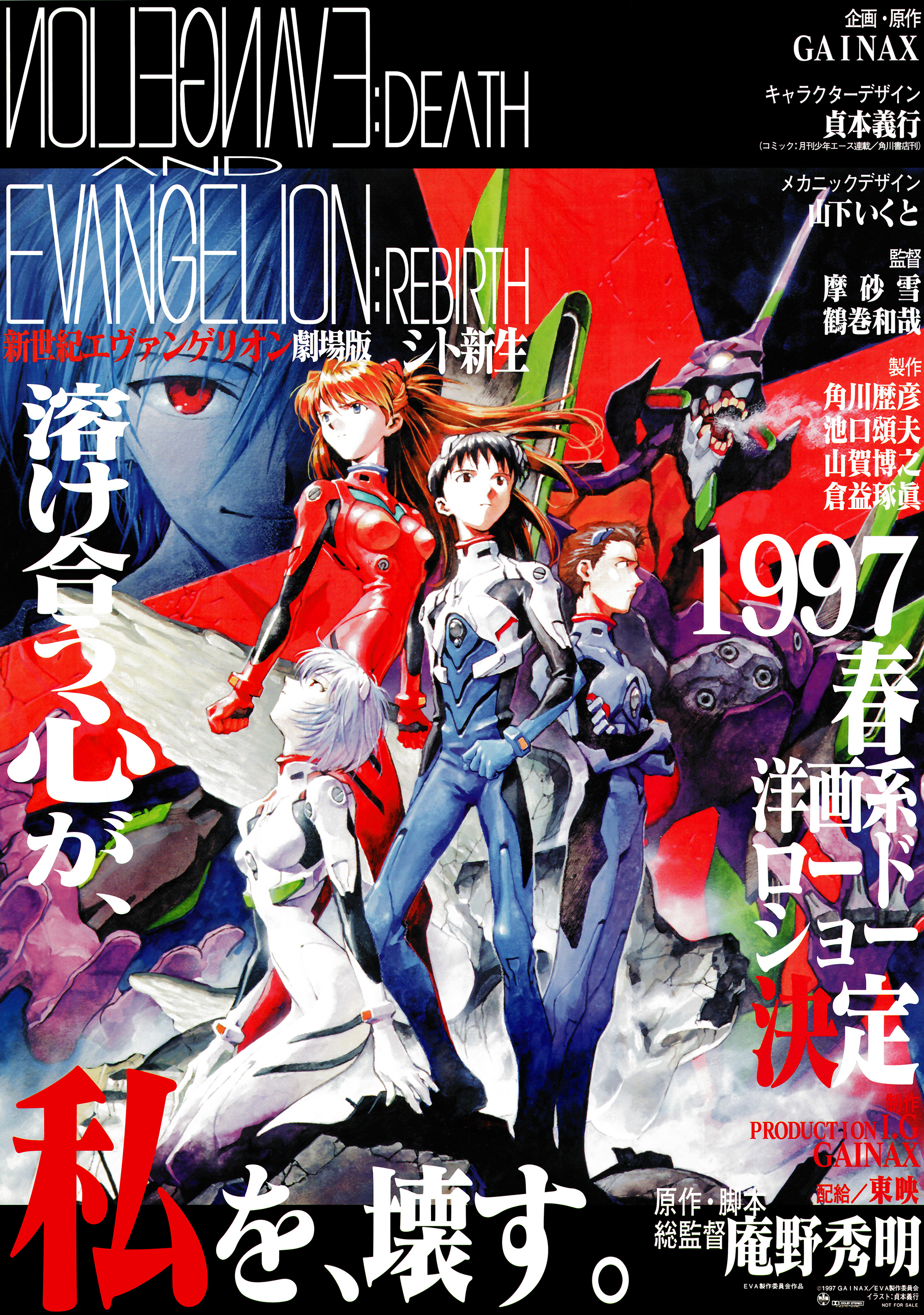
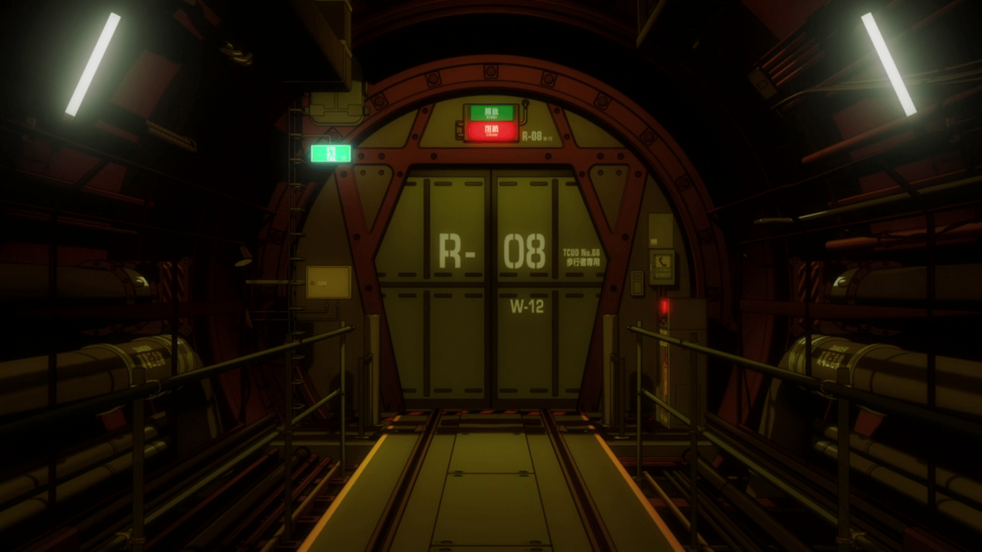
Instead of letting Western distributors translate episode titles themselves, the Evangelion staff decided to offer their own English episode titles. These are not direct translations, but rather alternatives or subtitles, often featuring biblical or philosophical references that might be difficult to integrate using Japanese. The English title cards feature a number of different typefaces, often tightly tracked and mechanically compressed. While most titles use Helvetica, the words “NEON GENESIS EVANGELION” are set in one of the bootleg versions of Century or Century Schoolbook that come with numerous Japanese fonts. The same seriffed font (or a similar one) is used in all caps for the titles in Episodes 5, 6, 7, and 23; and in sentence case in Episodes 9, 11, 15, and 25. The lowercase exhibits aggressively shortened descenders, a common feature implemented in Japanese fonts to fit Latin glyphs into the character bounding box. A horizontally squeezed Times is used in 12, 26 (“Take Care of Yourself”), and 26' (“I Need You”). 25' (“Love is Destructive”) appears to feature Matisse EB’s Latin glyphs.
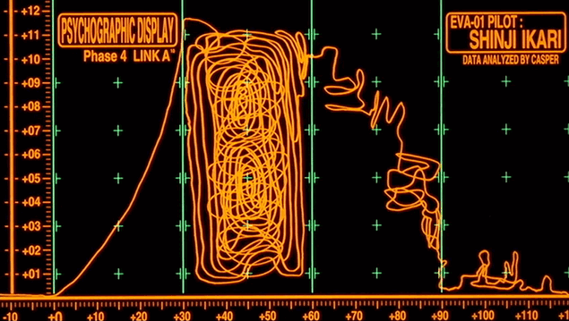
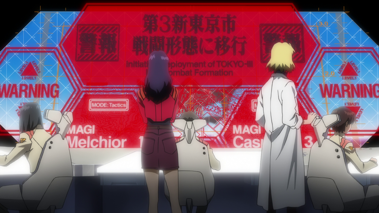
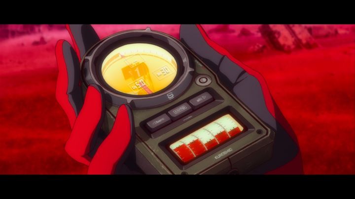
Established in title cards, this combination of Matisse EB and all-caps Helvetica soon bled into various aspects of Evangelion, most notably the HUD user interfaces in NERV. Although it would be possible to attribute the mechanical compression to technical limitations or typographic ignorance, its ubiquitous occurrence did evoke haste and, at times, despair—an emotional motif perfectly suited to a postapocalyptic story with existentialist themes.
If great storytelling made Evangelion popular among anime fans, it would soon become a fin-de-siècle social phenomenon, as a series of real-life episodes unfolded in the franchise’s production process. Budget difficulties, parents’ protest against the show’s graphic imagery, and Anno’s newfound interest in Freudian psychoanalysis all pushed the closing episodes’ visual direction from mainstream to experimental, filled with abstract animation, line drawings, flashbacks, and photographs. Told completely in a stream-of-consciousness style, the final episode “ended” without revealing an actual ending to the story, generating massive controversy on the internet. Feeling betrayed, confused, and angry, some fans made anonymous death threats to Anno in the form of letters and vandalized office façades.
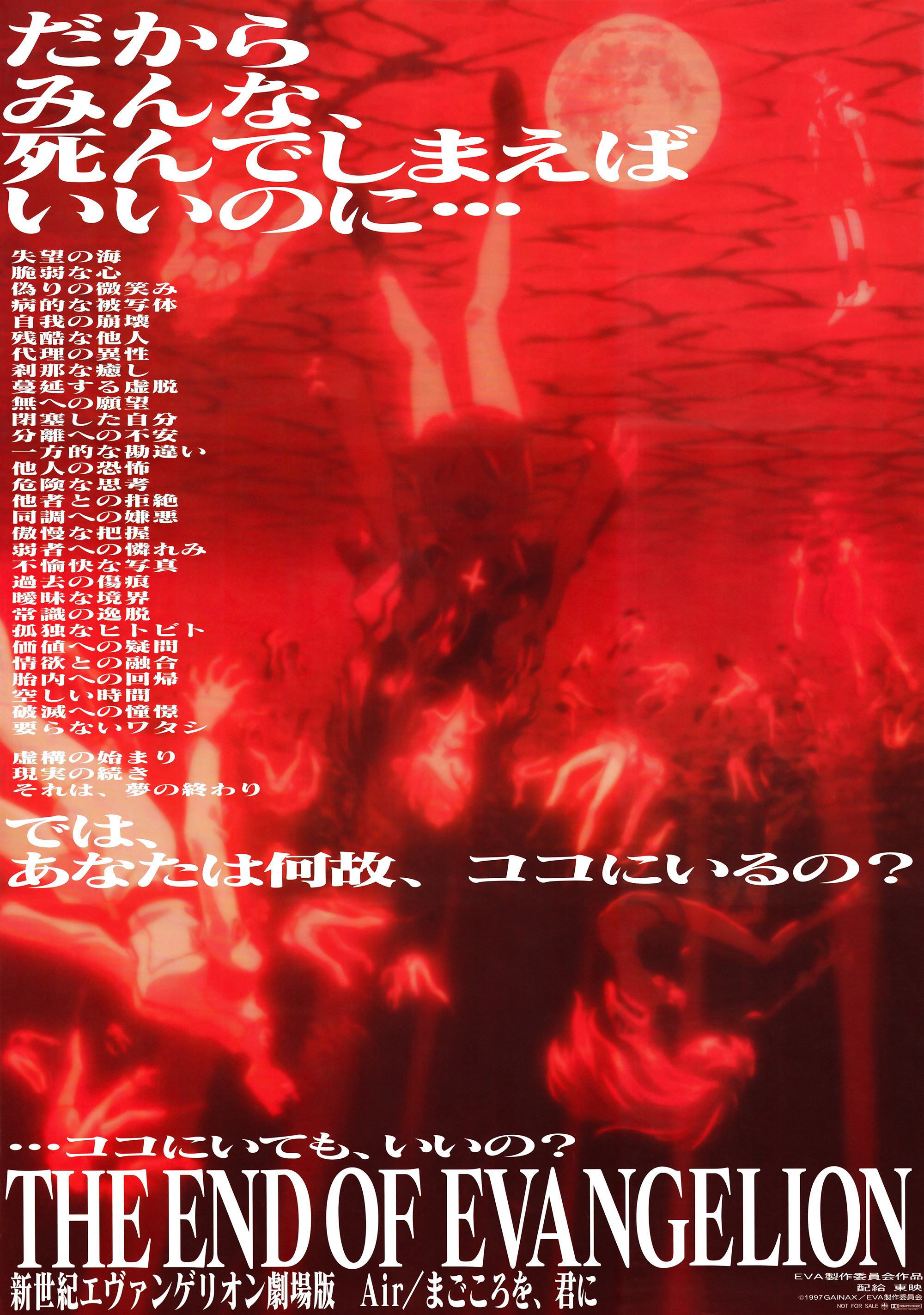
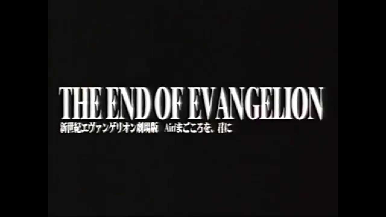
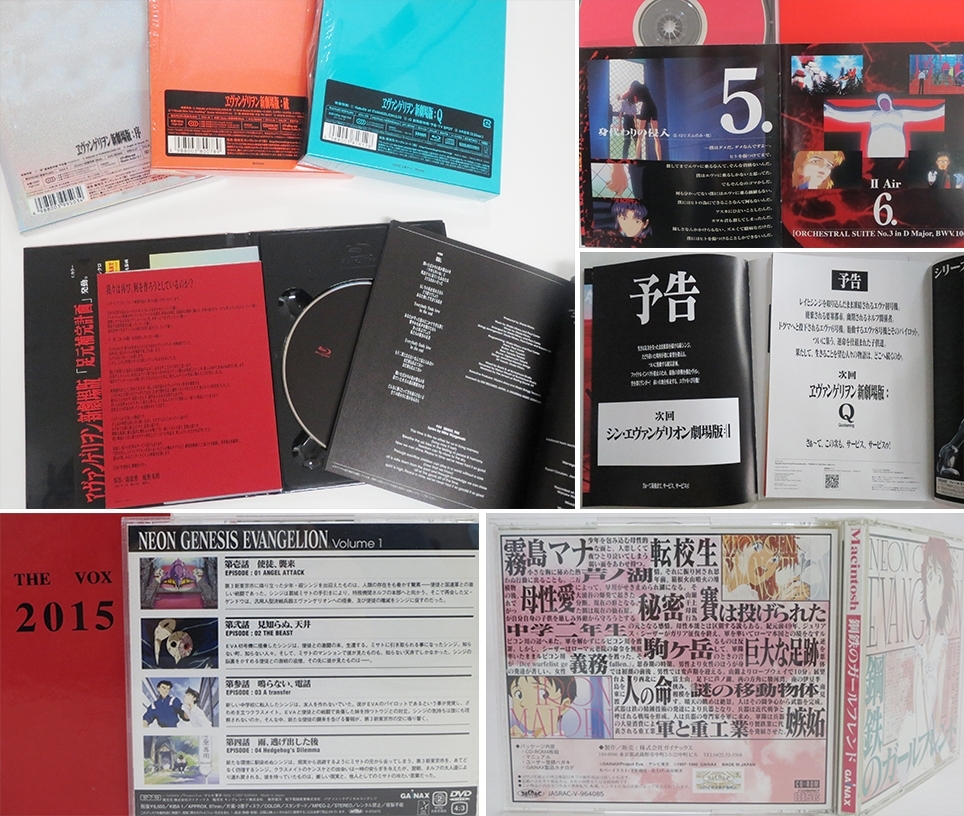
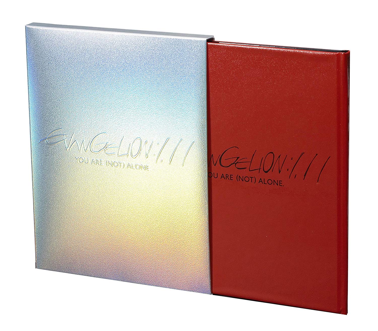
Having managed to cobble together a sufficient budget, Anno was compelled to remake the series in response to fan dissatisfaction with the finale, resulting in two movies: Death & Rebirth and The End of Evangelion. While the former recaps most of the TV episodes, the latter offers a genuine end to the Evangelion story. In utter contrast to the congratulatory mood of the final TV episode, The End of Evangelion is as visually arresting as it is thematically forlorn: the viewer must witness a total meltdown of NERV and the gory deaths of the main characters, culminating in humanity’s extinction, for which the protagonist is directly responsible. As if to further his revenge against disgruntled fans, Anno even incorporated photographs of some of the death-threat letters he received into the movie’s montages. Having solidified its status as visual shorthand for Evangelion, Matisse—this time in its ultra-bold (UB) weight—flooded the movies’ background art and promotional materials with even more unabashed mechanical compression. Aided by the franchise’s boosted popularity, the font CD-ROMs even briefly became sought-after collector’s items.
Rebuild of Evangelion and Matisse Pro EB
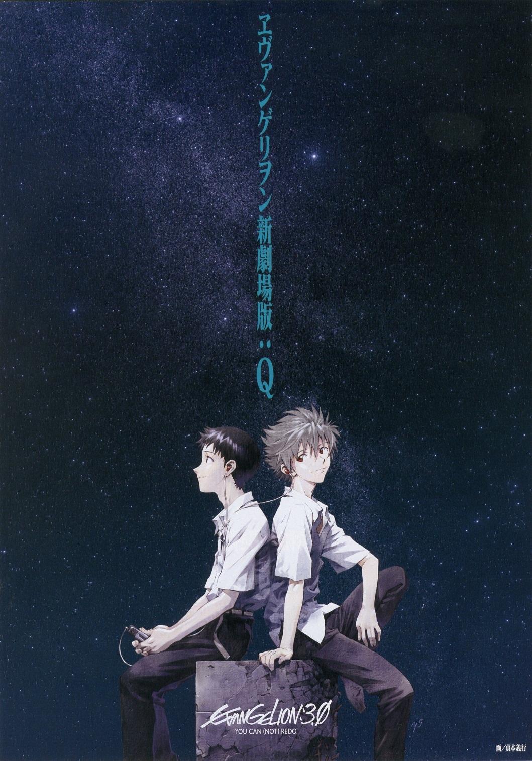
Convinced that Evangelion’s story should also adapt to its times, Anno decided to establish his own animation studio in 2006 so he could remake the entire series again. The result was Studio Khara (株式会社カラー) and the movie tetralogy Rebuild of Evangelion (ヱヴァンゲリヲン新劇場版); its first installment was released a year later. While the first movie largely follows the same plot as the 1995 TV series, significant deviation started cropping up at the end of the second movie, and the third entered a completely different plot line.
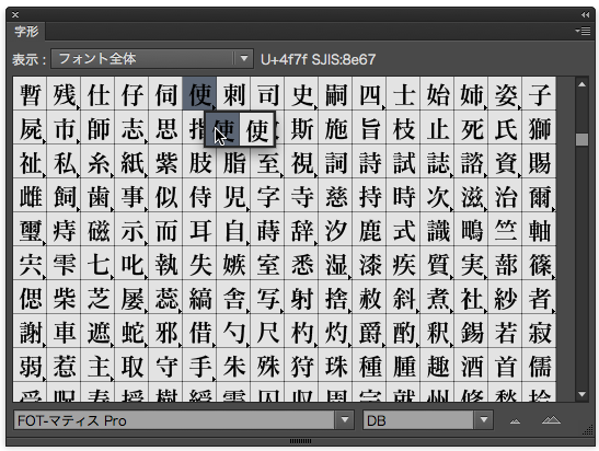
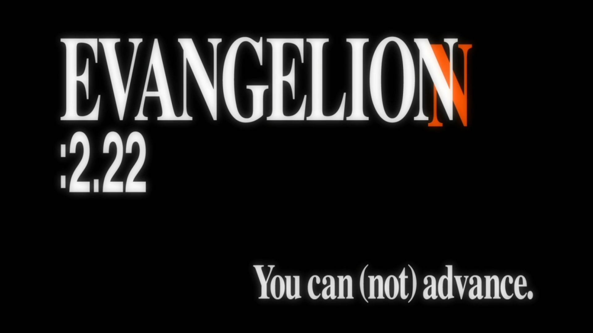
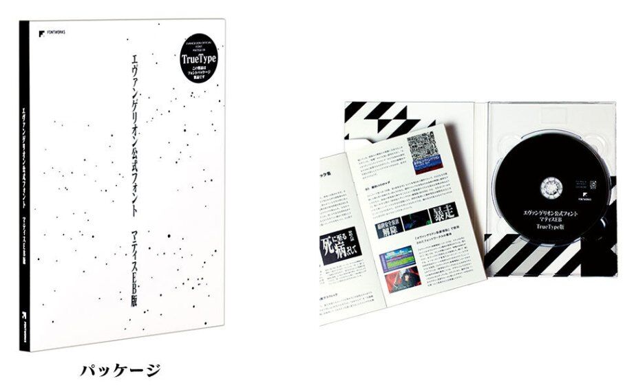
The original Matisse family was produced in desktop typesetting’s nascent days, its glyphs following the popular Japanese Industrial Standards (JIS), which prescribed what characters should look like. To conform to advances in type technology over the years, Rebuild of Evangelion uses Matisse Pro EB, which Fontworks reengineered to follow the Adobe-Japan standard. The font files were also delivered in OpenType, not the original OCF format. Following a new encoding standard meant that some characters would necessarily look different, so Fontworks kept the original versions as OpenType alternates.
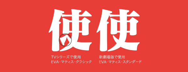
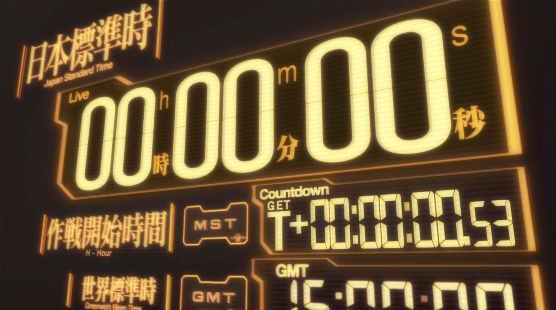
In both Japanese and English versions, mechanical compression officially became a celebrated identity element, used to produce a starker and more austere look for the films. The decision to use mechanical compression instead of commissioning a compressed-width variant is also confirmed by Evangelion’s official website, which loads the normal Matisse Pro EB and then uses the CSS transform property to achieve the compression effect.

Matisse’s Latin counterparts received a facelift, too. Neue Helvetica now complements Matisse on the movies’ user interfaces, sometimes sporting its condensed variant.
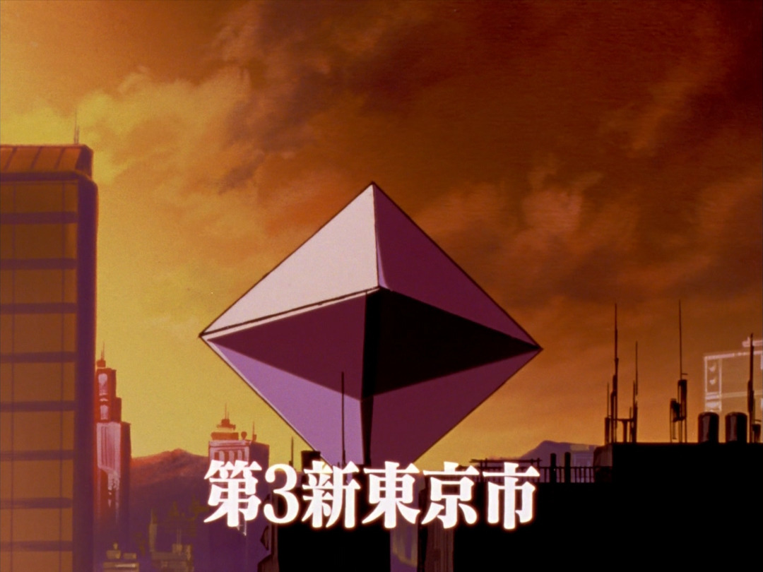
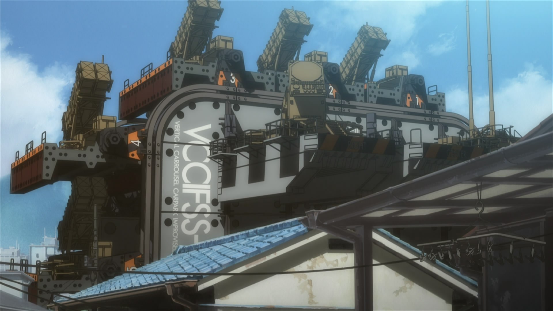
As the youngest typeface category, sans serifs have come to be associated with scientific and technological advancement. For example, Akzidenz-Grotesk often appears on Braun products under Dieter Rams’s direction, and Futura was chosen to represent humanity on the moon. Their unadorned letterforms conveyed the precision, progress, and optimism characteristic of mid-century modernism. Evangelion’s incorporation of Futura, Helvetica, and Eurostile in its visual world-building (especially when used for decorating Tokyo-3 and NERV) serves the opposite purpose, however. A last gasp after two presumably destroyed Tokyos, Tokyo-3 is a fortified underground city built to withstand giant monster attacks, its aboveground portion serving directly as a combat zone. Here, civic life gives way to heavy militarization. Civilization is on the brink of collapse, and humanity teeters on the edge of extinction. Futura and Eurostile do appear on objects in Evangelion that are as sophisticated and enormous as NASA rockets in real life—but while space exploration looks to the future with unending aspiration, Evangelion uses these typefaces to document the past and all of its unhealable trauma. In other words, the fact that typefaces like Eurostile and Futura are used in Evangelion as high-modernist signals offers an entry to a profound reflection on the collective human endeavor known as modernism by alluding to a world in which such endeavors were pushed to the limit, having already failed.
Evangelion and Matisse EB in the physical world
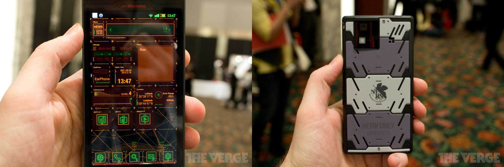
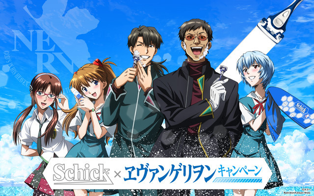
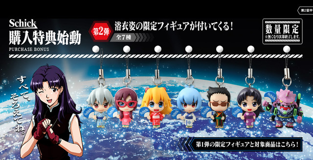
Since 2007, Anno has released three of the four planned Rebuild of Evangelion films, and the series has become a worldwide phenomenon. Capitalizing on its almost unparalleled cultural impact, Evangelion has spawned a huge official merchandise business, including electronics accessories, apparel, food, and even outdoor gear. Evangelion merch can also afford to reference a plethora of deeply embedded visual elements without showing entire drawings or scenes for context, the way many other anime need to do. Occupying center stage in these visual references, Matisse Pro EB has earned a couple of fond nicknames: “EVA Ultra Bold Mincho” or “EVA Ultra Bold Serif” (EVA 極太明朝体).
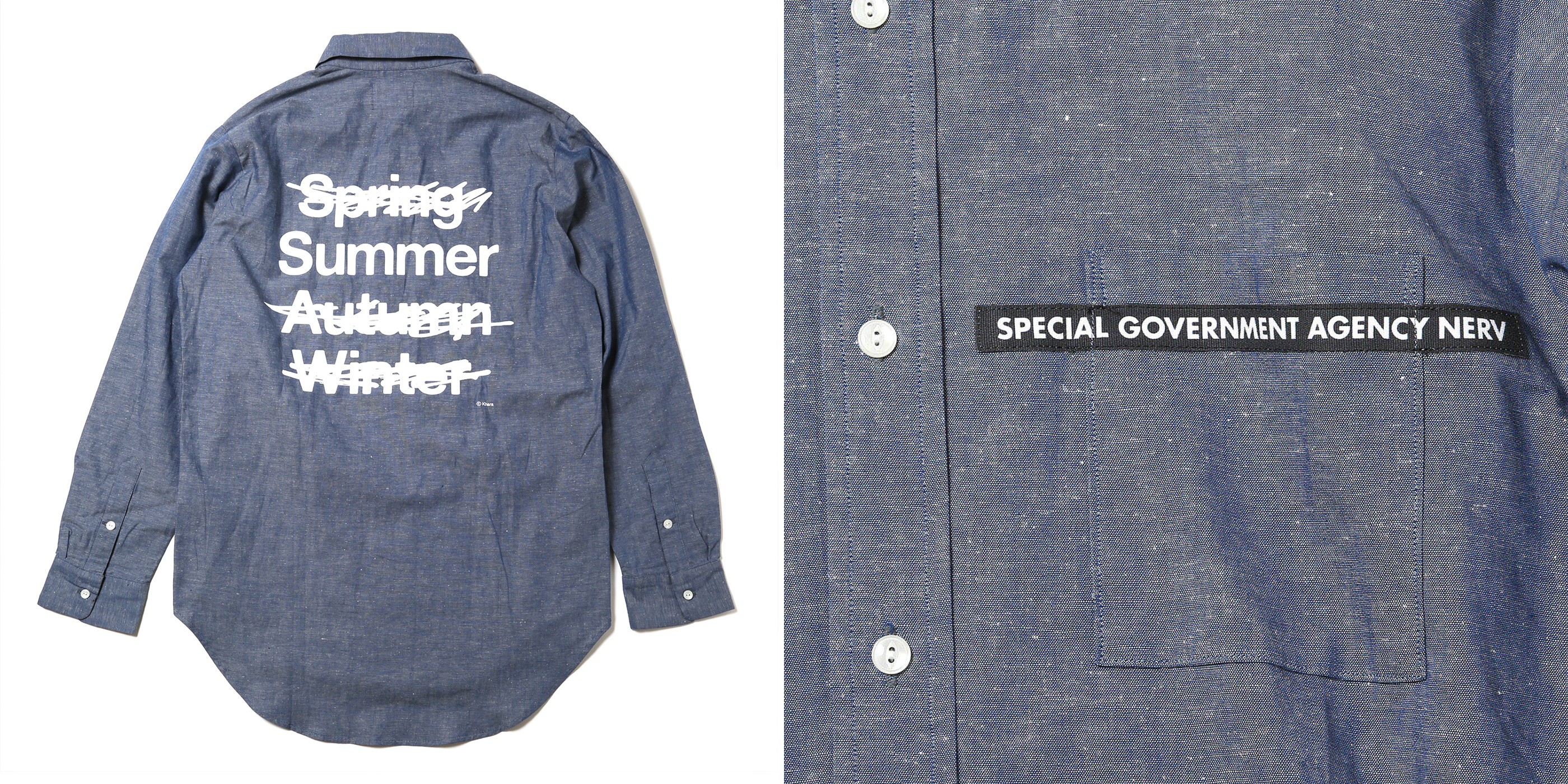
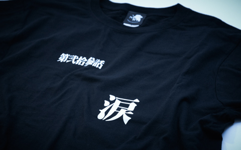
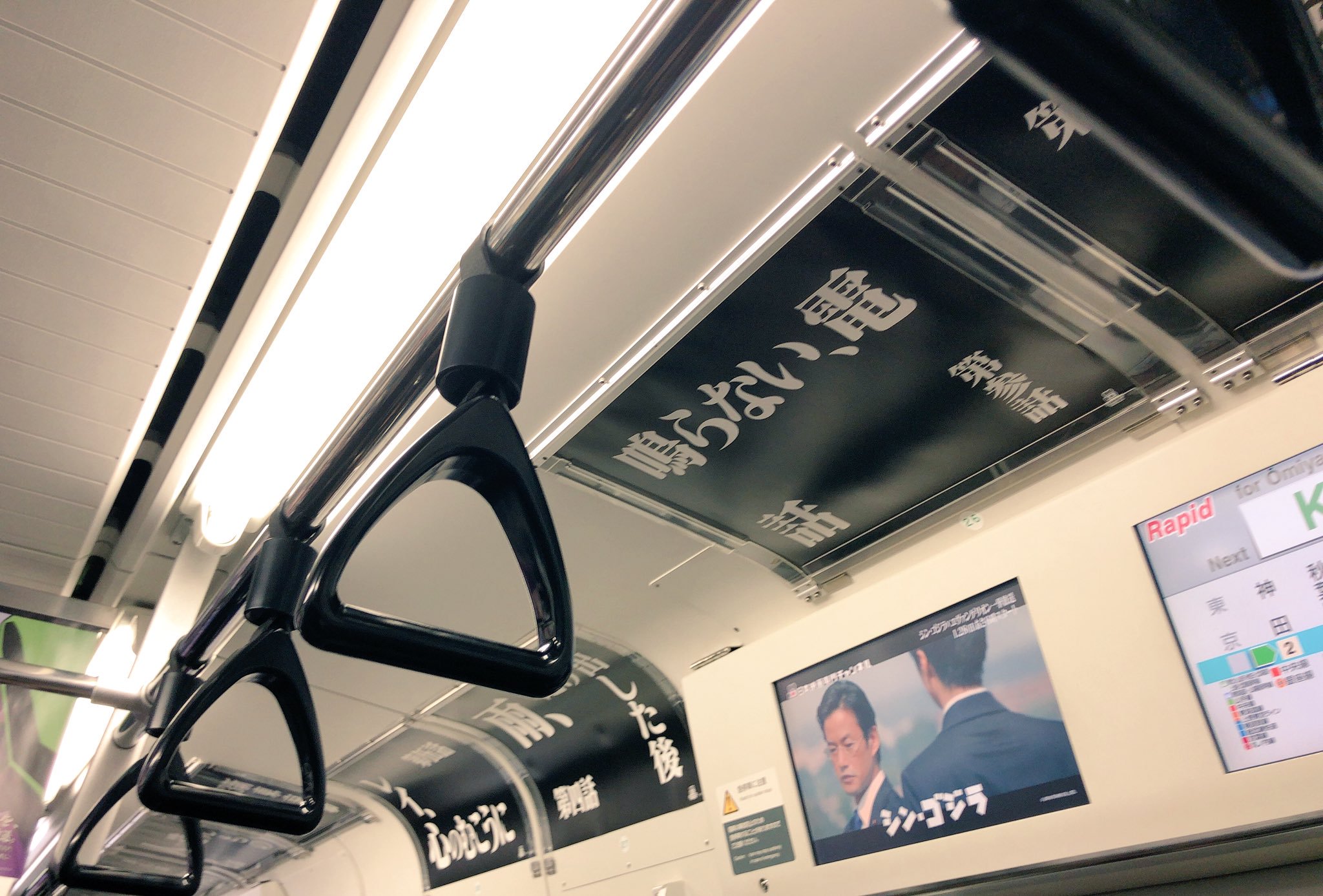
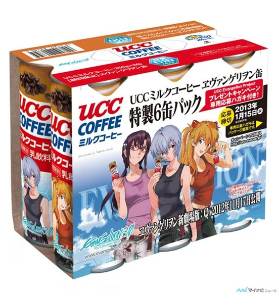
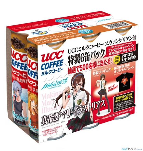
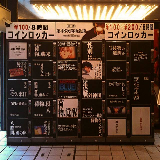
Fans also use the Matisse fonts to express their affection, referencing Evangelion in unexpected places like self-storage lockers.
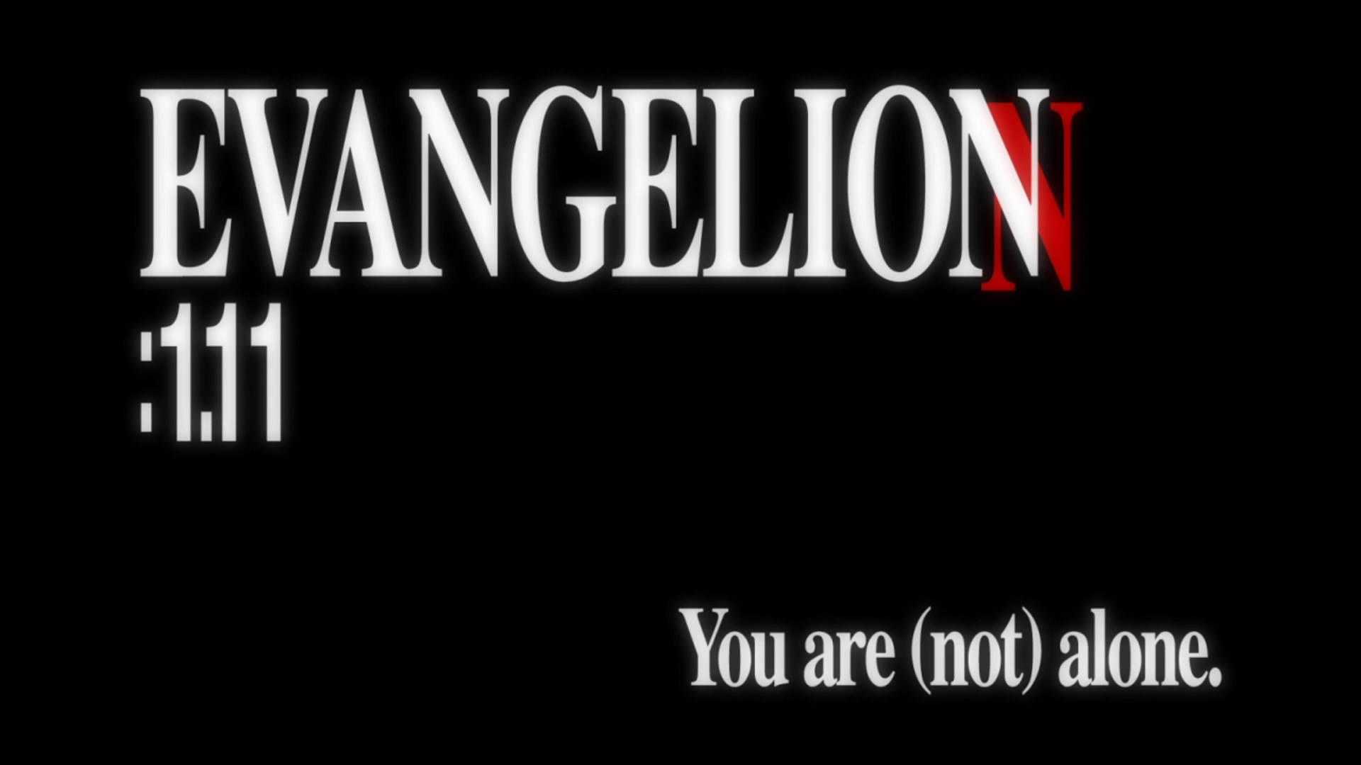
The fourth and final installment of Rebuild of Evangelion will land in theaters in the summer of 20201, to coincide with the Tokyo Olympics. A ten-minute teaser has already been released in Paris, Los Angeles, Shanghai, and various locations in Japan.

The 1995 TV series and the two 1997 movies featured masterful direction, superb voice acting, and a form of visual storytelling that combined existentialism, Freudian psychoanalysis, teenage angst, and biblical references into a mind-boggling stew. And the series of real-life episodes that accompanied its production process made Evangelion not just a franchise, but also a historical event. For many anime fans born in the eighties and nineties, the word “Evangelion” evokes certain fond memories, as does seeing text set in mechanically compressed Matisse EB. For me personally, as a graphic designer, Evangelion epitomizes the best of both worlds: solid Japanese typography combined with a Swiss sensibility. The final installment of the Rebuild tetralogy will certainly be no exception. Before you see it, be sure to revisit the remastered classic twenty-six-episode TV series and the two 1997 movies on Netflix.
NotesThe movie‘s release was postponed due to the COVID pandemic until 2021. Its title, Evangelion: 3.0+1.0 Thrice Upon a Time (シン・エヴァンゲリオン劇場版 𝄇), intentionally dropped the word “Rebuild”. ↩︎