Review: ABC Laica
In the type world, utility and inventiveness are hardly new topics of conversation. The useful-aesthetic dichotomy has become a meme, and numerous public exchanges have debated what constitutes a typeface’s originality. For me, Alessio D’Ellena’s ABC Laica reflects a refreshing, contemporary, and yet perhaps already familiar perspective for evaluating typefaces through the lens of these two categories.
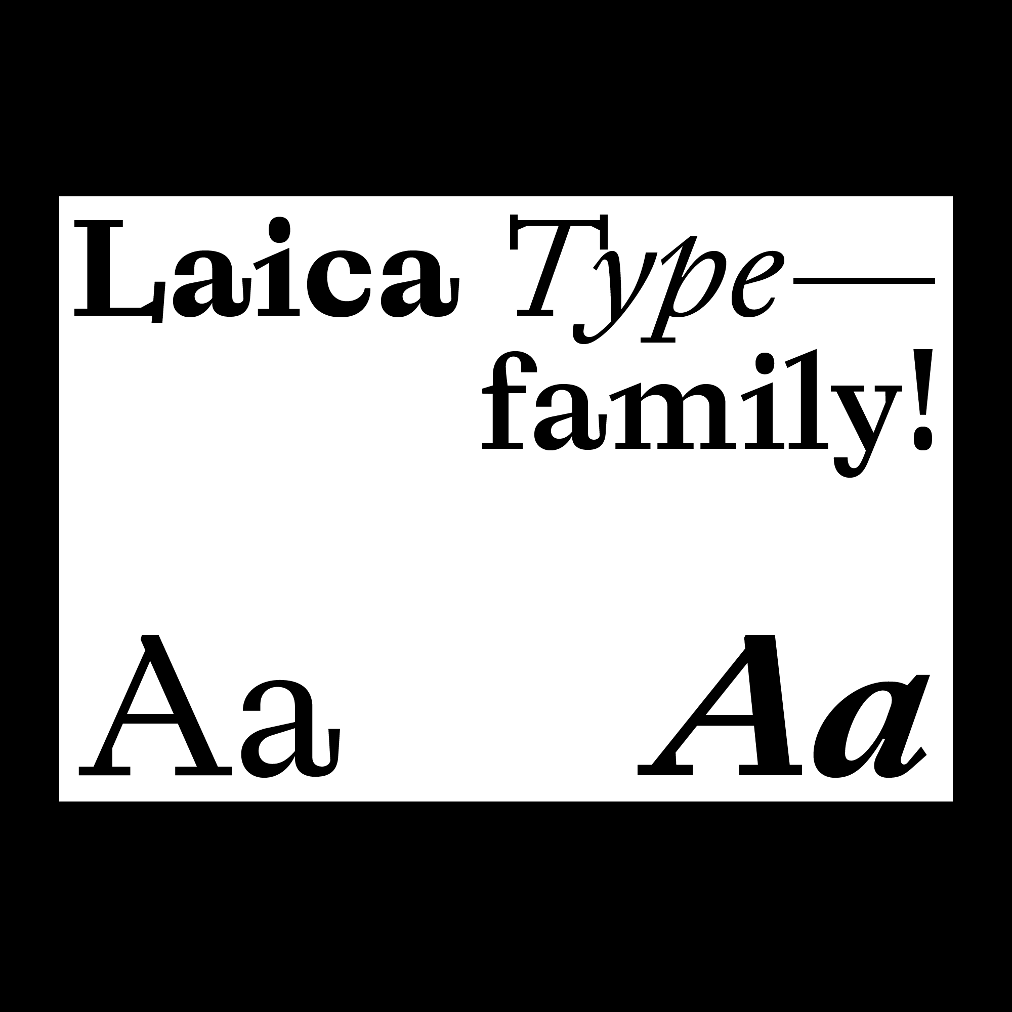
If reading comfort is among a typeface’s utility criteria, Laica probably wouldn’t score very high. In running paragraphs, its flaws are easy to spot: its overall contrast is too sparkly, and its detailing quite interruptive to continuous reading (just look at that prominent tail of the lowercase a). But deep down, I think we all know Laica isn’t here for setting bibles or paperbacks. It has a different mission.
Laica was born in and firmly belongs to the world of boutique photo books and insider jokes. Its conceptual operation is patently “postmodern” as we witness D’Ellena daringly deconstruct almost every feature that constitutes the notion of a Garalde-like serif typeface: serifs are represented by rectangles; serif bracketing is approximated by a crude line segment; and letterform parts are intentionally disconnected, hinting at the component-driven workflow typical of type design software nowadays. In other words, this is a typeface whose conceptual origin rests so deeply in the world of typographic and symbolic reference that a pair of purely formalist eyes would find only a conglomerate of weird-looking shapes. To bash it for not being utilitarian enough would be the equivalent of criticizing a family sedan for failing to haul timber—that’s a truck’s job.
Anybody with even a passing interest in type history knows that type production has been continuously democratized since the 1980s. The progressive lowering of barriers to entry has happened not only chronologically (the familiar “what took years now takes weeks”), but also spatially: mobile individuals with internet-connected laptops have replaced groups of workers tethered to type-making factories. This profound spatial shift is precisely the source of an anxiety latent in some of the commentaries on mediocrity mentioned above. It isn’t really about the degradation in material quality per se (e.g., curve smoothness or engineering robustness); painstakingly crafted multiscript superfamilies keep appearing every year. Rather, the anxiety revolves around an established aesthetic evaluation framework that favors some variation of harmony between the utilitarian and the beautiful. Its use is considerably decreasing in a new world that has been utterly dominated by an explosive supply of typographic and pictorial signs and symbols.
And Laica comes from this world—a world of cultural overproduction and overconsumption. If Monotype Garamond is haute couture, then Laica is surely streetwear. In a world where the blazing speed of cultural consumption has rendered meaningless any attempt at utilitarian/beauty evaluation, cultural products are largely valued by their novelty (which doesn’t necessarily equal originality) and “relevance”. In a matter of months or even weeks, new typefaces are now increasingly produced to be quickly consumed and promptly discarded once their cultural stock as stylistic differentiators has been exhausted. For example, the sometimes-ironic remakes of Helvetica or Akzidenz-Grotesk are popular not only for their façades of intellectual sophistication, but also because of their suitability for quick reproduction as cultural commodities. The fact that understanding Laica’s design requires prior knowledge of references is then not a coincidence, since its very existence was conceived not as a utilitarian response to given briefs (e.g., Frutiger for wayfinding or Retina for financial tables), but as a referential one to other signs and symbols. With the help of Instagram and Twitter, this new mode of production and consumption is eating away with unprecedented momentum the territories of typefaces previously canonized by their formal and technological practicality.
But not every fast-fashion typeface is equal. I remember what Nadine Chahine said in her TypeCon 2016 keynote lecture about type reflecting the zeitgeist. Truly, the typefaces valued higher in the symbolic economy are those that more closely capture their societies’ collective spirits. This was partially the case in the previous century and is almost fully the case in the current one. If Akzidenz-Grotesk could embody the Cold War era’s optimism about technocracy (with recent reinterpretations reflecting our collective desire for it), Laica’s dislocated shapes and sprawling texture walk a fine line between sublimity and grotesqueness, as the world in 2019 also appeared to teeter on the brink of conflicts and crises. It is a world that the buttery-smooth curves of Helvetica promised but failed to fix, as did Helvetica’s ironic imitations, regardless of their sincerity.
It is precisely this prescience that I value in Laica. It is easy to draw quirky shapes, but it takes courage and effort (and probably a bit of luck) to devise a system of wittily deviant shapes driven by a holistic conceptual direction that also has cultural relevance. I can already imagine Laica on high-end packaging and art house catalogs, but I’m even more curious about the length of its life span and, more intriguingly, the number of references and responses it in turn will generate.