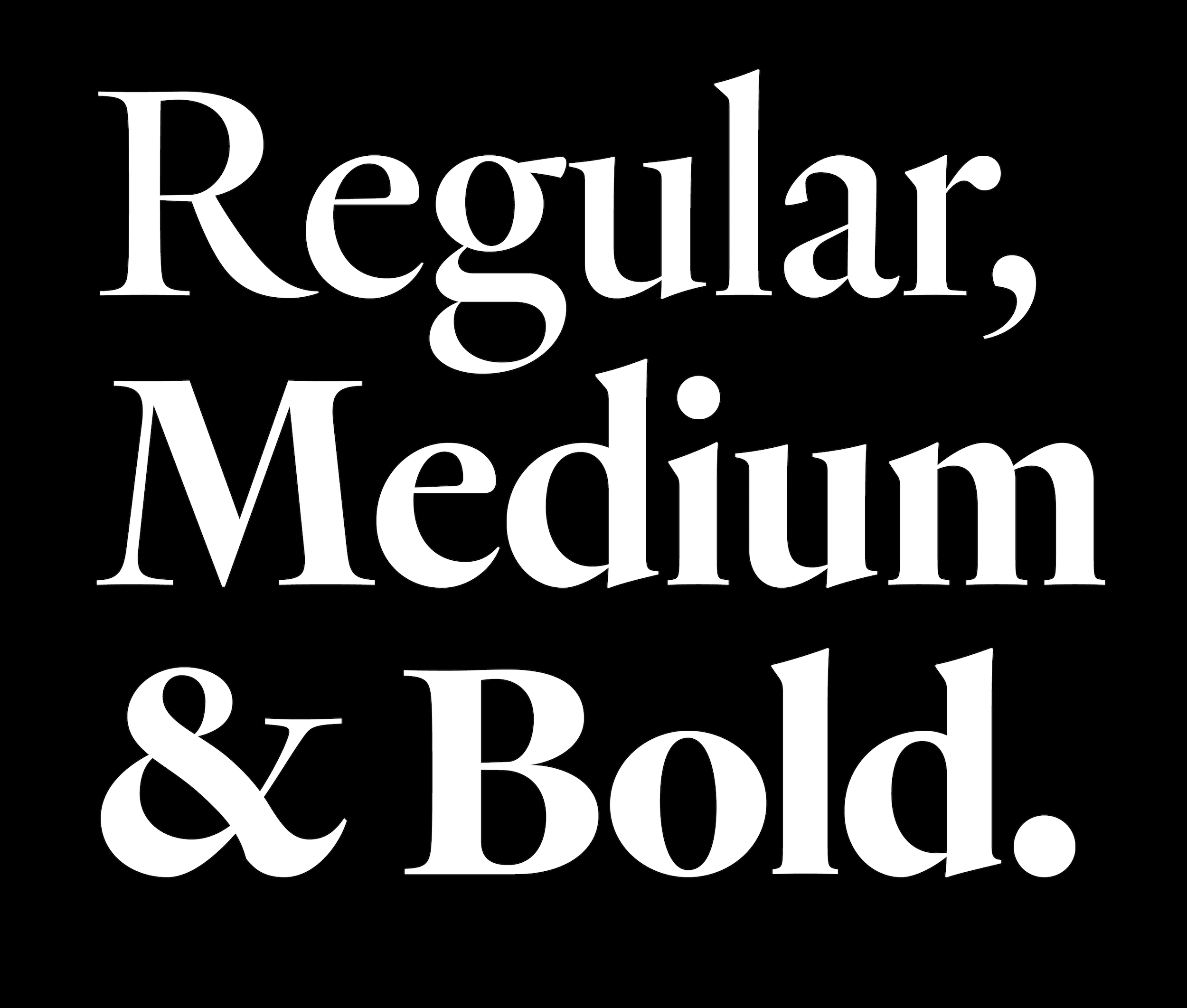
Review: Heldane
Of all of the genres of Garalde serif typefaces, I’m particularly fond of the early Renaissance Dutch, especially those cut by the Flemish punchcutter Hendrik van den Keere. I have vivid memories of my first encounter with his Gros Canon reproduced in Counterpunch. Fred Smeijers accurately pointed out many of the typeface’s flaws, and yet I still fell hopelessly in love.

I suspect I’ve simply seen too many “fancy” Garaldes, most of them from France. They all feature traces of the monumental capitals of Roman inscriptions, modest (“bookish”) x-heights, aggressively tilted contrast axes—basically, they all want to rub our faces in their calligraphic ducti. Their digital revivals are equally fancy, with rounded outlines, cupped bottom serifs, and, most zealously, a gratuitous load of flourishes and ornaments that will be eating dust ninety-nine percent of the time post-purchase. As stylistic signifiers, these things cloak the sources and the typefaces with an air of daintiness, antiquarianism—even, to my eye, a certain bourgeois authoritarianism. Not that type can’t come with atmosphere, but as a graphic designer, it’s hard for me to justify a purchase if I know the product will look out of place in anything cheaper than lavish coffee-table books.
So when I saw Van den Keere’s letterforms, I was immediately drawn to their austerity, practicality, and modernity. I felt like Van den Keere was consciously “reviving” his predecessors’ work, stripping letterforms to their most basic skeletons. Combining darkness, economy, and a no-frills attitude, his letters inherited the calligraphic elegance of his predecessors while managing to maintain the mechanical sharpness characteristic of a punchcutter’s gravers. With such striking clarity in their construction, the letterforms were sometimes indistinguishable from those pantographed in a 20th-century type factory. They were also so fantastically vital. To paraphrase W. A. Dwiggins, these letters want to race to a line’s end themselves (while their French counterparts daintily wait for horse carriages). Part of this vitality comes from local features — the sharp, no-nonsense upticks of a, u, t, and c, the forward-leaning postures of e and s, or the aggressive underbites of E and G. But it also comes from the geometric and slightly plastic proportions in the lowercase. The rounds (o, e, and c, and the bowls of b, p, and q) are unabashedly circular, while the rectangulars (m, n, and h) are highly regularized and compressed. Alternating in paragraphs, these two seemingly contradictory aspects—the painted and the written—piece together a dynamic, pleasant pattern.
Before I saw Kris Sowersby’s Heldane, I used to lament that Van den Keere didn’t receive as much enthusiasm from type designers as he deserved. Three years before its release, I stumbled upon Sowersby’s Instagram account and saw some in-progress screenshots. My heart raced.
After the initial euphoria dissipated, I sat down to examine Heldane in more detail, and found that it resembled what Günter Gerhard Lange did at Berthold. His revival typefaces, such as AG Royal and Berthold Caslon, captured not just their exemplars’ substance but also their essence, sometimes even enhancing it. The same alchemy happens with Heldane. Instead of directly interpreting a specific typeface in Van den Keere’s oeuvre, Sowersby summarizes what constitutes Van-den-Keere-ness, which he then refines and exaggerates. His digital likeness of Van den Keere is thus equally (if not more) graphic, direct, and vital. Sowersby also delivers when it comes to taking artistic liberty, as the numerals demonstrate. Though lifted from Granjon and Tschichold, the figures feel formally in line with the letters and, more important, conceptually modern because of their crystal-clear construction. Sowersby also does a great job inventing the italics, whose sweet, subtle roundedness appropriately complements the roman’s drama and urgency.
If there is anything more conceptually appropriate, it would be the very fact that Heldane is drawn on the computer. Many other sources don’t prescribe an artistic obligation when being revived. For example, it makes conceptually no difference to me whether one traces or interprets a Garamont. But I can’t say the same of Van den Keere. After all, how inappropriate would it be to cloak his modernity with imitated ink spread and unnecessary ink traps? Heldane has none of that. What it has is not just sharpness, but your-fingers-might-get-hurt-touching-it sharpness. Here, outline economy is no longer an arbitrary decision. For Van den Keere and Heldane, it feels inevitable. If Van den Keere’s collection of types represents a singular idea of what an alphabet would look like, then Heldane is the purest and most thorough expression of that idea I’ve seen.
Sowersby claims Heldane’s development spanned a decade, and I don’t doubt it. Sustained effort is probably the only way to achieve what Heldane has—that elusive, quasi-magical feeling of “everything just clicks into place.” Now you have it: promising source material expertly and lovingly handled, with optical sizes and a wealth of OpenType features. What more can one ask for?