Review: Nordvest
Among typefaces, there are the workhorses: humble, durable, with subtle senses of charm. And then there are the domestic pets: attention-grabbing, delicate, and meant to be cherished alone. Nordvest is neither. It’s a monster—a monster worth wrestling and taming.
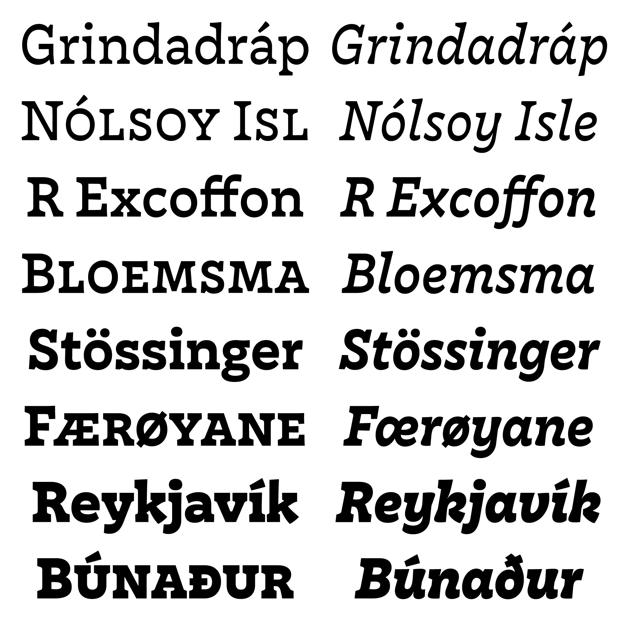
Nordvest is Nina Stössinger’s contribution to the obscure tradition of reverse-contrast typefaces. For many typographers and type designers, that usually means “quirky display type”. Efforts to make reverse contrast work in text have resulted in precious few successes, such as Roger Excoffon’s Antique Olive and Evert Bloemsma’s Balance. Nordvest pulls it off: its internal logic is still based on inverted distribution of blackness (instead of simply exaggerating the serifs like French Clarendons), but that blackness is subtly undulated so as not to tire the eyes. It proves that adding blackness in the horizontal direction, in the forms of triangular serifs, thickened terminals, and occasionally heavier curves, done right, can create an almost lyrical texture in running text.
Lyrical, that is, if you wrestle with it. Nordvest will not easily coexist with whatever you bring in: its triangular serifs can clash with many traditional serifed typefaces, and its unconventional construction can seem too geometric at times. Neither will it be content if you merely enlarge it like a Didone, or even Antique Olive Nord: though the sharp contours work at display sizes, its subtlety demands your attention beyond setting it on a pedestal and admiring it from a distance. But when you bring it down to the text range, it defies conventional typographic treatment: positive tracking destroys its word-image, while negative tracking can easily make it overwhelming. Lead too loose, it quickly amplifies the stripe-y effect to an unpleasant degree; too tight, it makes the paragraph block too black and offsets the page’s visual balance. Typesetting common Garalde or Grotesk faces is safe and convenient most of the time, and rewarding if you put in extra effort. Nordvest demands that you put in extra effort. All of it, all the time. To get it right, to honor its charm, requires discernment, sensitivity—and, most importantly, patience.
The struggle is worth it. When you’ve finally tamed this monster, the dance between whites and blacks, the well-studied horizontal emphasis, and the pleasantly calligraphic construction of italics—all form parts of the reward.
I first encountered Nordvest in 2015, when it was still Stössinger’s KABK graduation typeface and bore the name “Mica”. Struck by its beauty, I emailed her and asked if she would license it to me privately. She hesitated, replying it was being hinted by the wonderful folks at Monokrom. Now that it is officially out, I invite all of you to go try it. It will bite you if you’re not careful, but success doesn’t always come easy, does it?